Jost Hochuli
St. Gallen, Switzerland, 1933
Who’s Who
Jost Hochuli is one of the finest Swiss typographers and graphic designers.
From 1952 to 1954 he studied graphic design at the Kunstgewerbeschule (School of Arts and Crafts) of St. Gallen. The year later he did one-year apprenticeship as a compositor at the Zollikofer & Co. printshop, also in St. Gallen. In 1955 he moved to Zurich to attend the composition class at the local Kusntgewerbeschule (School of Arts and Crafts), from which he graduated in 1958. The same year he relocated in Paris to study at the École Estienne under Adrian Frutiger.
In 1959 he moved back to St. Gallen and opened his own studio, focusing on industrial and institutional graphic design. One of the first project he designed was an effective election campaign that was published on an 11-long pages article in the legendary magazine Neue Grafik (Issue 16, 1963).
During his career he focused more and more on book design and editing, producing some of the most beautiful books ever. In 1979 he cofounded VGS—Verlagsgemeinschaft St. Gallen (St. Gallen Community Publisher), acting as its President until 2004 and as its designer until 2011, taking care of books about local and regional culture.
From 1983 to 1998, he also edited and designed the acclaimed books published by Typotron, and since 2000 he is responsible for the Edition Ostschweiz (Eastern Switzerland Editions), curating books dedicated to Swiss and particularly St. Gallen’s culture.
In 2014 he cofounded the digital type foundry ABC Litera with his former student Roland Stieger, and Jonas Niedermann, developing new typefaces (Allegra, 2011), and resuming old projects (Alena, 2012, originally conceived in 1980).
From 1967 to 1980 he succeeded his former teacher Walter Käch—a Swiss master calligrapher and typographer, who also taught Adrian Frutiger—in teaching lettering and graphic design at the Kunstgewerbeschule (School of Arts and Crafts) of Zurich, with six-month break in 1968 for study in England. From 1980 to 1996 he continued teaching lettering at the Schule für Gestaltung (School of Design) of St. Gallen, and ran the “Typographical Designer” day-release course.
Member of ATypI (Association Typographique Internationale). Honorary Member of the Double Crown Club in London. Honorary Fellow of the STD (International Society of Typographic Designers). He was awarded important prizes including the Icograda Prize of Honor in 1989, and the Gutenberg Prize in 1999. Many of the books he designed have been selected for the Schönste Schweizer Bücher (Most Beautiful Swiss Books), and Schönste Bücher aus aller Welt (Most Beautiful Books of the World) exhibitions.
His work has been widely exhibited in Germany, Poland, Switzerland, and the United Kingdom. In 1993 he curated and designed the “Book Design in Switzerland” exhibition that travelled across Canada, Europe, and the U.S.A.
Author of numerous articles and books about typography and publication design, he published many books including the fundamental “Das Detail in der Typografie,” detail in typography (Compugraphic, 1987, revised in 2005) and “Bücher machen,” designing books (Agfa, 1989, revised in 1996), that have been both translated in to Dutch, English, French, German, Italian, Spanish, and Swedish.
He also published the autobiographic “Printed matter, mainly books” (Niggli, 2002), while for the beautiful Edition Ostschweiz he has recently edited and designed “Das ABC eines Typografen,” the abc of typography (Ostschweiz n.12, 2011), “Metamorphosis” (Ostschweiz n.15, 2014), and “Tschicholds Faszikel,” the Tschichold’s fascicles (Ostschweiz, n.16, 2015).
I truly wish to thank Mr. Hochuli for his unique kindness and generosity.
Enjoy your reading,
 TO THE TOP ↑
Q&A
Published Jan 6, 2015
Recorded Nov 26, 2014
What job would you have liked to do in the future, when you were a child?
To be a forester.
What was your favourite game as a child?
Chess.
Which was your favourite subject at school?
Drawing, but also reading.
What was your educational path?
Primary school, classical secondary school, Arts and Crafts school, training as a graphic designer, apprenticeship as type setter (St.Gallen, Zürich), École Estienne in Paris.
When and how did you start your professional career?
1959 in St.Gallen as a freelancer.
What is your definition of design? And what is the purpose of design?
For me these questions are too difficult to answer in one, two or three phrases, not even in an extended article. In my views on design I am deeply influenced by Norman Potter’s book “What is a designer” (London: Hyphen Press, 2009). Read it! It’s the most serious publication on that topic.
Should design produce things which are necessarily useful?
Yes, otherwise it is art. But even useless things are sometimes useful if they give pleasure.
Should the products of design be beautiful?
Not necessarily. (And besides of that, what does that mean: beautiful?)
What are the key features of your design?
Others have to judge it.
Does design require a handcraft or an industrial production?
It depends on the type of the product. Mostly both are involved to a greater or lesser degree.
To whom is design addressed? Is it for the masses?
To whom it concerns, for the masses or for the individual.
Should design tend to be ephemeral or permanent?
That depends on the purpose. In designing my books I tend to be permanent, knowing that permanent is not eternal.
What are the differences between art and design? Could design be art?
The borders are floating. Time plays a role, also different cultural environments. African masks were once used as religious objects, now they are in museums as objects of art.
A designer whose work you admire.
Piet Gerards, book designer in Amsterdam, and Bram de Does, type designer in Overfelte, The Netherlands.
The typefaces you prefer the most and why.
I am working with several different typefaces. Looking through the books I had designed in the last five years or so, I come to about 25 different typefaces. They are all serious, not trendy ones, serifs and sans serifs. I often use Trinité 2 or Lexicon 2 by Bram de Does. They have a warm appearance, give a literary feeling and yet they look up-to-date and not old fashioned.
What are the qualities of a good typeface?
Whether a typeface is good or not depends on the purpose it is used for. Typefaces which look “normal” – not too fat, not too thin, not too broad, not too narrow, not too extravagant in the details or in the overall appearance – are the typefaces which survive.
Without considering technology, what are the main differences in designing typefaces in the past and today?
The actual type design is in it’s details far more refined than it was in former times. That is partly the result of the relevant programmes, partly due to the possibility the designers have in refining the designs.
What would you recommend to a young designer?
To read, not only the technical books of our field, but also ambitious literary works. Being critical of modish trends. Have a liking to think things over.
What is the necessary condition to practice design?
Being curious, being socially minded.
What is the future of design?
Ask the stars!
Thank you very much.
Thank you too.
© 2014-16 Jost Hochuli, Nicola-Matteo Munari. All rights reserved.
TO THE TOP ↑
Portfolio
J.S. Bach
Poster, 100×70 cm
1956
FDP
Posters and Flyers
1960
Design of the identity and printed matter for the election campaign of FDP—Freisinnig-Demokratische Partei (Free Democratic Party), and the Jungliberale Bewegung (Young Liberal Movement).
American Club
Cigarette Box
1961
Mozart+Schubert
Posters, 50×50 cm
1961-63
Kunststoff
Advertisements, 22×14.5 cm
1962-63
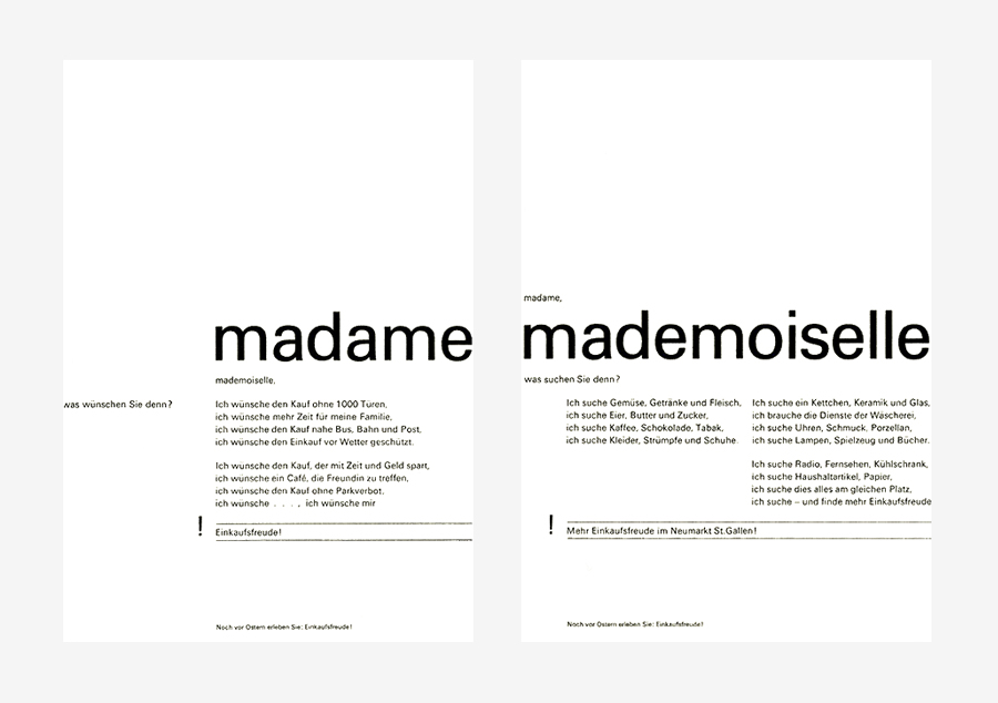
Madame+Mademoiselle
Advertisements, 25×17.5 cm
1963
Advertisement for the opening of a shopping center in St. Gallen.
Tradition und Gegenwart
Poster, c.128×90 cm
1963
Poster for “Tradition and Modernity,” an exhibition about the renovation of the Waaghaus am Bohl, St. Gallen.
Tschudy Books
Book Series, 16.8×10.5 cm
1965
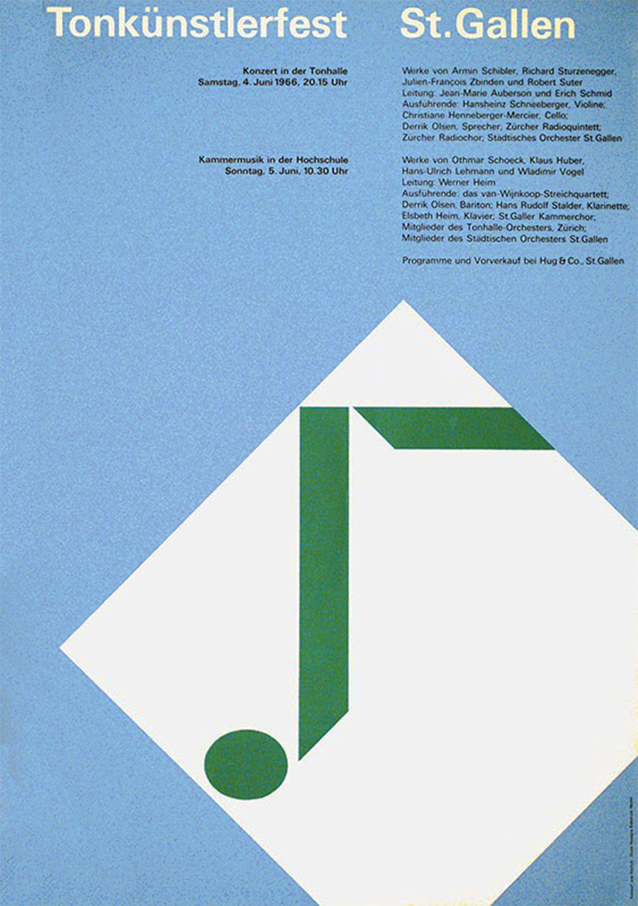
Tonkünstlerfest St. Gallen
Poster, c.128×90 cm
1966
St. Gallen und seine Landschaft
Book, 24×17.5 cm
1967
Design of the book “St. Gallen and his Territory.”
Walter Käch
Poster, c.128×90 cm
1973
Designed for the exhibition “Walter Käch: Schriftgrafiker und Lehrer,” type designer and educator, held at the Kunstgewerbemuseum Zürich.
Jan Tschichold 1902-1974
Catalog
1976
Published by the Kunstgewerbemuseum Zürich.
Alstadt St. Gallen
Book, 24×17.5 cm
1978
Rudolf Hostettler
Poster, 42×59 cm open
1981
Designed in memory of Rudolf Hostettler, cut in beechwood
Kostbarkeiten St. Gallen
Book Series, 24×17.5 cm
1983-87
“Tresures of St. Gallen,” published by VGS.
Ortsbilder und Bauten
Book, 24×17.5 cm
1984
“Townscapes and Buildings,” published by VGS.
Martha Cunz
Flyer, 21×15 cm
1993
A similar graphics with colored letters was used for the poster promoting the same exhibition.
Mein St. Gallen
Book, 24×15 cm
1994
Links & Docs
Articles
Index Grafik Jost Hochuli
Modular 4KC Design Friday
Print Sixty Years of Book Design
Interviews
St. Galler Tagblatt PDF
Profiles
Luc Devroye Jost Hochuli
Wikipedia Jost Hochuli
Projects
ABC Litera Type Foundry
Page-Spread Printed Matter
Slanted Das ABC eines Typografen
Thinking Form Jost Hochuli
Thinking Form Rudolf Hostettler & Jost Hochuli
Tumblr Jost Hochuli
VGS-SG Das ABC eines Typografen
Videos
Roland Stieger Jost Hochuli (Part 1)
Roland Stieger Jost Hochuli (Part 2)
Roland Stieger Das Detail in Typografie (Part 1)
Roland Stieger Das Detail in Typografie (Part 2)
Slanted Tour de Suisse
T.U.D. Music Jost Hochuli im Gespräch
TO THE TOP ↑
Comments
If you wish to add a comment please feel free to write at
info@designculture.it
TO THE TOP ↑
Follow on Facebook
Partnerships

Archivio Grafica Italiana is the first digital resource to the Italian graphic design heritage. Founded by Nicola Munari in 2015.

Design consultancy based in Piacenza, Italy. Founded by Nicola Munari in 2015, it operates in the whole field of design.
TO THE TOP ↑
© 2013-16 Nicola-Matteo Munari. All rights reserved.


