Rolf Muller
Dortmund, Germany, 1940 – Munich, Germany, 2015
Who’s Who
Rolf Müller was a leading German graphic designer.
In 1960 he enrolled at the HfG Ulm School of Design (Hochschule für Gestaltung) where he studied for three years under Otl Aicher. He completed his training with a one-year experience working at the Atelier Müller-Brockmann in Zurich.
In 1964, at the age of 24, he opened his first studio in Ulm and focused on corporate design projects. From 1967 to 1972 he was involved by Aicher in the design of the wonderful coordinated identity program for the Munich 1972 Olympic Games, that immediately became an international standard in corporate identity and sign system design.
He played a major role in the project acting as the Deputy Chief of Design and working on the whole identity: typography, colors, layout, brochures, posters, maps, merchandise, signage, and pictograms. Aicher asked Müller to sign an agreement that granted to him the full and sole credit, but “Müller’s distinctive signature is unmistakable. Without his incorruptible eye, his feeling for color, and his poetic longing to making surfaces merge into spaces, this vibrant design program would never have been created,” as Peter von Kornatzki wrote.
While working on this major project he moved his office in Munich, where he worked until he passed in 2015. During his fifty years long career he designed many beautiful posters, such as the 1972 Kieler Woche official poster. From 1985 to 1988 he acted as the founder and editor-in-chief of HQ (High Quality), an international magazine to promote the quality of graphic design and printing.
Member of AGI (Alliance Graphique Internationale) since 1976. He has been member of its board for eight years, President from 1991 to 1993, and organized the AGI Congress twice, in 1980 and 1989. He was awarded several prizes including the Gold Medal from the ADC (Art Directors Club) in 1989, and the German Prize for Communication Design in 1993. He gave lectures and seminars in Austria, Canada, Germany, United Kingdom, and the Unites States of America.
Enjoy your reading,
 Portrait: Courtesy of Andreas Bohnenstengel.
TO THE TOP ↑
Quotations
“A number of my staff who made fundamental contributions deserve to be named. […] Rolf Müller assisted at the Olympic Games with an admirable aesthetic discipline,” Otl Aicher.
“I had just turned 27 when Otl Aicher came into my office and asked if I wanted to go to Munich with him. There might be a large order in it: the visual identity for the Olympic Games. […] There was an agreement between Otl Aicher and myself to the effect that I conceded the full and sole credit for the visual identity of the 1972 Olympic Games in Munich to him, making him the sole originator of the entire visual identity, which is unfortunately how it is presented today.”
“Making a mark is the most elementary and historically rooted field of activity of the designer. […] The creative achievement consists in reducing the draft so far that the design becomes distinctive and remains in the memory.”
“Order, clarity, and recognizability are always in the focus.”
“Visual systems have to function equally well in different media and formats, and therefore require standardization.”
TO THE TOP ↑
Q&A
Published Jun 23, 2014
Recorded Jan 20, 2014
What was your favorite game, when you were a child?
To be always curious.
What job were you dreaming of for your future when you were a child?
I was born in Germany during and amidst the Second World War. I dreamt of a future without war and without rubble.
What was your educational path?
Normal: high school. Unnormal and more or less by accident: studying at the Ulm School of Design, interrupted for one year by working in Josef Müller-Brockmann’s office in Zurich.
What was your favorite subject at school?
Everything outside school.
When and how did your career start?
I don’t know. It just happened.
How your design has evolved since that time?
Straight.
A book that was important for you as a designer?
The “Tractatus Logico-Philsophicus” (1921) by Ludwig Wittgentstein, and the booklet “Programme entwerfen” (Niggli AG, 1963) by Karl Gerstner.
What kind of projects do you prefer to work on?
Projects which I can discuss with the client before I start thinking and designing.
A project you would like to design.
A better world.
A designer whose work you admire.
Josef Müller-Brockmann and Paul Rand.
 The façade of Carré d’Art by Norman Foster, Nimes, France (photos.creafrance.org).
A piece of architecture.
Carrè d’Art in Nimes, France designed by Norman Foster in 1993.
A piece of design.
A pebble of marble, perfectly rounded in thousands of years.
A typeface.
Akzidenz-Grotesk and Walbaum.
How do you approach the design of a new project?
With curiosity.
Without considering technology, what are the differences between the design from the past and the current one?
In the past it seemed to be easier to have one’s own ‘handschrift,’ to be authentic.
Has the way people perceive the design changed?
It had been for me a matter of attitude. Nowadays it seems to be a fashion.
What would you recommend to a young designer?
Not to become a designer.
Why? And what kind of job would you suggest?
Not to become a designer means not to to participate in producing information waste or trash. Almost 99% of all the worldwide verbal and visual communication have no reason to be done, are not necessary. That’s why my suggestion is to choose any profession which serves mostly sustainability. Or, and that’s the alternative, to become an artist, in order to create unique pieces of culture.
What job would you have done, if you had not become a designer?
A bee keeper.
Thank you very much.
Thank you.
 © 2014-16 Rolf Müller, Nicola-Matteo Munari. All rights reserved.
TO THE TOP ↑
Portfolio
Der Damm
Poster, 84×59.5 cm
1964
Previously unseen on the internet.
Karl Gerstner Opjekte
Poster, 81×59.5 cm
1965
Designed for the (Op)Art Galerie, Eissingen. Previously unseen on the internet.
Munich 1972 Olympic Games
Runner Pictogram
1967
“The runner, the first pictogram of all, comes from me—including the grid.” This image is unseen on the internet.
Münchner Philharmoniker Jubiläumskonzert
Poster, 119×84 cm
1968
Designed for the 75th Anniversary Concert of the Munich Philharmonic Orchestra. Previously unseen on the internet.
2nd Philarmonisches Konzert
Poster, 119×84 cm
1968
2nd Concert from the Munich Philharmonic Orchestra. Previously unseen on the internet.
Bulletin, n.3
Brochure, square format
1967-70
“Official Report on the XXth Olympiad, issued by the Organizing Committee for the Games of the XXth Olympiad Munich 1972.”
Art Direction by Otl Aicher.
Münchner Volkshochschule
Poster, 119×84 cm
1970
A beautiful poster featuring a rhythmic layout. The text reads: “Know what you need, become what you want, at the Munich University.”
Die verorgene Vernunft
Exhibition Poster, 119×84 cm
1971
“The Hidden Reason. Functional Design in the 19th Century.” Exhibition poster designed for Die Neue Sammlung, Munich.
Die verorgene Vernunft
Exhibition Catalog, 19.5×21.5 cm
1971
“The Hidden Reason. Functional Design in the 19th Century.” Published by the Kunstgewerbemuseum Zürich (Museum of Applied Arts).
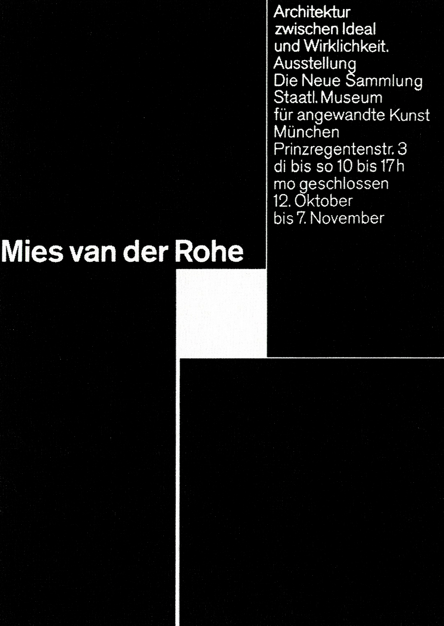
Mies van der Rohe
Poster, 84×59.5 cm
1971
“Architecture between Ideal and Reality.” Exhibition poster for Die Neue Sammlung, Munich. Previously unseen on the internet.
Olympische Sommer
Brochure
1971
“The booklets on the cultural program were published in 16 to 20 language versions in the run-up to the Olympic Games. I had to find a practicable system to get that done. The solution was a pre-printed blank with four special colors in huge quantities, into which the different texxts were then subsequently printed.” Art Direction by Otl Aicher.
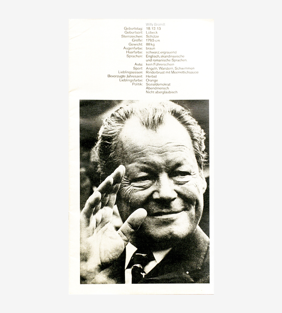
Willy Brandt
Brochure, 39.7×21 cm
1971
“To present Willy Brandt to the public we designed, wrote, and compiled the brochure about him.” Detail of the cover. Previously unseen on the internet.
Kieler Woche
Poster, 119×84 cm
1972
An outstanding poster designed for Kieler Woche (Kiel Week), the largest sailing event in the world. The posters designed for the event constitute an internationally known case-history in graphic design.
Derag AG
Trademark
1973
Designed for the Deutsche Realbesitz AG (German Real Estate). Previously unseen on the internet.
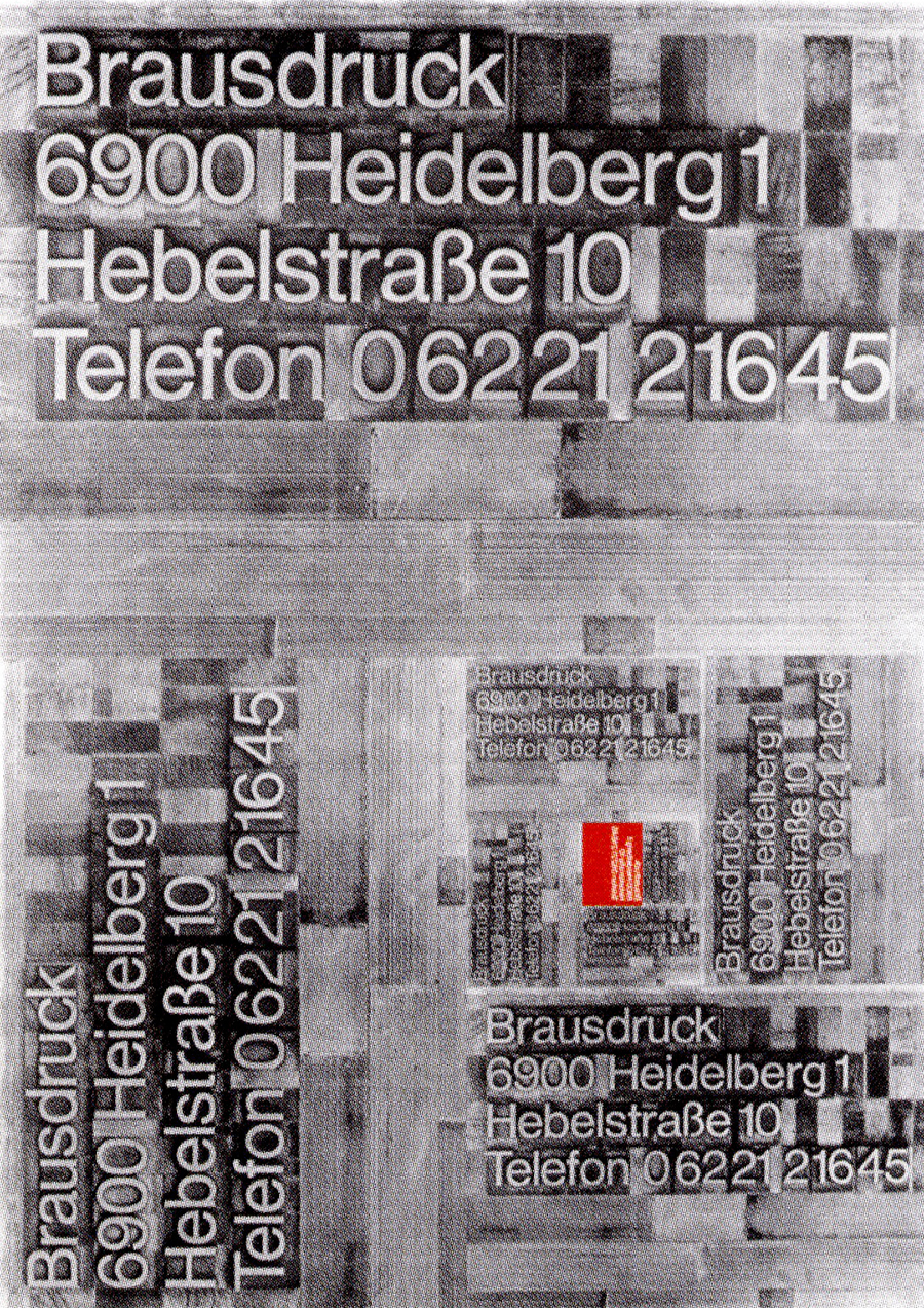
Brausdruck
Poster, 84×59.5 cm
1974
One from a series of posters designed for a printed. “The posters were created at the premises of the printer and publisher Günter Braus. We took the DIN proportions and the DIN spiral, and made them into a symbol.”
Hoschule der Bunderswehr München
Book, 28×29.7 cm
1975
Designed for the German Army University of Munich. Previously unseen on the internet.
Nomina
Logotype
1982
Previously unseen on the internet.
HQ, n.10
Magazine, 29.7×21 cm
1988
“I wanted to do something that could act as a mediator between good printing and good design. There had to be a magazine. […] I then wondered what the magazine should look like. I rapidly arrived at the structure which stayed the same right up to the last issue. I would pick a topic and introduce three designers in each issue. […] The structure was clear,” Rolf Müller. Previously unseen on the internet.
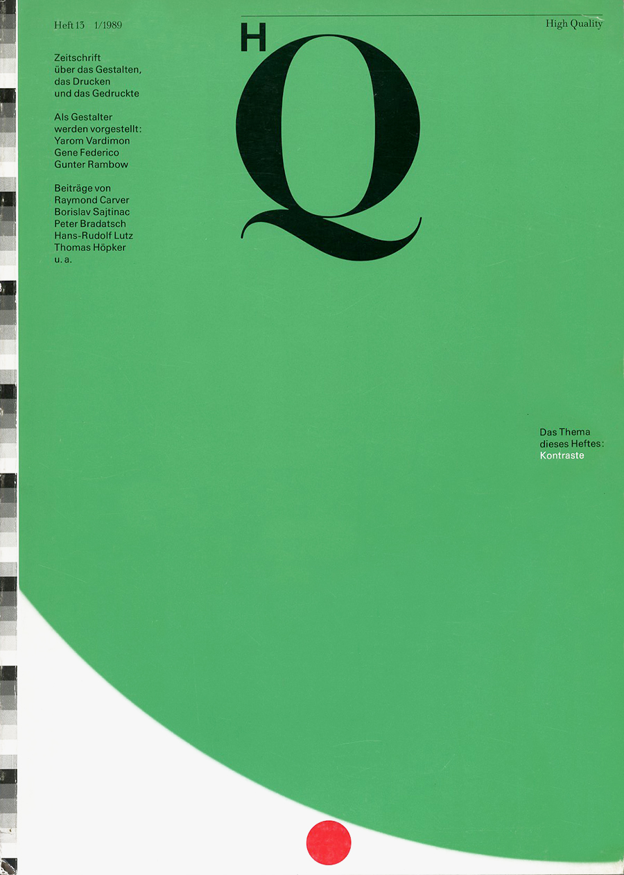
HQ, n.13
Magazine, 29.7×21 cm
1989
The text reads: “Magazine about design, printing, and reproduction.” Previously unseen on the internet.
Links & Docs
Articles
Creative Review Munich 72+
Lars Müller Publishers A5/07 Rolf Müller
Phaidon Kieler Woche
Interviews
A5 Design Rolf Müller
Profiles
AGI Rolf Müller
Wikipedia Rolf Müller
TO THE TOP ↑
Comments
If you wish to add a comment please feel free to write at
info@designculture.it
TO THE TOP ↑
Follow on Facebook
Partnerships

Archivio Grafica Italiana is the first digital resource to the Italian graphic design heritage. Founded by Nicola Munari in 2015.

Design consultancy based in Piacenza, Italy. Founded by Nicola Munari in 2015, it operates in the whole field of design.
TO THE TOP ↑
© 2013-16 Nicola-Matteo Munari. All rights reserved.

 The façade of Carré d’Art by Norman Foster, Nimes, France (photos.creafrance.org).


