AG Fronzoni
San Mommè, Italy, 1923 – Milan, Italy, 2002
Who’s Who
Published May 5, 2014
Revised Jan 10, 2018
Angiolo Giuseppe Fronzoni — who called himself Angelo instead of Angiolo and later just used the acronym AG as his first name — was an internationally acclaimed Italian designer and architect, and the undisputed master of minimalist design in both the fields of graphics and furniture.
He started working in 1945 in Brescia, Lombardy. Two years later he started an art and literary magazine titled Punta.
In 1956 he moved to Milan where opened a new studio. During 1960s, he designed the famous Serie 64 — a furniture collection that was originally designed for schools and hospitals — made of square metal tubes and laminated wood.
From 1965 to 1967, he worked together with Italian editor and architect Alessandro Mendini at Casabella magazine, taking charge of the magazine’s art direction for which he designed beautiful covers and an extremely rational layout.
In 1969 he designed the posters for the International Festivals of Film, Theatre, and Contemporary Music of the Venice Biennale and also curated the Biennale’s Exhibition of Art Posters.
He devoted himself a lot to teaching. From 1967 to 1969, he taught at Umanitaria School in Milan and designed the school’s bulletin titled ‘U’, that was characterised by a very small headline set in 8 pts uppercase Haas Helvetica (so to have a letter without serifs).
After that, he taught at ISA Monza (State Institute of Art) from 1968 to 1988, the ISIA Urbino (Higher Institute for Artistic Industries) in 1976-77, Milan’s Institute of Visual Communication in 1978-79, and finally at his own school-atelier from 1982-84 to 2001.
His teaching experience deeply influenced many contemporary designers, including internationally renowned Italian architect Claudio Silvestrin.
His work has been exhibited both in Italy and abroad, and many of his posters are part of the MoMA’s and other major museums’s collections, including the Musée des Arts Decoratifs of Paris, Kunstgewerbemuseum of Zurich, Musée Cantonal des Beaux Arts of Lausanne, Stedelijk Museum of Amsterdam, and Royal Ontario Museum of Toronto.
Fronzoni pushed the search for the essential to the limits, but never settled on pure functionality. On the contrary, his minimalism is rich of expression and meaning. His work is an extraordinary example of ‘aesthetic intelligence’, representing a milestone in the history of design.
Enjoy your reading,
 TO THE TOP ↑
In praise of the essential
Extract from an untitled text by AG Fronzoni
Freely translated by Nicola-Matteo Munari
 The original text set by Fronzoni. Previously unseen on the internet.
I think that typography — which is the main field of my activity as a designer — is one of the best examples to show that signs can express many meanings, as long as the signs themselves are as simple as possible.
Michelangelo wrote that sculpture emerges by removing the material and I think that is also true for typography. The more you subtract — the more you ‘strip the flesh’ from the signs — the more you can express meanings.
I give to empty space a communication purpose which is based on its relation with the full space. So the space itself plays a fundamental part in typography.
Empty space does not mean emptiness of information. On the contrary, it is an expressive element and I consider it as important as the full space. And sometimes even more, for example when it represents a pause, an interruption, or time to reflect.
Text has a fundamental role within space, which is independent from its reading purpose. Text fills the empty space. The full space represented by text is the counterpart of the empty space.
Typography is very rich from an expressive point of view. It gives designers endless possibilities and that still surprises me. It can be very strong, or dynamic. Typography is truly a world full of expression.
And if typography is black on white — the white of the paper and the black of the ink — the relation itself between this two colours shows the nature of typography, which is to communicate in an essential way.
I didn’t design many coloured works. I used colour only when I thought it was functional to the message. Anyway don’t you think that black and white are the colours of imagination? The colours of the world made of ideal images?
However, this synthesis (black and white) is not a representation of something else. It is not a simulation of something that doesn’t exist, but a new and unexpected reality.
Anyway, colours can never reproduce reality. While white and black suggests the edge of our perception. In the beginning, lightness. In the end, darkness. It is the synthesis of communication and also the synthesis of our life’s journey.
White and black, outside and inside, within and beyond, private and public, full and empty, noise and silence, pause and continuity, rhythmic and arrhythmic.
Black and white are an attitude to reduction, pushed down to zero. Less is more.
A G Fronzoni
TO THE TOP ↑
Quotations
“A message, whatever it is, should be sincere, appropriate, and essential.”
“Colour is distraction.”
“Culture is the highest expression of a human being.”
“Designing is not just a profession but a way to live.”
“Designing the page of a book is like planning a city.”
“Form is beauty.”
“Form is extremely important. I think it exists to express the thought and it must be structured with geometry.”
“I detest anything that is superfluous, redundant, surplus to requirements. Anything that is wasteful, not just in terms of material, effort, and technology but also morally and ethically wasteful.”
“I had always been fascinated by Japanese simplicity, paring everything right down to produce clutter-free, purely architectural environments where space exactly matches living requirements.”
“In an ideal society everyone should be able to design.”
“I think it is up to each of us to bring culture not where it already exists but to where there is a lack of it.”
“The deepest meaning of design is to build ourselves.”
“The difference between two-dimensional and three-dimensional design is only a question of scale, which means that everything can be designed.”
“The purpose of design is to shape the human environment and by extension the man itself.”
“To design anything you always need a methodological approach.”
“To design one’s own life should be everyone’s most important commitment.”
“We must use form or color only when they are necessary to the comprehension.”
“We need to aim at essential things, removing every redundant effect, every useless flowering. Elaborating a concept on mathematical bases, on fundamental ideas, on elementary structures. We strongly need to avoid waste and excess.”
“Without culture, design does not exist.”
N.B.
There are many sources wrongly reporting that “who don’t design accept to be designed” is one of the most famous aphorisms by Fronzoni. Although he repeated that phrase, actually it is an aphorism by Italian art historian Giulio Carlo Argan.
TO THE TOP ↑
Portfolio
Quadra
Wall lamp
1962
An essential object, a suprematist square that takes the place of traditional paintings. Manufactured by Viabizzuno.
MoreschiMark
1963
An early mark by Fronzoni retaining a figurative connotation. Designed for a shoes manufacturing company, that today is internationally renowned.
Source:
Archivio Grafica Italiana.
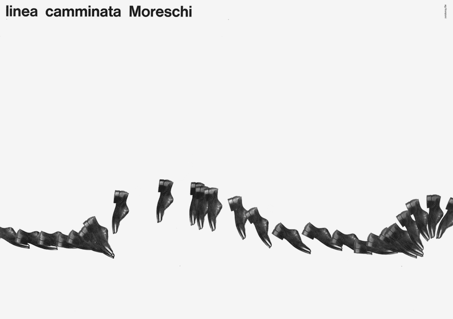
Linea camminata MoreschiAdvertisement
1964
A beautiful advertisement titled “Moreschi walking line” that suggests the movement of walking with great elegance and dynamism.
Source:
Archivio Grafica Italiana.
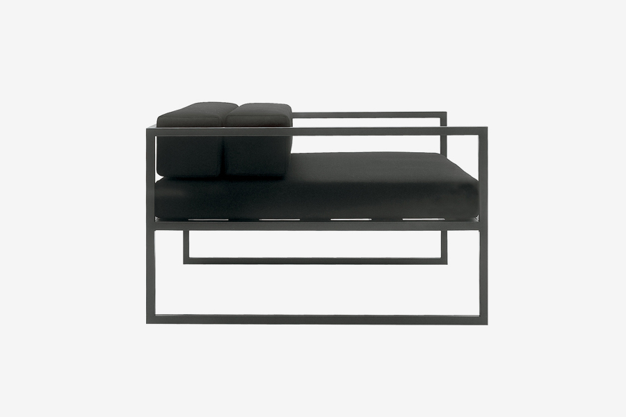
Serie 64
Furniture series
1964
The furniture pieces that more than any other ever possess the austerity and accuracy of absolute geometry. They are the form itself of timelessness. Originally manufactured by Galli. Today is manufactured by Cappellini.
Nizzoli Associati
Mark
1965
Mark for a firm called Nizzoli Associati. Fronzoni used geometric primitives producing a wonderful play of full and empty spaces to suggest the initials of the firm’s name.
FontanaPoster, 100×70 cm
1966
The most famous poster by Fronzoni. It’s the very implementation of Lucio Fontana’s art in typography. Designed for an exhibition at Galleria La Polena, Genoa. A masterpiece.
Source:
Archivio Grafica Italiana.
Museo Sperimentale d’Arte Contemporanea
Poster, 88×60 cm
1967
A basic modular grid made by six squares. Two columns and three rows. A white triangle, a black square, and a circle. The same layout was used by Fronzoni for the catalogue of the exhibition at GAM (Modern Art Gallery), Turin.
Situation Mailand
Poster, 70×50 cm
1967
Poster for an art show at Galerie Senatore, Stuttgart where were exhibited works by Bruno Munari, Emilio Isgrò, Enzo Mari, Lucio Fontana, and others. Fronzoni designed a truly typographical grid where each module is made of a letter.
Sonia Delaunay
Poster, 65.5×47.5 cm
1968
An essential but very dynamic poster thanks to the inclination and the visual confluence of the two black curves, which somehow recall Sonia Delaunay’s initials. A great example of ‘Gestaltung’.
Istituto Statale d’Arte
Poster, 100×70 cm
1969
A group of three lines on a flat surface, repeated twice. One group using a thin stroke and the other a thick one. And the space magically becomes three-dimensional. Wonderful. Designed for the State Institute of Art, Monza.
Serie 70
Armchair
1970
An armchair in the tradition of Luigi Caccia Dominioni’s Catilina chair. The structure is made of a metal sheet. An open cylinder forms both the back and the legs — that here are a single piece — and a circle forms the seat. Again, Fronzoni used the absolute shapes of geometry thus producing an essential and timeless object. Manufactured by Henry Timi.
Rotonda della BesanaPoster, 95.5×67.5 cm
1970
Fronzoni uses the architecture of the architecture itself, thus allowing the structure of the building to build the structure of the poster. Photo by Gianni Berengo Gardin.
Source:
Archivio Grafica Italiana.
Tool. Ricerche interlinguistiche
Poster, 68.5×48 cm
1971
A poster about inter-linguistic research that is an inter-linguistic research itself.
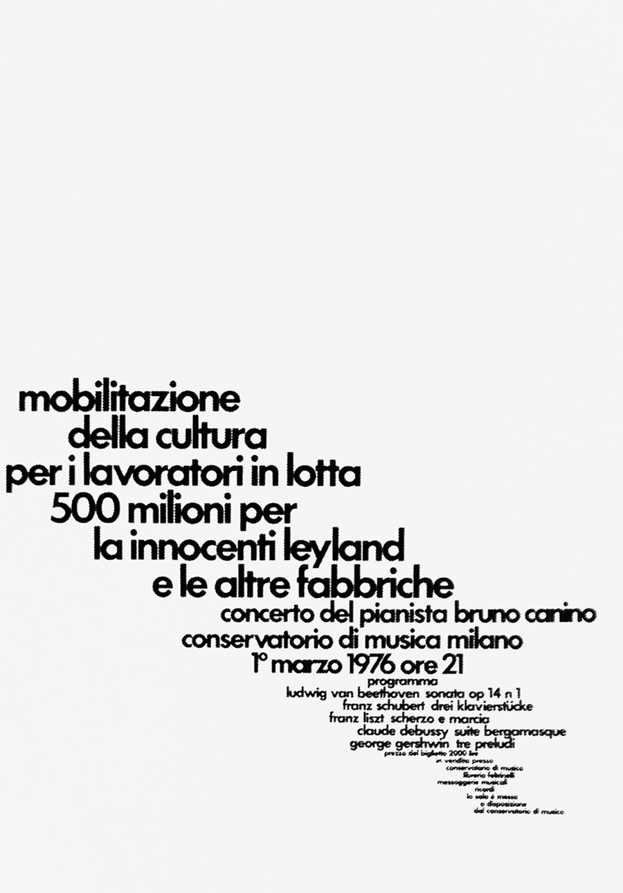
Mobilitazione della cultura
Poster, 98×68 cm
1979
A poster promoting a cultural event for labourers consisting in a concert by pianist Bruno Canino. At the the same, typography suggests a workers’s march and a musical symphony.
A. Gramsci
Poster, 95×67.5 cm
1979
A poster about Italian politician Antonio Gramsci portrayed by Fronzoni in a synthetic way, using a square-based modular grid. Somehow, Fronzoni anticipated the contemporary tradition of political icons graphic portraits.
Arte e scienzaPoster, 96×68 cm
1979
Poster for an exhibition titled Art and Science (Palazzo Reale, Genoa). The idea of art and science is perfectly represented by the globe made of letters.
Source:
Archivio Grafica Italiana.
Musei d’arte contemporanea in Europa
Poster, 98×68 cm
1979
A simple typographical poster promoting a congress of European Contemporary Art Museums. Thanks to its experimental layout, the poster itself is a piece of contemporary art.
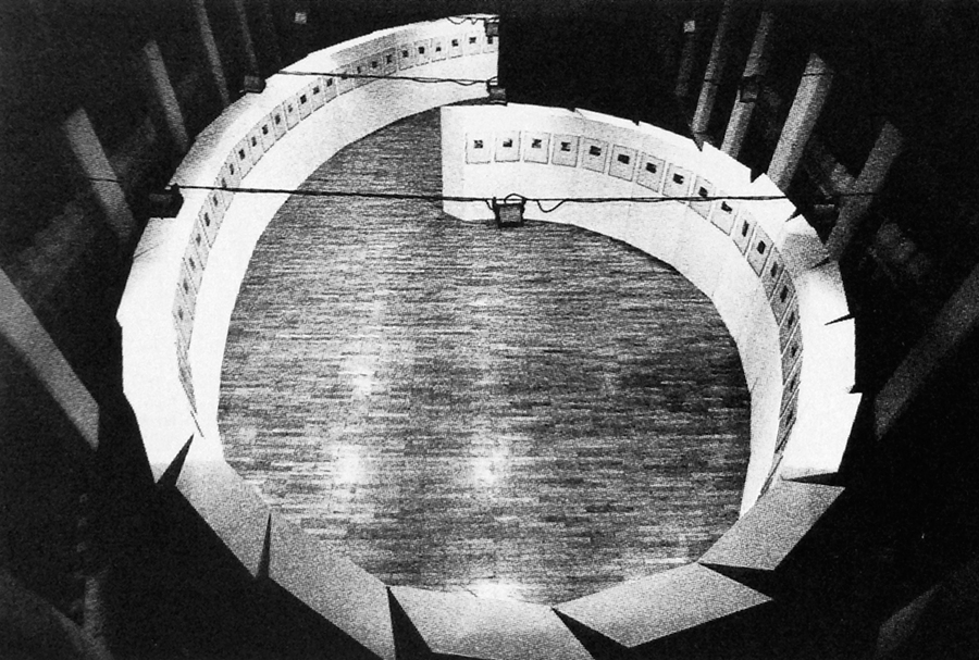
Wols fotografo
Exhibit design
1981
A display system designed by Fronzoni that allows to arrange both straight and curvilinear paths of any shape and length. Here used for an exhibition at Palazzo Reale, Genoa.
La biblioteca nella scuola
Poster, 98×68 cm
1982
A poster promoting school libraries. A sequence of lines, all the same thickness, all the same distance from one another, suggesting a series of book spines and leaves.
Links & Docs
Articles & Essays
Alessandro Mendini Colorare AG Fronzoni
Andrea Guccini Il progetto dell’essenziale
Ester Manitto A lezione con AG Fronzoni
Florencia Costa A life in design
Luca Morosi Design tra Oriente e Occidente
Roberta Sironi Gli spazi di AG Fronzoni
AG Fronzoni Exhibition catalogue (Villeurbanne, 1986)
Profiles & Archives
Aiap CDPG
AG Fronzoni Website
eMuseum Collection
Facebook AG Fronzoni Group
Museo del Marchio Italiano Marks by Fronzoni
Thinking Form AG Fronzoni
MoMA Collection
Tumblr AG Fronzoni
Audio
C-R-U-D April 11, 1999
TO THE TOP ↑
Comments
If you wish to add a comment please feel free to write at
info@designculture.it
TO THE TOP ↑
Follow on Facebook
Partnerships

Archivio Grafica Italiana is the first digital resource to the Italian graphic design heritage. Founded by Nicola Munari in 2015.

Design consultancy based in Piacenza, Italy. Founded by Nicola Munari in 2015, it operates in the whole field of design.
TO THE TOP ↑
© 2013-18 Nicola-Matteo Munari. All rights reserved.

 The original text set by Fronzoni. Previously unseen on the internet.


