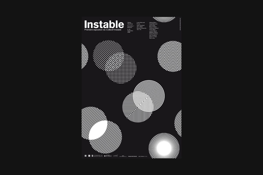
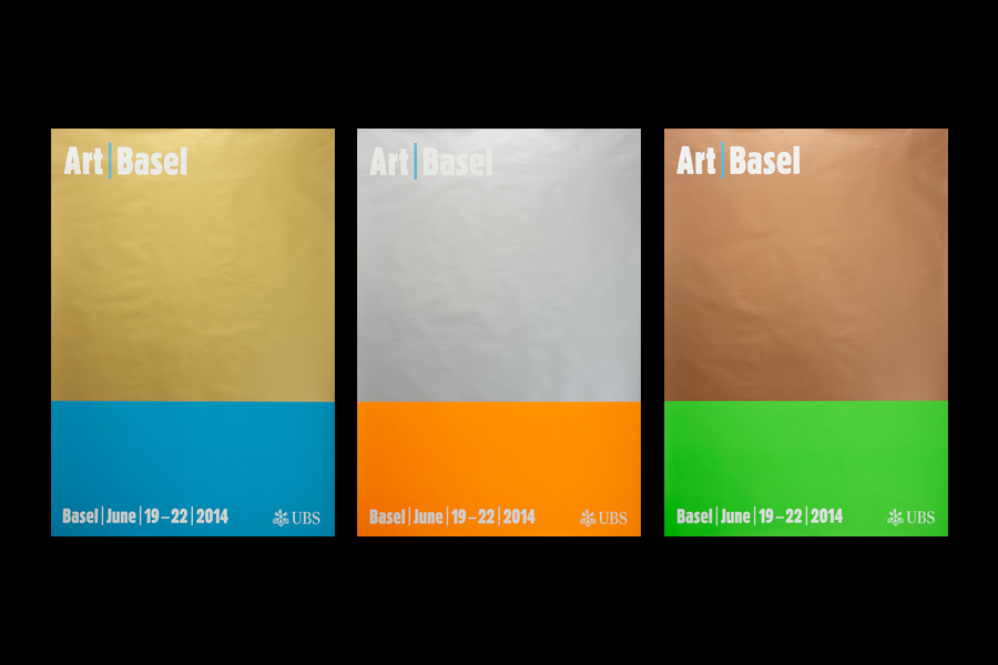
Demian Conrad is a Swiss graphic designer and art director whose work ranges from visual arts to visual communication.
One of the most interesting graphic design professionals working today, his work blends formal simplicity with complexity of meaning, condensing cultural richness and essential aesthetics with great intelligence and through a sophisticated sensitivity.
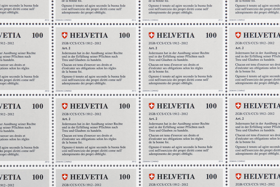
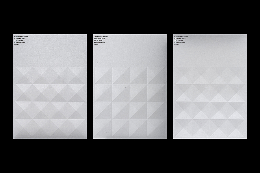
An author of books on design, Conrad also dedicates himself to creative direction of cultural institutions and firms, such as the Center for Future Publishing (2017-23) and DADADUM. Furthermore, he is known for having invented a printing process named Water Random Offset Printer (WROP), that allows him to intervene with the industrial printing process to create random effects.
From 1993 to 1997 he studied at the University of Applied Sciences and Arts of Southern Switzerland (SUPSI) in Lugano, becoming the pupil of graphic designer Bruno Monguzzi and artist Reto Rigassi, eventually graduating in Visual Communication. Later, he also studied Lateral Thinking with Edward De Bono at the University of Malta.
In 2003 he moved to Lausanne where in 2007 he founded the Demian Conrad Design Studio. In 2013 he also founded DADADUM furniture collection that, under his creative direction, won several awards including the European Design Award.
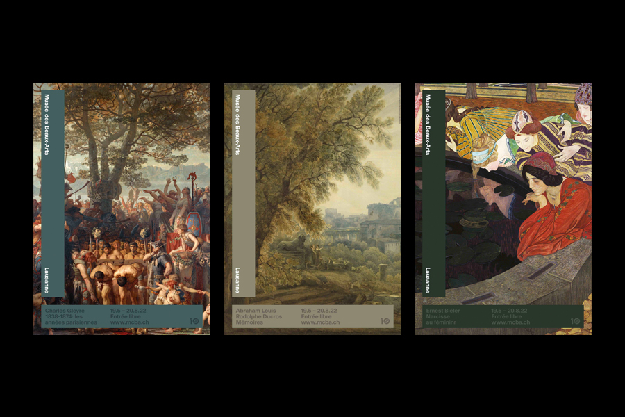
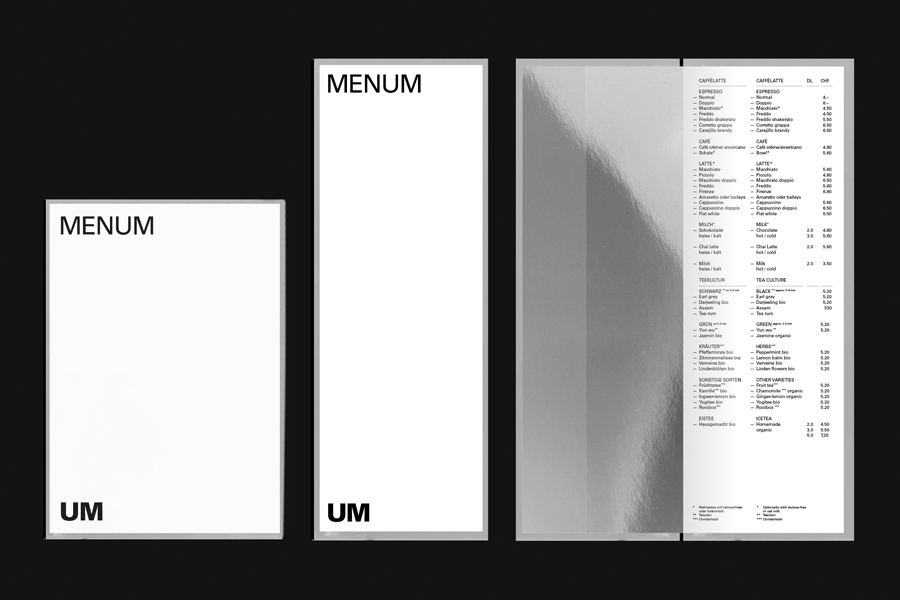
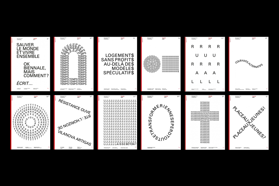
His work focuses on adopting a typographic minimalist approach to creative coding, editorial design, visual identity, wayfinding and exhibition design for the fields of architecture, product design, modern and contemporary art.
From 2014 to 2023 he taught editorial design and was a researcher at the Haute École d’Art et Design (HEAD) in Geneva, where in 2017 he also co-founded the Center for Future Publishing, becoming its creative director.
His work received numerous international recognitions including the Silver Cube Prize by the Art Directors Club (ADC), TDC Tokyo for Packaging, 100 Beste Plakate and the European Design Awards 2013 Gold Prize.
In 2017 he renamed his atelier Automatico Studio and became a member of the Alliance Graphique Internationale (AGI).
His work can be found in important museum collections, including the Museum für Gestaltung in Zurich, the Musée de Design et d’Arts Appliqués Contemporains in Lausanne, the National Library in Bern, and the Cantonal Library of Canton Vaud.
Enjoy your reading,
 TO THE TOP ↑
What job did you want to do when you were a child?
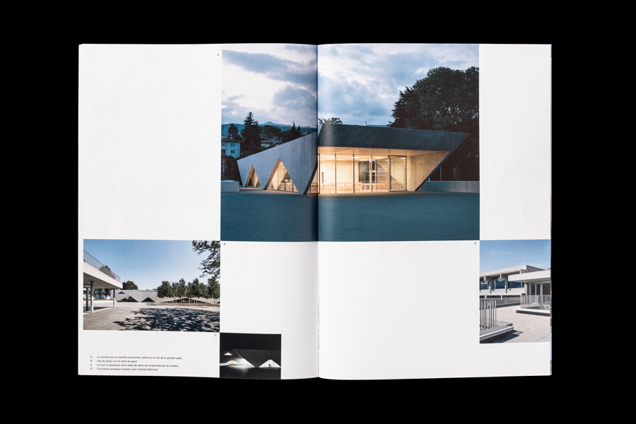
My first dream job was to become an architect. I build up my first projects with Lego, and after some time, getting better, I passed to cardboard maquettes. I liked to build up spaces and structures and think about how a human could move and enjoy a unique space. Today I still admire architecture and I spend a lot of time studying it and visiting great places. This knowledge provides me an advantage in helping my clients architects, because I can understand them, in all aspects of the job, and I can find the more appropriate and successful solutions to their problems. So you see, passion can grow in different ways and even if I am a graphic designer, working for architecture makes me extremely happy.
Where did your interest in graphic design originate from?
Probably the first impression on graphic design came from skate magazines. I used to skate a lot and this urban visual culture was so fresh and new. The feeling of breaking the rules was so creative. I was seeking a feeling of freedom. At that time I used to collect Transworld Skateboarding magazines designed by David Carson. My first attempt in graphic design was in fashion and skate deck design. I used to hack my karate kimono pants adding slogans with spray stencil typography. Those pants were unique, creative and really comfortable to do any crazy maneuvers. Later, when I started school, my teachers introduced me to designers such Emil Ruder and Bruno Munari. Those figures opened my eyes to another world, of kindness, sensitivity, essentiality and elegance.
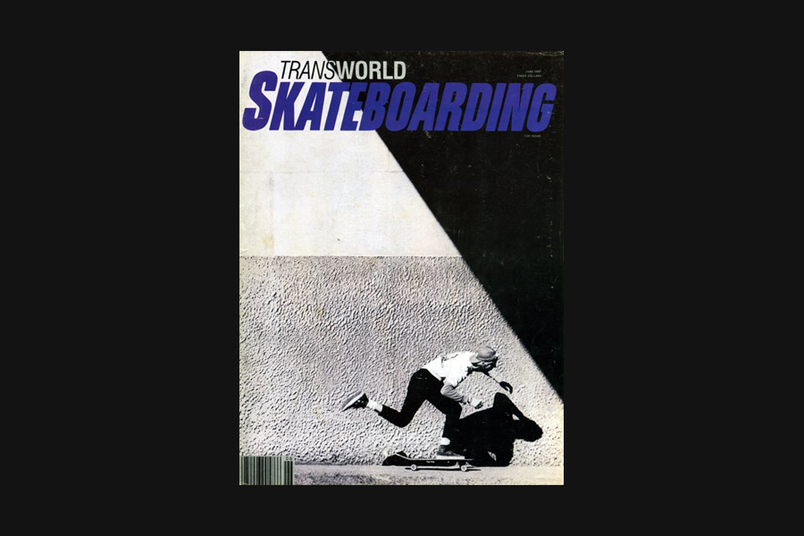 Transworld Skateboarding, June 1987. Designed by David Carson.
When and why did you choose to become a graphic designer?
Transworld Skateboarding, June 1987. Designed by David Carson.
When and why did you choose to become a graphic designer?
For me it was obvious that graphic design was my way. I was at ease to work with type and to write text. Actually when I was child I had a great skill of writing creative stories and I was the best of my class. But the turning point was in 1984, when in my house entered a Macintosh 512k. Can you imagine it? We were among the first early adopters, globally, to own this machine. It was really something magic to be able to experiment with it. I designed the identity of our Skate association—the Nuts Brigate—in MacPaint. Besides that, our family best friend, Chris Carpi, was also a graphic designer. He was a kind of hyperactive intellectual and he really inspired me to start into this discipline. He designed magazines, logos but also fake stamps, under the discipline of Mail Art. He was so iconoclast and inspiring, especially the stamp with the portrait of the president Thatcher. There was also something political in his design—a kind of Tibor Kalman of Canton Ticino.
What is your definition of design, in general, and that of graphic design, in particular?
I would leave this question to a graphic design historian or theoretician, because definition by its own nature changes in relation to the period and places and is a difficult task to define. I feel right now we are going into such a turmoil of changes with our discipline that it is really difficult to define it. I would say that is a dynamic field at the moment.
What in your opinion are the qualities of good design?
Good design should fix a problem, in opposition with art. I like the distinction that Bruno Munari made in the book ‘Design as Art’. Good design is a blend of functional and aesthetic solutions to reach a specific goal. Either perform well in communicating a story, a content, either help to have a presence in a market, or making money for a business. Good design as a specific and measurable purpose. But at the same time it could also provide something more, a secondary meaning, a double lecture, a commentary, which is what is nice about good design—that is not only about one dimension, but can open debate in many axes. However, the parameters of good design may change depending on the political and economic regime in which we live. That is why, personally, I admire many of the design solutions that we can find in certain periods, like the Japanese Zen Buddhism or the glorious Thirties. When society is healthy, we can care about nice details and nuances. But right now I have the impression we are more in a kind of barbarian situation, with many problems to face, such as ecology or wars. I have the feeling that nowadays, just designing a nice art poster is not right. I feel that enriching the ultra-rich—who are the art collectors or art buyers—is not correct. I see that in my country, Switzerland. The increasing of homeless on the streets of major cities is a social problem that I would address as a responsible and engaged designer. I trust the new generations will change this situations. My students are smart and sensitive and take many issues seriously, like veganism, inclusivity, gender roles, ecology… So I try to provide them with all the resources I know and also my network to help them grow and push our discipline in a good direction.
Do you think of graphic design as a form of art or is it closer to engineering?
That is the famous discussion at the School of Ulm, the confrontation between Otl Aicher and Max Bill. For me we have to move away from it, because at that time the contemporary art market such it is now, did not exist. So probably at that time, it was possible to have some crossing disciplinary but today the two disciplines are so verticalised, so specific and so competitive that you cannot transfer the knowledge so easy from one to another. I mean you can be inspired by art and applied to graphic design, and vice versa, but to be able to do both or change from design to art. That is really difficult and would need a commitement like that of artist Nora Turato, who started as a graphic design student and become an artist. So I think that first, design should fix a problem, and in doing that you must be able to repeat it in a consistent way. So it is more a kind of a rational methodology, close to engineering. I love engineers who can be creative and playful like the swiss Heinz Isler, who was prototyping domes outside in the winter using textile towels and water at minus zero degrees; or Luigi Nervi who built fantastic structures. I think with the spreading of Artificial Intelligence and Creative Coding, we will see more and more graphic designers changing their profession and morphing into new paradigms that we do not even know today. If you know more about statistics you will be able to stay ahead of the machine learning race for instance. If you want to create dynamic and kinetic identities you will be the best if you can also do some Creative Coding. So as you see, the more the world is becoming digital and connected the we need to understand who is manipulating data and how.
Should design produce things that are necessarily useful?
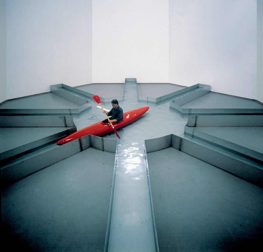
It is clear to me that you enter in the kingdom of art when design is useless. It becomes a piece of art in its own, such as the “Urinoire” of Marcel Duchamp, or the red kayak by Roman Signer. Art can stay away from functionality or utilitarianism, but can inspire and hack your consciousness with its magic processes. Art can be really empowering and inspiring. But with age, I become more and more inclusive and I can accept and appreciate when sometimes design also becomes a bit silly and do not perform exacly as it should suppose to do, maybe it can provide other meanings or atmospheres. Sometimes I need to do some self-initiated projects. I use them as a pharmakos, in order to balance the seriousness of the daily jobs we have to do. So when in a personal project you do as you wish, that is not art, is not a commissioned job, but a free space of experimentation and play without any expectations.
 Roman Signer performing Wasserinstallation at the Bonnefantenmuseum Maastricht, 1999.
(Photo: Peter Cox).
What is the role of beauty in your design?
Beauty is a concept that changes with time, culture and society. Think how the human body has been perceived differently through the centuries. I think we have lost the purpose of beauty in a more general term, just right after Post-Modern time. Beauty is not only polished minimalistic shapes, but is also the attitude of a human being, his or her kindness. Beauty is also the choice you make, not only an aesthetic one but also a moral one. Berliner based philosopher Byung-chul Han in his book ‘Saving Beauty’ says that our vision of beauty lost its roughness! Everything is now smooth like a screen of a smartphone, losing information of physicality and mortality. Beauty is something that has no friction and goes smoothly and fast. This is a big change in society because we used to have another vision of beauty. Now ugliness has become an asset, it creates news, attract audiences, makes buzz, and with its arrogant attitude it takes over a lot of attention. Ugliness paired to scandals and there you have the holy grail of contemporary advertising. Many celebrities are using this new strategy, such as Kanye West and his ex-wife, or Elon Musk to name a few, but it started way long time ago, lets think in fashion brands like Yves Saint-Laurent, posing naked, or saying he was abusing drugs, and other provocations and scandal to get the attention of the media. In order to defend and protect an attitude of benevolence and kindness we really have to leverage ancient wisdom and highly critical thinking. To be kind you need to work on yourself and maybe pursue a spiritual journey. The great architect Luigi Snozzi was preaching the architecture of resistance. This would be the same for me in graphic design—you need to resist in order to defend a classic sense of beauty. And to resist is also part of design.
What is the relation between graphic design and advertising?
Graphic design is a wider discipline, from book to poster, etc. Advertising is a more precise and industrialised niche discipline whose aim is to improve sales and brand presence or awareness. Personally I am not against advertising, if it is done in an ethical way, I can appreciate it and also it can help me make my consumption decision. We must take responsability. At the end we have all subscribed to this consumeristic model. Massimo Vignelli also had this opinion. But I cannot tolerate and accept misleading advertisements or the use or abuse of social pressure in order to push you to buy stuff, especially if you do not need it. For instance, I cannot support these rapper stars appearing all over the social media, just to monopolise the space and then sell goods. Stars such musicians have become human sandwiches and their unique role is to influence and help to sell goods. How poor and boring has become this society! I quote french writer Guy Debord who told us that everything is becoming a spectacle. I have the impression that we waist our most precious asset—time—watching void and uninteresting spectacles on social media. I also see a lot of unethical graphic design. I think that today a contemporary designer should not treat other designers as if there were many social layers—like a higher designer and lower designer. That would mean that you become a snob, or behaving arrogantly. Why should a designer working for a museum be consider of a higher status than a packaging designer? Why should an editorial designer be considered higher than a website designer? I think many designers are still trapped in this bad model of hiding themselves in a kind of elite model of intentions and I do not find it neither democratic nor inclusive. In a good democratic society I want to see every graphic design discipline proud of being done and free to be expressed.
What is your ultimate goal as a designer?
Helping my clients to reach their goals, by sharing the same ideas and purpose. If they can earn good money to sustain their life and create abundance and pleasure for their families and closest ones that is all good and fair. I see myself as a team player and not just as a service provider. But I do not think a designer should change the world or save the planet. That is all mid-century ideology. For me it is enough to give a little contribution and if in doing it you also help the evolution is all good.
What has been the most important book to you as a designer?
The most important book into shaping me becoming a graphic designer was ‘Fantasia’ by Bruno Munari. It is an old book but was revealing the secrets of creativity and opened my mind allowing me to be able to find my own path. Another book that helped me was ‘How to Be a Graphic Designer without Losing Your Soul’ by Adrian Shaughnessy. That was my introduction to the world of self-employment as a graphic designer. It gave me all the necessary tools to cope with this complex task of being a graphic designer. Today, I would say it is the Youtube channel done by Chris Do and his team, the Futur, that is helping the new generation of designers to become independent.
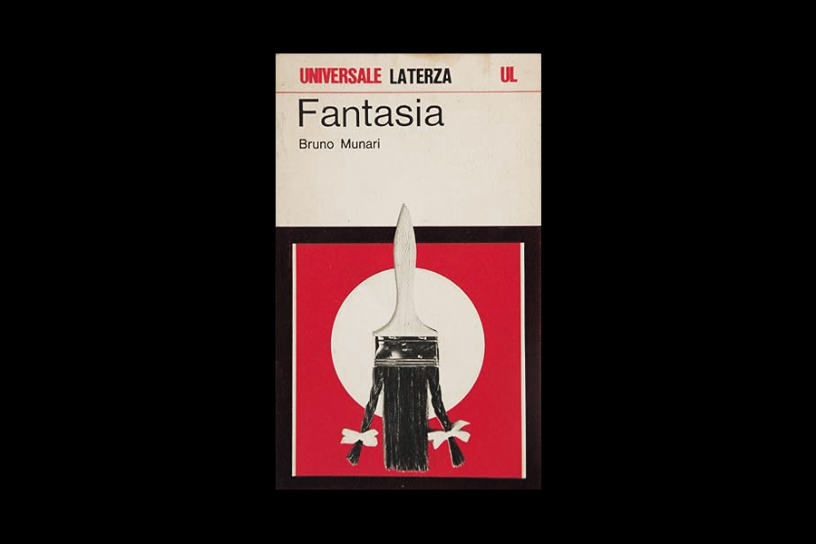 Fantasia by Bruno Munari, Universale Laterza, 1977.
Your favourite graphic design project/s (not designed by yourself) and why.
Fantasia by Bruno Munari, Universale Laterza, 1977.
Your favourite graphic design project/s (not designed by yourself) and why.
It is an impossible choice, I have many favourites and because I have in me a collector soul, it would be painful do only one choice. But I can give you a few projects that I admire, also explaining why I admire them. First, the visual identity for Basler record shop boite à musique, designed by Karl Gerstner. I think this is the first responsive and fluid identity ever done. Here Gerstner changed the rules of the game, from building a visual identity around a static logo and some colors, introducing the idea of a visual system. Boite à musique is set in Akzidenz Grotesk Bold and is set into a box, this one changing depending on the support size and proportions. It anticipated the contemporary way of designing identities and it still is the greatest example of this kind. Of course I think he was influenced by Max Bill variations works, and Gertsner also influenced people like Paul Rand with the IDEO logo. Second, ‘Messages and Means’, a square poster designed by Muriel Cooper for MIT Media Lab. Muriel is a pioneer of digital graphic design, but here she is expanding the use of printing not for merely reproduction work but as a creative tool to enhance the meaning of the content. The poster is printed in an offset press with one colour tower and uses only one plate at the time. The paper has been sent 4 times into the press, changing the colour each step, overprinting Cyan, Magenta, Yellow and Black. In doing so, the paper was turned by 90 degrees at each colour change, resulting in a 4 colour overprinting. In the poster you will notice the crossing of the colors and the emerging of the complementary ones. It is a seminal work about creative printing. Third, the AG Fronzoni’s poster for Lucio Fontana exhibition at Galleria La Polena in Genoa in 1966. It is an minimalistic design but super powerful. This design is deciding everything about your reading experience. You have just to obey. The text is set in Neo-Grotesque uppercase black on white, creating a vertical black line in the middle of the whiteness of the paper. It invites you to start reading from top down and in doing so you explore the important informations of the exhibition—just the name of the artist, the place and date. No frills, no logos or sponsors, only typography reduced to the max. In doing this optical journey, you will discover that the text is splitting in the middle, like sliced by a cutter, obviously re-creating the act of making the art piece of Lucio Fontana.
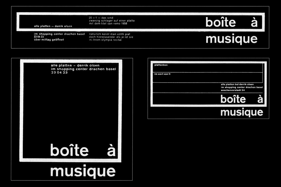 Boite à musique. Identity for a record shop by Karl Gerstner, 1959.
Your favourite typeface/s and why.
Boite à musique. Identity for a record shop by Karl Gerstner, 1959.
Your favourite typeface/s and why.
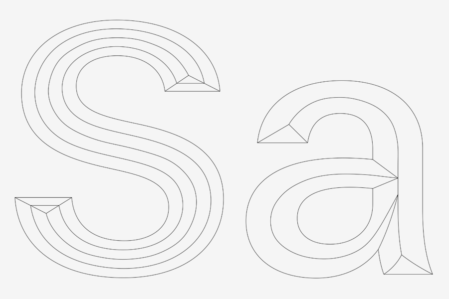
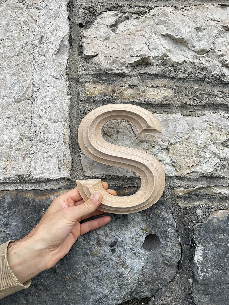
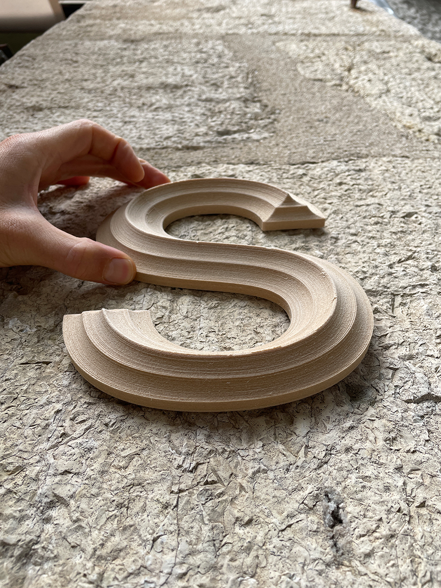
Definitely Univers by Adrian Frutiger! I have been using it for more than five years for the majority of my projects. So far so good, it is a fantastic, adaptable face that can help you to fix so many problems. I love the way Frutiger fixed the legibility for the small size text, better than Max Miedinger’s Helvetica. Univers, with its generous kerning and little optical tricks, like the dot on the ‘i’ slightly bigger, helps you to recognise small text and to read them fluently. Moreover, it is the first systematic font family that has been designed and I cannot stress enough how revolutionary this idea was and how still interesting it is. It conveys a sort of modular approach of design, a kind of intelligence on how to reuse parts of the system to build the whole. I have also designed a new typeface with my collegue Arnaud Chemin. It is a kind of homage to Univers, but we wanted to make a contemporary neo-grotesk for the studio works. The font name is Automatico and it has been designed in two optical sizes—Display and Text. The proportions and kerning spaces have been kept from Frutiger’s original version. We had the chance to study the original drawings of Univers at the Museum für Gestaltung in Zurich, but the shapes and geometries are of Automatico are more our own sensitivity and more geometric. We kepts the humanistic approach that you can find in letters like the uppercase R but we also played with contrast to obtain really geometric letters like the uppercase Q. The font will be for the exclusive use of Automatico Studio’s projects for the next five years.
Your favourite architecture/s and why.
I like so many great buildings and admire so many architects, but recently I’m really into some Swiss engineers. I like when those people pushed themself further than what they should be supposed to do, and get creative. The first one is Heinz Isler, who built more than 1000 shell structures all over Switzerland. Those reinforced concrete structures are self supporting and have a maximum of 10 cm thickness. The design process that he used is really playful and lateral thinking. During winter time, while it was under zero degrees, he took wet blankets and hung them upside down, creating a kind of dome structure generated by gravity. During the night, the textile freezed so that he could later turn it and study the shape of it. Then he took these shapes and made calculations and small scale prototypes to verify the statistics. The structures are pure, elegant and beautiful. There is some utopian and natural ideal behind that I like a lot. A second engineer is the one who built the renowned furniture USM, Fritz Haller. Before doing those he was already into building modular structures. He is known to be part of the Solothurn Architectural Group and he made structures in three sizes—S, M, L. Those modular and sophisticated structures are among the most advanced and complex I have ever experienced. Both engineers were building around my area in Canton Bern, so I had the chance to visit them and study their work.
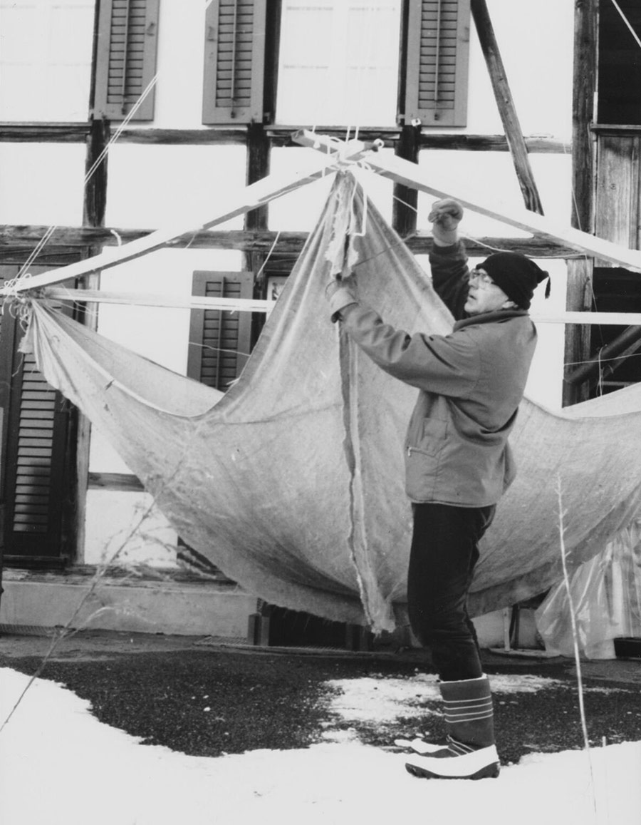 Swiss engineer Heinz Isler (1926-2009) researching shell structure by experimenting with a blanket.
Your favourite design object/s and why.
Swiss engineer Heinz Isler (1926-2009) researching shell structure by experimenting with a blanket.
Your favourite design object/s and why.
My most used object is a little one—a Safary fountain pen designed by Wolfgang Fabian and produced by Lamy. It does not cost so much, but provides me a lot of joy. Especially when you are doodling or sketching, the flow of the ink sliding over the paper makes the process of thinking more fluid and joyful. Even though I also like to think and generate ideas by typing on a keyboard, the flexibility and the multidimensional nature of the pen makes sketching super fast, being able to switch from writing to drawing, from doodling to 3D models.
What are in your opinion the main differences between contemporary graphic design and graphic design from the past?
Today everything has changed so drastically. I’m really a neo-classic in my heart, that is why I love modernism so much. But we have to face the fact that all our graphic design creations are more and more streamed into digital channels instead of being printed, and that is having a tremendous impact in the way we design. I have the impression that one of the most clear problem is the algorithm produced by the GAFAM. Those are celebrating and rewarding design creation that have specific traits and attitudes. For instance I did some tests, in just posting a minimal poster done in vectors all black and white. The traction is almost zero. That is due to the fact that algorithm and neural networks are not trained in microtypography and typography, but more into photography, portraits and spaces. That is why all the big accounts are normally showing a person, like an influencer and not a typeface. That is also why now all the graphic design physical reproductions are shooted on a floor with a nice texture behind, like shadows, because the algorithm can understand better what is happening. Secondly, more complex and colourful is the design and more reward normally you can get. So you see that unfortunately technology, as French philosopher Jacques Ellul saw, is not only changing our social interactions, but also is changing our relation to design and aesthetics.
What positive contribution graphic design can give to contemporary society?
I guess there are many ways to contribute to our society. I personally do it in many ways. First, I help the new generation to understand the complex problems of the contemporary design discipline. Teaching is for me a social commitment. Secondly, I do it with the research. The book ‘Graphic Design in the Post-Digital Age’ is an anticipatory book that has been helping students and practitioners to better understand the current situations and find solutions to their journey. And last but not least, I do work for helping non-profit organisations, like my iconic printing technique WROP (Water Random Offset Printing) that I developed for Blackswan Foundation, an organisation helping research on rare diseases. Collecting money for the war in Ukraine, doing a poster we sold, and many other self-initiated projects we do to help the society to cope with the many problems we are facing. I believe that we can do a lot also in doing a little contribution.
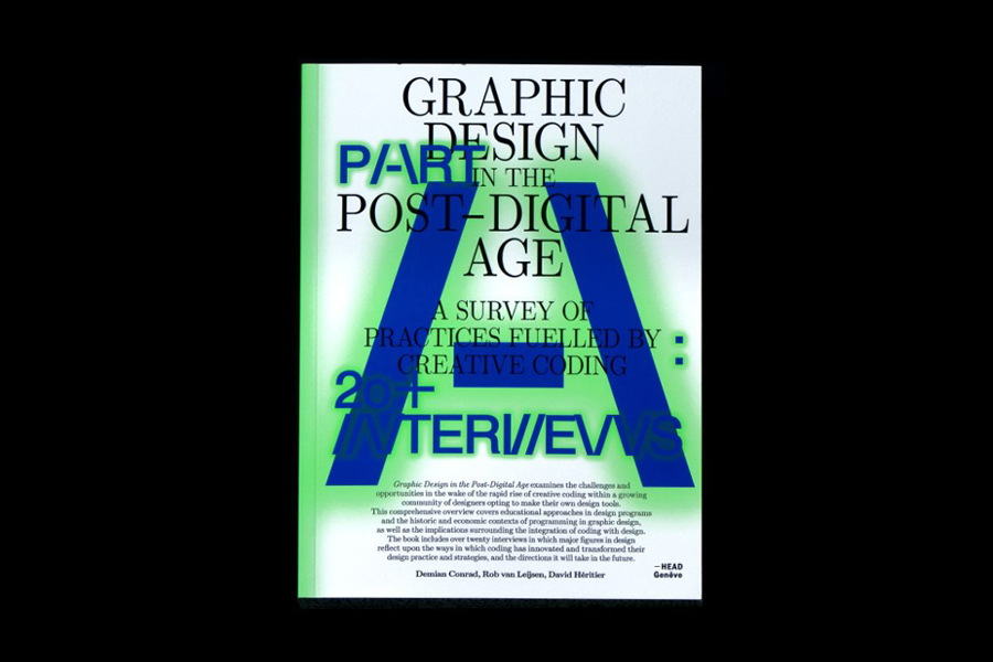 Graphic Design in the Post-Digital Age, Set Margins’, 2023.
What would you suggest to a young graphic designer, who is approaching this profession today?
Graphic Design in the Post-Digital Age, Set Margins’, 2023.
What would you suggest to a young graphic designer, who is approaching this profession today?
I think this is the most interesting moment in decades to enter this sector. You have to imagine that we are at the edge of a huge revolution in technology and also in how we are going to change our perception of the world. We are introducing a new kind of Gutenberg technique but even more powerful, because this time is not only about multiplying the knowledge but also about creating it. The Artificial Intelligence era has just started and nobody has a clue about what is going to bring us. Personally, we have already been working with AI in my research project, the Center for Future Publishing, and in 2017 we did a first publication with the use of Google Vision AI. The project was called ‘Self-Assembling Book’ and we did a kind of black box where you could add an iconography and the software was going to generate a printable pdf of a book. So the sequence was chosen and artifact by AI. The last project we did with AI is my research book ‘Graphic Design in the Post-Digital Age’ where one third of the book was generated by Chat GTP. The book came out two years before the current boom in AI.
What do you think is the future of graphic design?
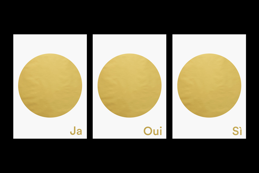
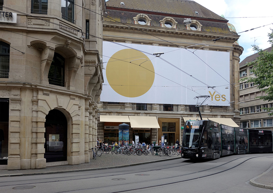
It is really difficult to imagine what is going to happen, because I guess in this period we are facing so many problems that we do not even know if we will be here in ten years time. But concerning my personal feeling, I’m pretty sure that a big chunk of the industry is going to be wiped out by automatisation. That is also the irony of my studio name, Automatico Studio. But, there is a but, the ones who will understand how to leverage AI, they will be able to create unique and innovative design solution. Those will be more powerful and more efficient, either in their factual communication side, or in the more entertaining side. I also think that traditional graphic design will be able to survive of course, either in a niche market or either as a hobby. That because I’m pretty sure that the economical system will have to switch and introduce Basic Income. I designed a poster in 2016 for the referendum vote on the introduction of Basic Income in Switzerland. The campaign failed, at only 27% of votes, but the posters have still selling since. We sell about 2000 per years. This is a positive indicator of that idea has some followers, but this is also a seed that has been planted and will grow to help to change society. I would like to see the possibility for the advanced societies to produce design as just a cultural, or a social artifact that is not only connected to industry but also about our way of growing as a species.
What was your favourite game as a child?
One that I enjoyed a lot was Enzo Mari’s animal puzzle.
 © 2023–25 Nicola-Matteo Munari. All rights reserved.
TO THE TOP ↑