Ellen McFadden
Portland, Oregon, 1928
Who’s Who
Ellen McFadden—born MaryEllen Sater—is a talented North-American graphic designer, the wife of
Irwin McFadden.
During the 1940s, she studied at the school of the Portland Art Museum. In 1950s she started to work as a freelance graphic designer and calligrapher, with a growing expertise in pre-press production.
During the 1960s, she taught calligraphy classes at the Art Department of the WSU (Washington State University), and worked in the university graphics lab doing technical illustration and graphic design. (At the same time, his husband worked as a publication designer for the same institute.) Since 1965 she also started to collaborate with the Whitworth College of Spokane, Washington handling all of its publication design.
From the late 1960s to the early 1970s, she worked as a graphic designer in the Medical Illustration Department of the University of Iowa, while her husband was appointed to design all publications of the same university. She continued to gave graphic design courses at the University of Iowa, and calligraphy courses at the Kirkland Community College in Cedar Rapids, Iowa.
From 1974 to 1991 she taught full-time classes of graphic design, calligraphy, color design, and television graphics at the SFCC (Spokane Falls Community College), Washington. In 2008 she gave a workshop at the Suzhou Art and Design Technology Institute, China.
Since 2008 she started a career as an artist, dedicating herself to the production of abstract paintings influenced by concrete art.
Thanks to their courage, intelligence, and passion Ellen and
Irwin McFadden successfully helped to spread a modern approach to design in the North-West of the U.S.A. They not simply applied a so called “swiss style,” rather they developed their own authentic and consistent graphic language.
I am very grateful to Teacher Ellen for hear great kindness and generosity.
Enjoy your reading,
 TO THE TOP ↑
Quotations
“I think the reason that many designers are not as keen today about Helvetica or Universe is that the new design movement from Switzerland became jaded after being used so extensively, even globally and misused for so long by so many who never took the time to study the principles or even had any idea of what constituted the ‘Swiss Sook.’ Perhaps all movements in the visual arts go through the same process.”
“I was freelancing in the Pacific Northwest in 1960 when I first saw “Swiss Typography” and it was like a lovely cool wind blowing down from the mountains on a hot, muggy July day.”
“My graphic design schooling came out of a different time than what I see currently and I am sure that I taught for a different time as well. But there are design basics to be learned and utilized as a sound foundation for working as a graphic designer today as well as yesterday.”
“My youngest daughter thinks metric, my oldest daughter thinks inches and feet, I think points and picas. It’s pure chaos when we all measure the same thing.”
TO THE TOP ↑
Q&A
Published Nov 14, 2014
Recorded Oct 21-22, 2014
What was your favorite game as a child?
My favorite game as a child was hopscotch: squares drawn with chalk on the sidewalk.
What job would you have liked to do in the future, when you were a child?
Childhood during the Great Depression saw few career options for a woman. I just wanted to be an ‘artist.’ I was able to attend the children’s summer Saturday art classes at the school of the Portland Art Museum. So, as far as I was concerned, I was an artist. Not so today, I am not an artist, I design.
What was your educational path?
A career path did not exist. I was adopted and raised by people who felt the future for a girl was going from a working class job to a ‘good’ marriage. That meant attending a vocational all-girls public high school in Portland, Oregon, during World War II. It was there that I most fortunately was assigned to the school art teacher who was a graduate of Pratt Institute. She was my guiding light from then on. Mrs Ebner encouraged me to continue taking classes at the Portland Art Museum during high school, and to make application for a scholarship when I graduated. I continued as a full-time student for the next three years at the Museum’s art school. I also continued with classes from Lloyd Reynolds, a master calligrapher, and Douglas Lynch, a Portland designer, for many years after full-time Museum’s school attendance. Portland of that time was a long, long way from any design centers.
When and how did your career start?
My graphic design career started in 1956. I freelanced from my own office, a small cuby-hole in a downtown Portland building. I canvased business for possible design projects, and assembled traditional mechanicals and art pre-press preparation for other designers. It was at this time that I received the swiss publication announcement for the journal New Graphic Design (Neue Grafik), that I subscribed to. New Graphic Design was the great turning point in how I saw myself. I was no longer involved in advertising art but was now a graphic designer, a new term for many of us. In 1953 the Portland Art Museum purchased Josef Albers “Late Reminder” (1953), from the “Homage to the Square” series, and it had a great impact on how I saw painting as well.
What designers were important early influences?
Paul Rand had a great influence on Doug Lynch, who at that time was teaching the advertising art classes at the Portland Art Museum’s school as well as freelancing. When I was attending Doug’s classes as a part-time student he introduced us to Bradbury Thompson through the “Westvaco Inspirations,” Ladislav Sutnar’s “Catalog Design” (Sweet’s Catalog Service, 1944), World War II posters, especially Herbert Matter’s CCA ads (Container Corporation of America), and others. But it was the New Graphic Design (Neue Grafik) journal that was the final direction that influenced me the most. Doug Lynch never responded to swiss design. By the time the journal came to me I was no longer involved with any classes but was on my own freelancing.
What was your job at the Washington State University?
The Washington State University is a U.S. land grant college in a rural setting, and there was a large amount of design created by various departments within the college itself. The WSU Graphics Lab where I worked was there to serve departments that did not have access to the publications office. I am sure the computer has changed all of that now.
And what about your teaching experience in China?
Six years ago I held a two week workshop at the Suzhou Art & Design Technology Institute in Suzhou, China. I was amazed that they would invite a female teacher who was 80 years old to come alone from Portland, Oregon, to Suzhou. When I stressed the fact that I was 80 the answer was: “Not a problem in China!” It was one of the most fantastic trips that I have ever taken and I survived it all! It was at the Suzhou school that the students started to call me Teacher Ellen, and I especially liked that.
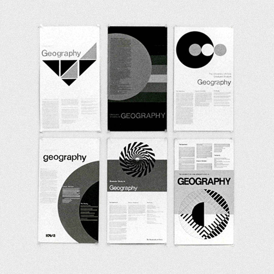 Student projects from the course of graphic design from the University of Iowa, 1971-72.
Do you think that your teaching activity influenced your design work?
My teaching came after my years as a working graphic designer. I based my curriculum on my own experience combined with new technology that was suddenly looming over the whole print industry as well as graphic design. Student response often lead off into directions that I had no anticipated, all for the good of both the student and myself.
What is your definition of design?
When I think of design I think graphic or publication design, since publication design and signage were the basics of my professional life. Graphic design meant solving problems for a client. Information design became the core of my later work and that required a clear, concise layout of information.
What is the purpose of design?
Bringing order out of chaos. No matter if it is a magnificent Tlingit cedar clan totem pole or a Bauhaus memorial column by Max Bill. I feel that is the driving force behind all human visual activity. If it is contemporary information design that uses type, then I like to be able to read the typographic message with ease and have that information stay clear in my mind. I also like to think the project stayed within a budget, and that is a product that I can afford.
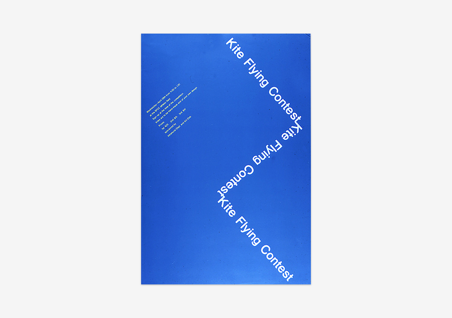 A student’s final project for a lettering class, c.1972.
What do you think are the aspects to consider to understand if a project is of high quality?
Today’s awareness of pressing questions over our environment, climate change, and many other important current issues has created a different concept of a high quality project than when I first started out in graphic design. Today, is the project important to better living for all of us but not at the expense of the environment? That was never a question that anyone asked when I started out in graphic design. The style of the graphic design project itself was the important aspect. The Whole Earth Catalog challenged that state of mind but today even that influence is gone. I have seen too much graphic design gloss over critical projects, especially in my years of supervising student interns at Hanford Nuclear Site, Washington.
Should design produce things which are necessarily useful?
Much of what I did as a graphic designer was not at all creative but was very useful, such as creating a campus signage system where I was employed.
Should the products of design be beautiful?
Design of useful products usually happens through the very nature of the materials that are used to create it. The paper mache egg carton: you can’t create anything that’s more functional. But I don’t know about it’s being beautiful. The latest design in new automobiles is very evident in the senior environment that I live in, all very new and beautiful but at what a cost and far more vehicles than are unnecessary! Design, like life, is full of contradictions.
To whom is design addressed? Is it for the masses?
Graphic design is—by it’s very nature—addressing the largest audience possible, especially true today in branding. Without that all important branding, a national company cannot aspire to be an international brand of critical importance in the world markets of today.
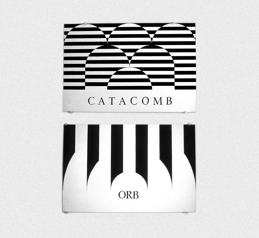 Student exercises from a graphic design course, 1971-72.
What are the differences between art and design?
Applied art and fine art are basically—in my mind—all one and the same.
Could design be art?
I guess my designs are called art. I’m the client now. So yes, design can be art.
[Note: This answer clearly reveals the difference between the concept of design rooted in European Modernism—that I think is the proper one—and the English understanding of the word. She calls her paintings ‘designs’ in relation to the aesthetics, but the Modernist or better Functionalist concept of the word considers design as the (planning) process, not the (aesthetic) product resulted from the process. And the misconception is reinforced by the, in my opnion, erroneous idea that design is an (applied) art.]
What is the future of design?
The computer and a world wide market.
What would you recommend to a young designer?
Learn all that you can about the fine and applied arts. Travel, especially as an exchange student, but travel. Get as many internships as you possibly can, and don’t above all expect too much. Be serious about yourself and what your goals are.
Thank you very much.
Thank you too.
© 2014-16 Ellen McFadden, Nicola-Matteo Munari. All rights reserved.
TO THE TOP ↑
Portfolio
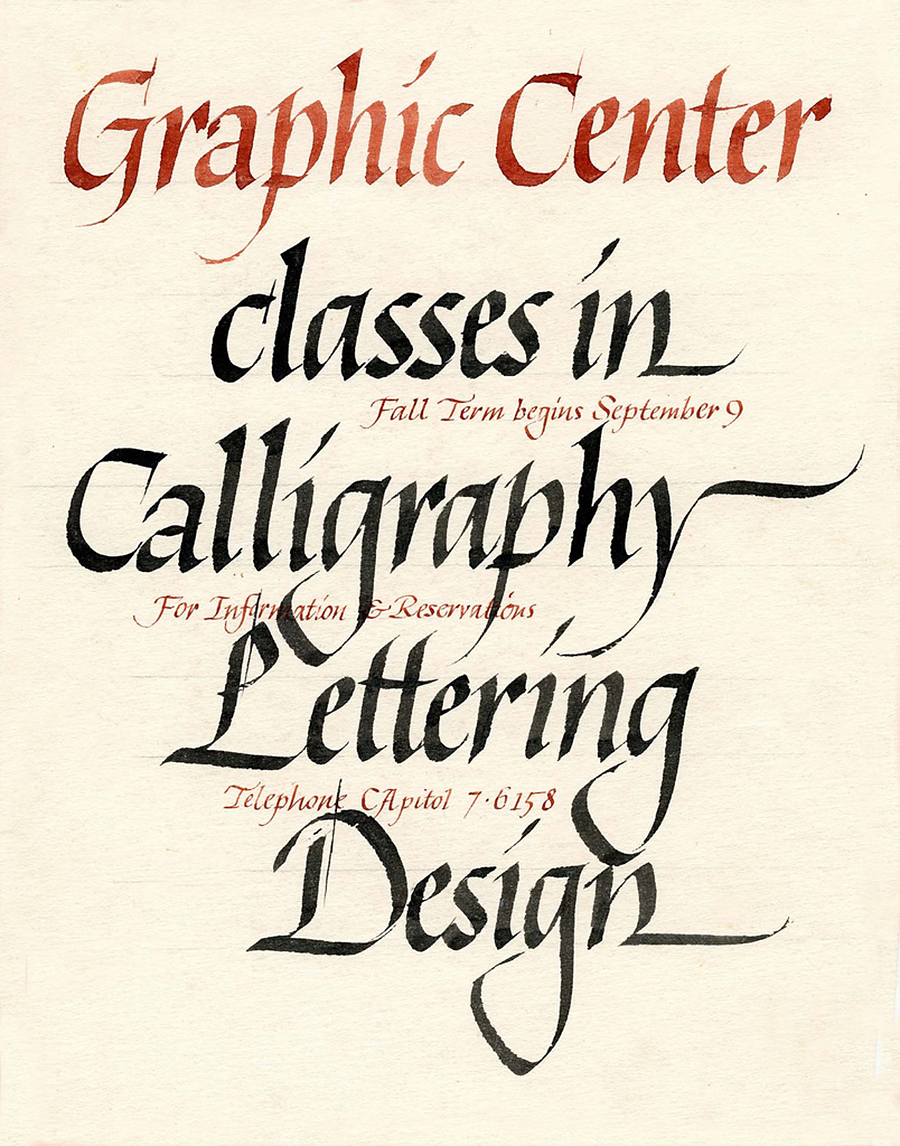
Graphic Center
Poster
pre-1960
“Much of my work was calligraphy when I first started freelancing in the late 1950s.”
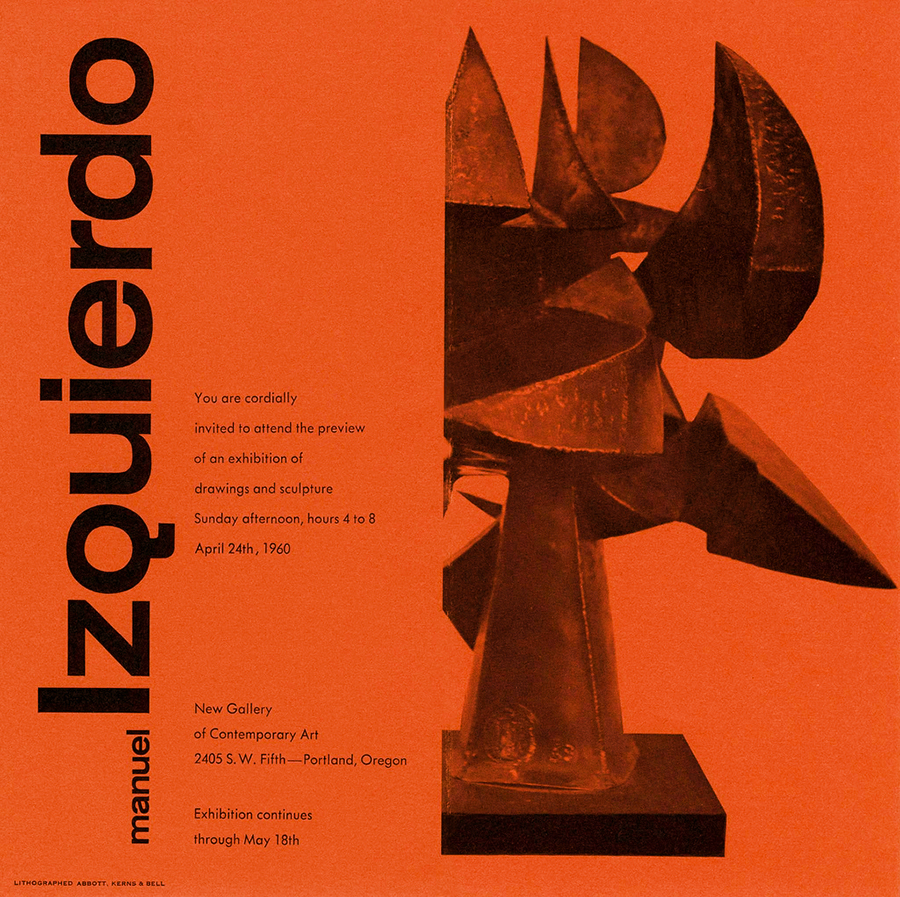
Manuel Izquierdo
Invitation Leaflet, c.20×20 cm
1960
Invitation designed for the New Gallery of Contemporary Art, Portland, Oregon. “The text was set in Futura. Helvetica wasn't available in Portland at that time.” The image has been recolored.
Hastings Business School
Brochure, c.A4
1962
“This was the very first design that I contracted on my own in 1962 as a freelance designer. Letterhead, envelop, business card, and catalog. I wanted to produce a striking visual that was truly contemporary—Helvetica had just appeared on the U.S. Pacific Northwest type market—for this little commercial school. And they loved it.”
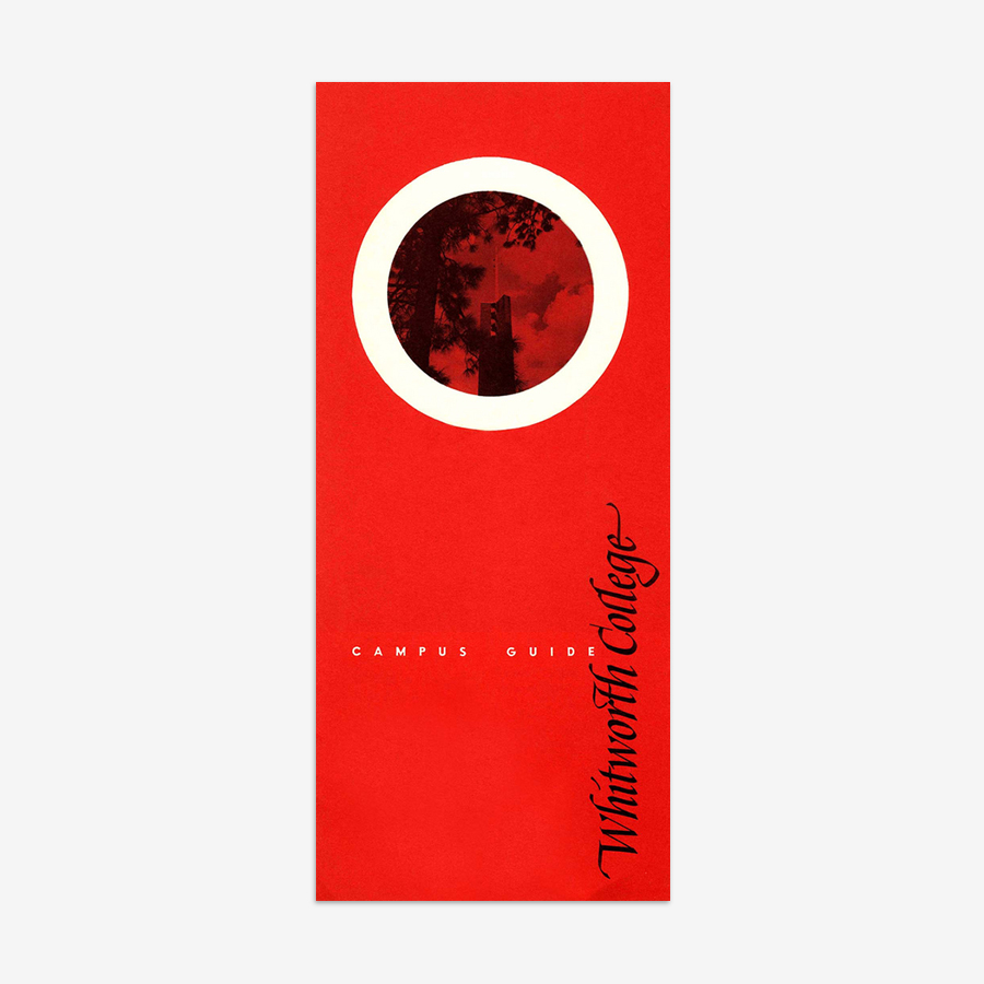
Campus Guide
Leaflet, c.21×10 cm
1964
“I shot all my own photographs and developed and printed them in my basement.” Designed for the Whitworth College, Spokane.
Whitworth Art
Mark
1965
Designed for the Whitworth College Art Department. “When there was no turn-around time or budget, I would pick up the edged pen and create my own lettering.”

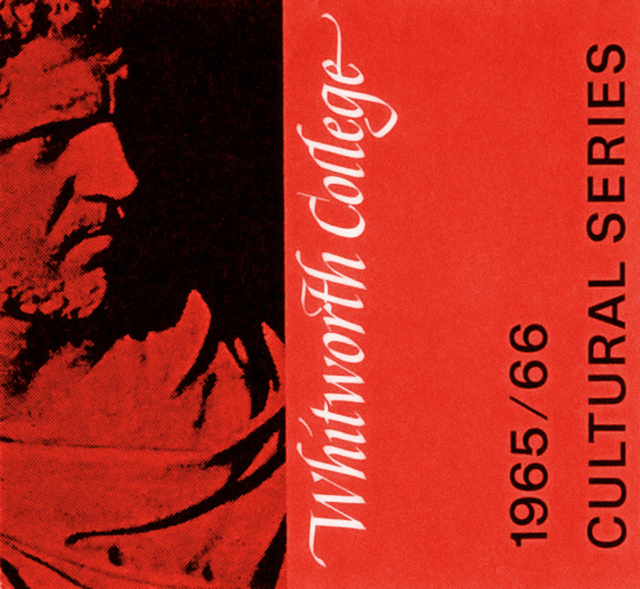
Cultural Series 1965/66
Brochure Series
1965
“That year this brochure series won an award for college publications from the ACPRA (American College Public Relations Association). I don’t think ACPRA exists anymore but Whitworth was more than happy with winning their first-ever college publications award.” To design this brochure “I ordered the type from a printer in Spokane, […] got the type repros shipped back from them on the Greyhound bus. Then I created a mechanical with type and stats of headings that I pasted in position, with rubylith windows for the photos to be dropped in by the printer after they had been screened, specified the PMS color, then shipped the mechanical back to Whitworth College on the Greyhound bus. Then all I could do was hope that it would turn out as I had planned.” Originally printed in yellow. The image has been recolored.
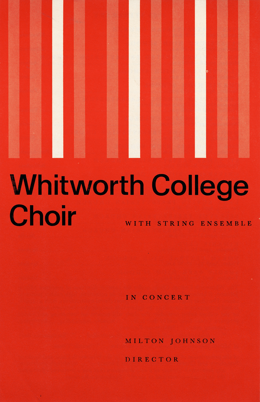
Whitworth College Choir
Brochure Cover
c.1965
Courtesy of Sean Wolcott.
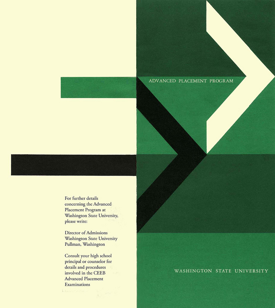
Advanced Placement Program
Leaflet, c.21×10 cm
1966
Designed for the Washington State University. Detail of the back and front cover.

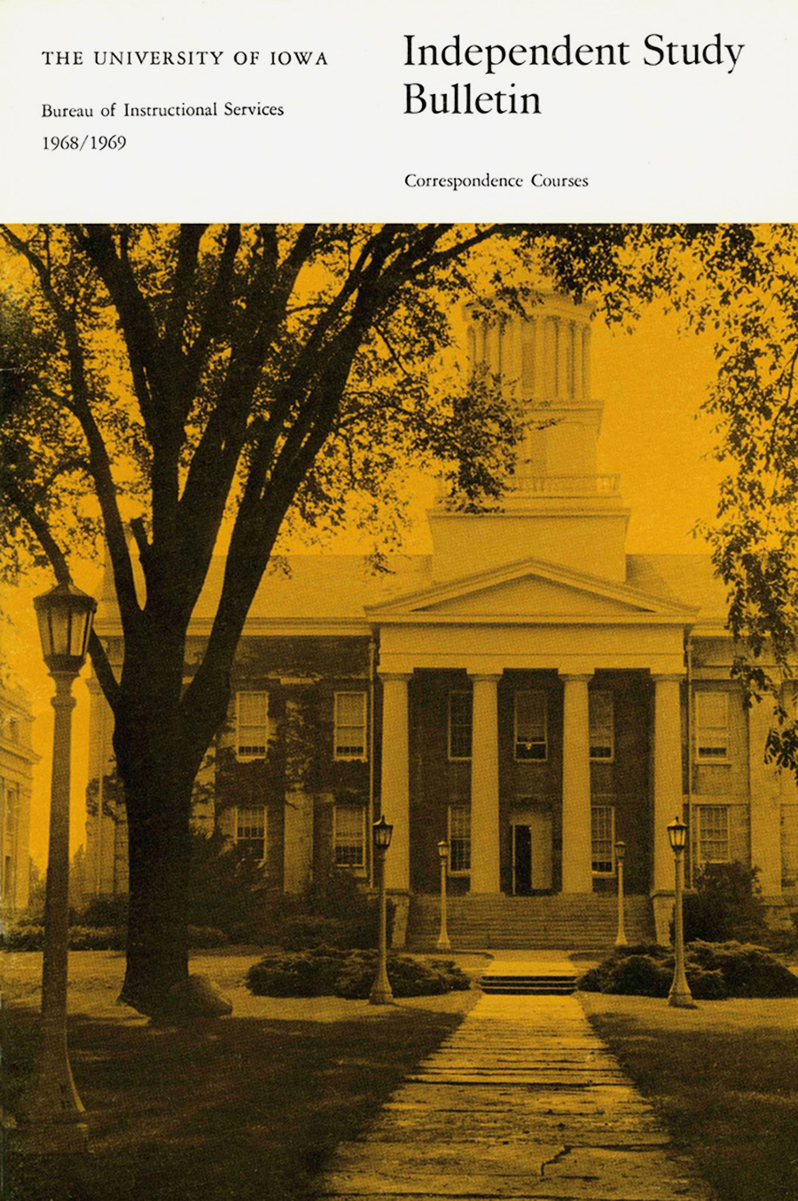
Independent Study BulletinBrochure, 23×15 cm
1968
Designed with
Irwin McFadden for the University of Iowa. “This is a picture that I took before the big fire in Old Main, then after they got it all reconstructed a tornado went through the campus and town. The elm trees in the foreground are gone now, I think they were either victim of elm blight or they were removed after the fire. I was attending a meeting in Old Main when practically the whole student body rose up and demonstrated over the Kent State killings and the continuation of the war in Vietnam. We had to evacuate the building immediately and as I stood on those steps, some of my students were crouching in those bushes, waving at me!”
“We had to know about type. The professional compositor that you worked with and the proofreaders who read the galleys, caught most type errors!” The typeface is Reynolds Roman.

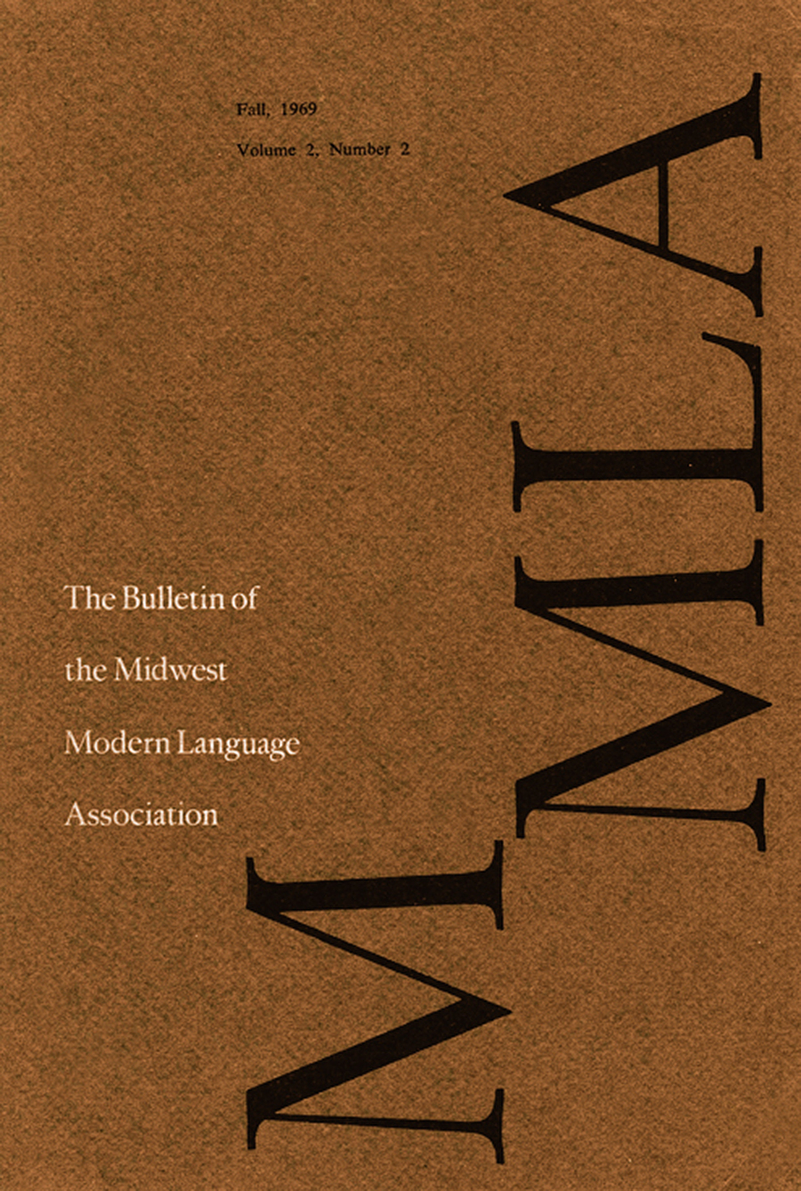
MMLA, vol.2, n.2
Bulletin Cover, 23×15 cm
1968
Designed for the Midwest Modern Language Association. “I learned so much about the beauty of elegant letterpress printing from Kim Merker, who taught the typographic laboratory class that I enrolled in at the University of Iowa. He was a teacher who truly inspired a student to have a vision of the very finest in printing. Kim had just founded the university’s Windover Press, and it went on through the years to publish many magnificent books. He was also involved with the MMLA. He had a full schedule teaching classes and developing the new press, so he turned the job of designing the 1969 MMLA bulletin over to me. It was not a letterpress publication, but was printed offset by a commercial printing company off campus. It was on this job that I realized that printers can’t necessarily print white on a rough dark paper stock and have it work visually.”

MMLA
Layout Draft
1968
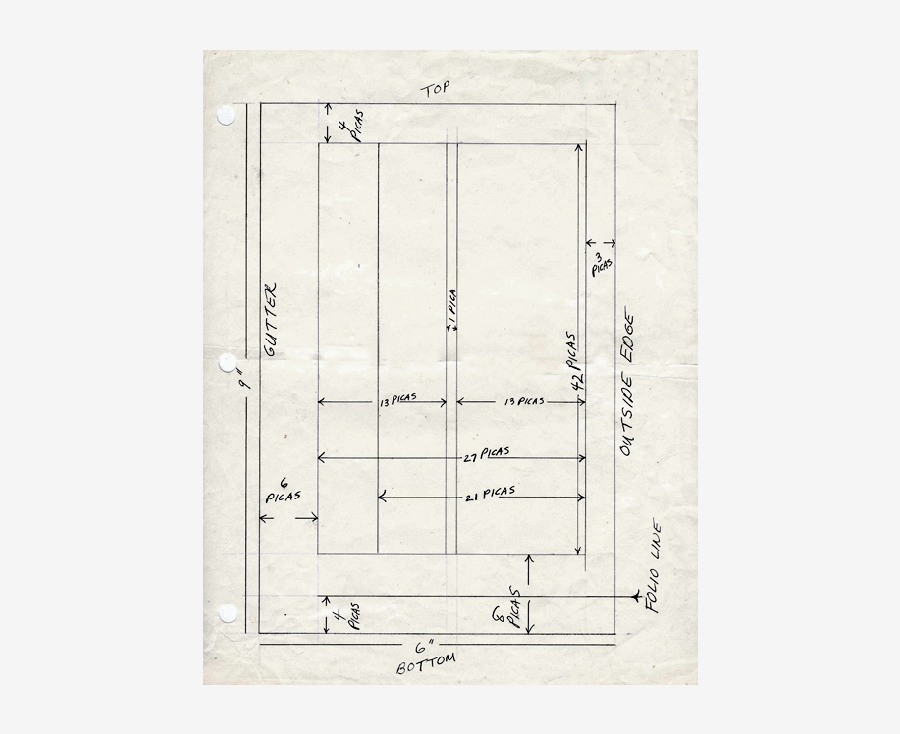
“The first thing I designed was a grid outline, a frame to follow through the whole publication. I marked up copy, proofed copy, and pasted up repros and display headings for 96 pages along with the addition of several ads. There were times, when working away in my little East Hall office, that I related to the poor Miller’s daughter trying to spin gold out of hay but I was also happy that Kim trusted me to carry through the project.”

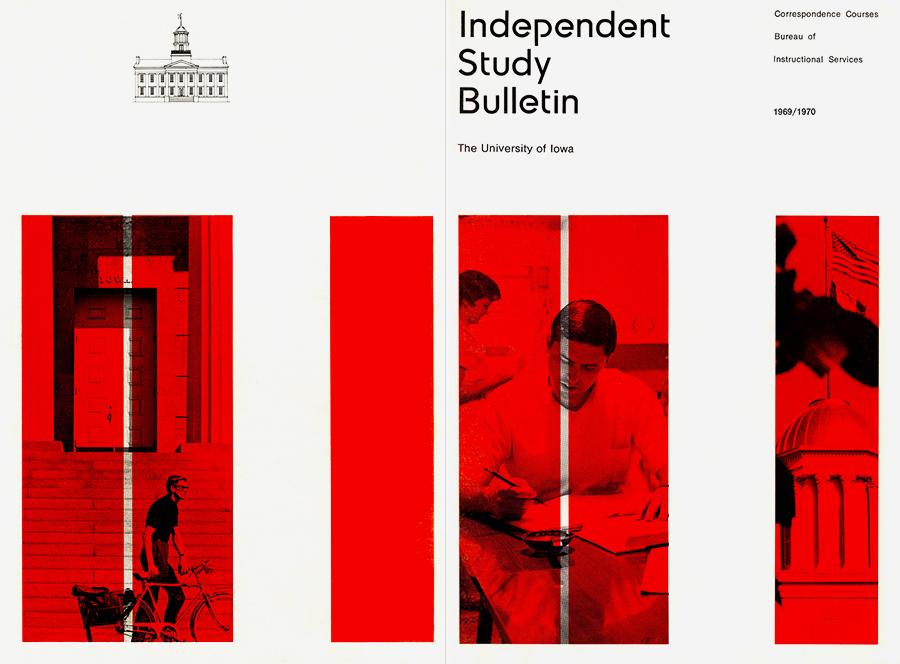
Independent Study Bulletin
Brochure, 23×15 cm
1969
A beautiful brochure for the University of Iowa. Detail of back and front cover. “My second redesign of the University of Iowa’s Independent Study Bulletin, this time in 1969. The photograph of the young man was given to me by an administrator and I shot the flag picture. I used an asymmetric layout in this publication, with headings that I set in New Museum—a typeface that my husband designed—and Helvetica for the text. I would have preferred Univers but the college printing office didn’t have it. I didn’t like the college logo that was being used at that time, so I dropped it and made a line drawing of Old Main instead.”
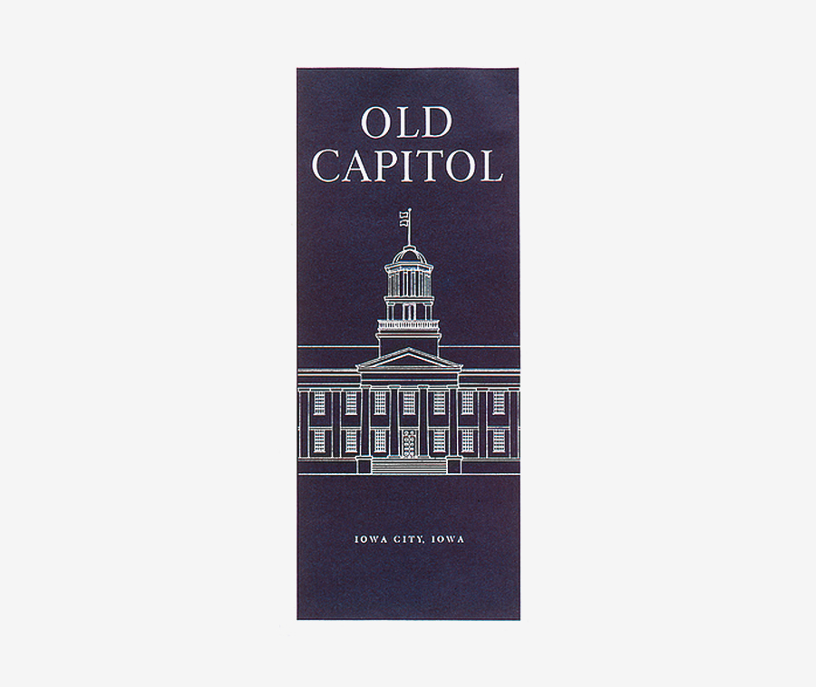
Old CapitolLeaflet, c.29×10 cm
c.1969-70
Designed with
Irwin McFadden. A single color folder on the history of the Old Capital building issued by the University of Iowa.
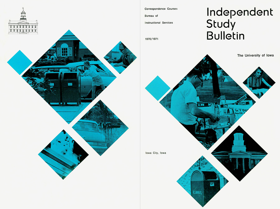
Independent Study Bulletin
Brochure, 23×15 cm
1970
Another cover for the University of Iowa. Detail of back and front cover. The influence of Max Bill is quite clear.
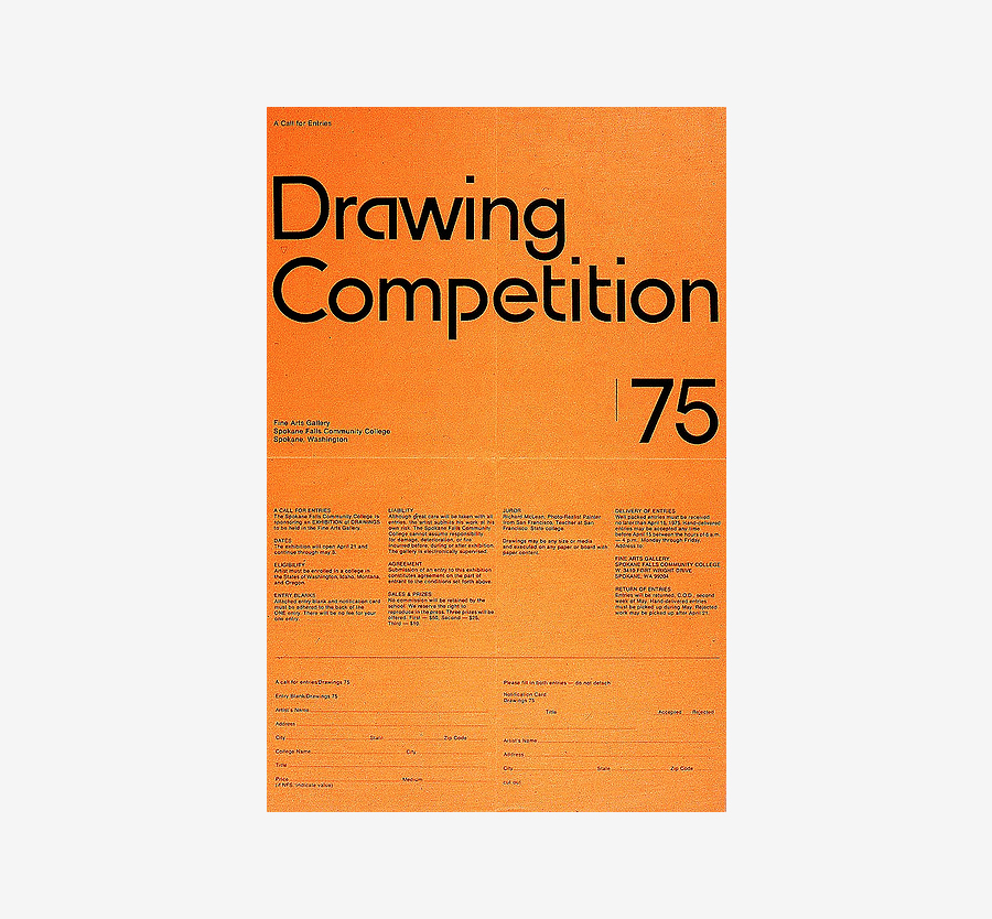
Drawing CompetitionPoster
1975
“Posters that get posted on a bulletin board have to be simple, and still carry the basic information when the application form is torn off. […] I used New Museum as the display type, an alphabet that my husband
Irwin designed.”
Links & Docs
Archive
Flickr Maryellen McFadden
Articles
Arcade Pacific Northwest Modernist
Fortport Ellen McFadden
Ampersand Gallery Paintings
Profile
Art Ellen McFadden Official Website
Projects
Flickr Calligraphy
Flickr Imperial Letterforms
Flickr McFadden Graphic Design
Flickr McFadden
Flickr My Stuff
Flickr Student Graphic Design
Flickr University of Iowa
TO THE TOP ↑
Comments
If you wish to add a comment please feel free to write at
info@designculture.it
TO THE TOP ↑
Follow on Facebook
Partnerships

Archivio Grafica Italiana is the first digital resource to the Italian graphic design heritage. Founded by Nicola Munari in 2015.

Design consultancy based in Piacenza, Italy. Founded by Nicola Munari in 2015, it operates in the whole field of design.
TO THE TOP ↑
© 2013-16 Nicola-Matteo Munari. All rights reserved.

 Student projects from the course of graphic design from the University of Iowa, 1971-72.
 A student’s final project for a lettering class, c.1972.
 Student exercises from a graphic design course, 1971-72.