Franco Maria Ricci
Parma, Italy, 1937
Introduction
Franco Maria Ricci is one of the finests and most cultured publishers and designers worldwide.
He is one of the designers that has most defined the graphics in Northern Italy, and particularly in the area of the historical Duchy of Parma and Piacenza, managing to rediscover and to promote Bodoni’s typographic heritage in the world.
Being born in Piacenza, near Parma, thanks to Ricci’s commitment, culture, and passion I was lucky to grow up surrounded by an aesthetic heritage that came from Bodoni’s tradition and became part of our everyday life: advertisements, agendas, calendars, checks, books, signboards, magazines, and packaging. A tangible heritage that everyone here feels as its own. It is our aesthetic and cultural background in graphic design.
An elegant graphics rich of tradition, based on clarity and order coming from Neoclassical architecture: large format books, white space surrounding types, text set in clear columns, constant use of type rules, full-page images, a sharp contrast with black backgrounds and, above all, the use of the most authentic Bodoni types that define a unique and inimitable aesthetics.
A graphic that is intrinsically linked to the Italian artistic culture which—in the union of images and letters—educates to love of beauty, elegance, and intelligence.
A cultured bibliophile and collector, Ricci is the graphic designer who better understand and appreciate the potential of the Italian artistic heritage. He dedicated his entire life to discover and valorize the work of Giambattista Bodoni, sanction for it new success and eternal fame in the world.
Enjoy your reading,
 TO THE TOP ↑
Who’s Who
He graduated in geology in the early 1960s from the University of Parma. After a short experience in the Middle East, he came back to Parma and in 1963 he opened a graphic design studio. The same year, the 26 years old Ricci set up a printing house and produced the first reprint ever of the “Manuale Tipografico” by Giambattista Bodoni, after 145 years since the publishing of the original edition.
In the 1960s and 1970s he focused on corporate identity serving major clients mainly based in the area of Parma such as Banca Emiliana, Cassa di Risparmio di Parma, SCIC, and Smeg, but also worked for Bompiani, Fondazione Giovanni Agnelli, and Neiman Marcus.
In 1967 he reprinted Bodoni’s “Oratio Dominica” (1875) organizing a prestigious presentation attended by Jacqueline Kennedy and the most important members of the American elite. In the middle of the paperbacks era—printed in large runs and low quality—Ricci met a resounding success publishing magnificent works of excellent quality, sold in limited editions. In 1970 he began another epic adventure in the publishing history that will occupy him for ten years, producing the first and only complete reprint of the “Encyclopédie” (1751-1772) by Diderot and D’Alembert.
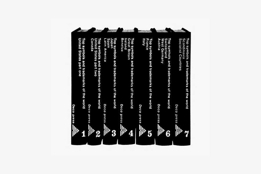
From the early 1970s he started to focuse more and more on publishing, producing numerous series such as The Signs of Man, the Library of Babel, the Blue Library, Iconographia, Quadreria, and others. In 1973 he published the fundamental “Top Symbols & Trademarks of the World” (Deco Press, 1973-82), a 7+4 volume series that collects some of the best marks and logotypes designed since that time.
In 1982 he began publishing FMR, “the most beautiful magazine in the world,” as Jacquline Kennedy stated. Some of the world’s best writers filled its pages, and it quickly became the best and most famous art magazine in the world. FMR was followed by many other beautiful magazines such as Kos, La Gazzetta del Bibliofilo, Mæcenas, and Po. It closed in 2009 but Ricci announced that he will start again to publish it soon.
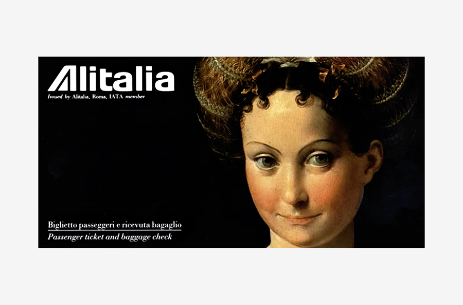
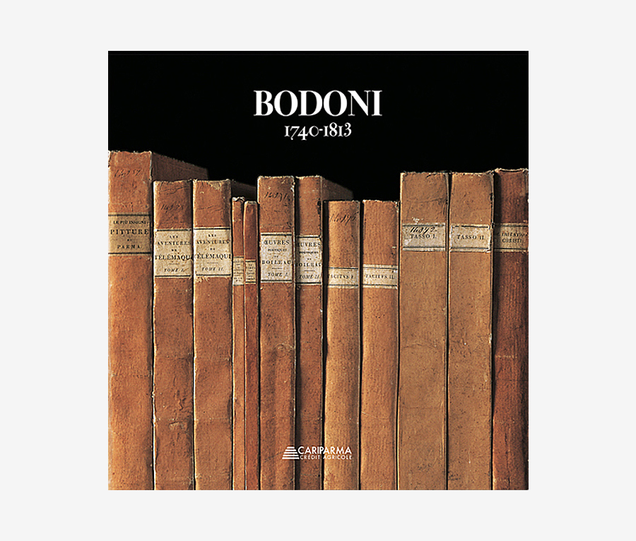
In the 1990s he designed a wonderful series of Alitalia tickets, and recently he signed the promotional mark of Parma. He still publishes prestigious art books, inlcuding a beautiful catalog about Bodoni (Cariparma, 2013). In 2015 he built and opened the Labirinto della Masone in Fontanellato, a cultural center that houses an art museum, a 15.000 volumes library, and the largest maze in the world.
TO THE TOP ↑
Quotations
“Bodoni was the major connoisseur and graphic designer that there has ever been. His typefaces are very difficult to use beacuse require a great respect for proportions, distance, and white spaces.”
“Everyone thinks that Bodoni is a single typeface, but he actually produced 50.000 matrices.”
“Graphic design is a cultural fact. Today, manual ability is worthless. I would encourage the young people to get educated: read Dante, Joyce, Calvino and, above all, go to museums and look at beautiful things.”
“I don’t think that humanity will accept spending one’s life in front of the screen. The pleasure of paper is also the pleasure of touch, of flipping the pages, of possessing something. Books win in the end.”
“I have always published books that I would have liked to have had.”
“I use high-quality images and simple, redeable texts, with no gossip nor adverts. This is why my magazine has survived.”
“I wanted my magazine to be worth the price those who read it are asked to pay. Whoever buys my magazine pays 18 Euros instead of paying 7 and getting a load of advertising. The concept of a magazine was completely overturned by FMR.”
“The major resource of Italy is beauty.”
“Try to do a good job, working like crazy. Not for the money, for pride.”
TO THE TOP ↑
Q&A
Published July 20, 2014
Recorded Feb 13, 2014
What job were you dreaming of for your future when you were a child?
The archaeologist.
Which was your favorite game, when you were a child?
Toy soldiers and trading cards.
What was your educational path?
Classical studies at Romagnosi High School in Parma, and then the university where I graduated in geology.
What was your favorite subject at school?
History of art, but also philosophy. Since the high school I have a special passion for Benedetto Croce.
When and how did your career start? I read that Giulio Confalonieri has somehow joined in your training.
I started doing the graphic designer shortly after the college, almost by accident, drawing a poster for the Festival of University Theatre which was held in Parma. I met Confalonieri a few years later. We had a great friendship. All contributions that gave birth to FMR including its layout came from exchange of ideas during our informal meetings. I remember in particular that his help was important during the design of issue 1. At that time, I was already a great admirer of Bodoni’s types and I thought to print the headline ‘FMR’ in a different way, by inserting an ‘M’ in Bodoni Papale
[Note: It is a big display body-size font.] between the two other letters in Bodoni Roman
[Note: A text body-size font.], but Confalonieri convinced me that the Papale ‘M’ would have made the cover too prissy, while three identical clean characters would have a greater impact. He was right.
When and how did you started your career as a publisher and printer?
I was already a successful graphic designer when I began to publish in Parma in 1963. My first title was a work about writing, in the literal sense of the term: Giambattista Bodoni’s “Manuale Tipografico.” In the footsteps of the great typographer, I debut in publishing as a joke by set up a small letterpress workshop to produce a facsimile of the manual. The unexpected success that had the 900 copies run of this confidential reprint decided the future of my publishing company.
 A type case that contains original punches cut by Bodoni. Museo Bodoniano, Parma.
When was the first time you discovered the figure of Giambattista Bodoni? How and why you developed such a passion for his books and typefaces?
I chose Bodoni especially for love and interest in one aspect of culture, graphic design, that is between art and industry. Graphic design has in Bodoni its absolute genius, the most important example of how graphics is made mostly of art and thought. The Romans carved their inscriptions in stone. They manifested through the material chosen and the shapes of the letters—regular and rigorously codified—the “dur désir de durer,” the desire to last, and the political will to make writing an instrument—not less than the road network—to tie the largest of empires. But they also expressed the aesthetic need to assign to each member of the alphabet, once and for all, the graphic form that suited it. Even today, if we look at the letters on the pediment of a temple or a tombstone—straight, vertical, relentlessly capitals—they appear to us eternal.
Bodoni’s motto reads: “Je ne veux que du magnifique et je ne travaille pas pour le vulgaire.” (I don’t want anything but beautiful, and I don’t work for the vulgar.) What is your definition of magnificence and what of vulgarity?
Bodoni wanted to paint with the alphabet to create excitement with four letters on the white, a lot of white, of the page. His mission was not to propagate the culture and the texts of his books, but to invent an art that before him didn’t exist: graphic design.
What goals—aesthetic, formal, communicative—do you have as a designer? And what as an editor?
To me designing a mark means to communicate through the paper an image that corresponds to a precise function: it must enable the viewer to immediately understand the essence of that corporate. The reference point is the idea of unity, the graphic sign. There are two kinds of unity: the single unity and the plural unity. An example of single unity is the flag of Japan: a single element within a white field, the unity within a space. An example of plural unity is the flag of the U.S.A. I think that both kinds of unity are important in graphic design discipline, but the aim is always to gain a long lasting memorability that doesn’t expire with trends. I have tried to act in this way in my career as both a designer and editor.
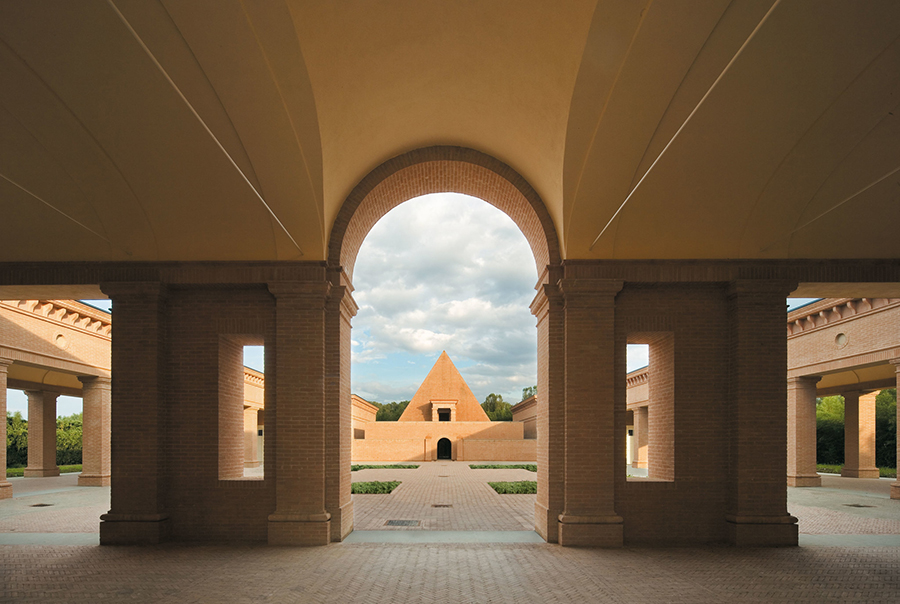 The main courtyard of Labirinto della Masone, Fontanellato, 2015.
A project you would like to realize.
I have already done it. It is a great labyrinth in Fontanellato, near Parma. The first time that I dreamt of building a labyrinth was twenty years ago. In that period I housed a dear friend and fundamental collaborator of my publishing house: the Argentinian writer Jorge Luis Borges. It is known that the labyrinth was one of his favorite issues. The paths of blind steps he drew around me suggested the hesitation of someone who have to deal with enigms and bifurcations. I chose bamboo as raw material, a very elegant plant, so less used in the West and specially in Italy. Near the labyrinth I am building a museum, a library, a school, an archive, and various tourist facilities that will assure to cultured and curious people, specially to young people, hospitality and leisure opportunities, information, and inspiration in the sign of civilization, elegance, and comfort.
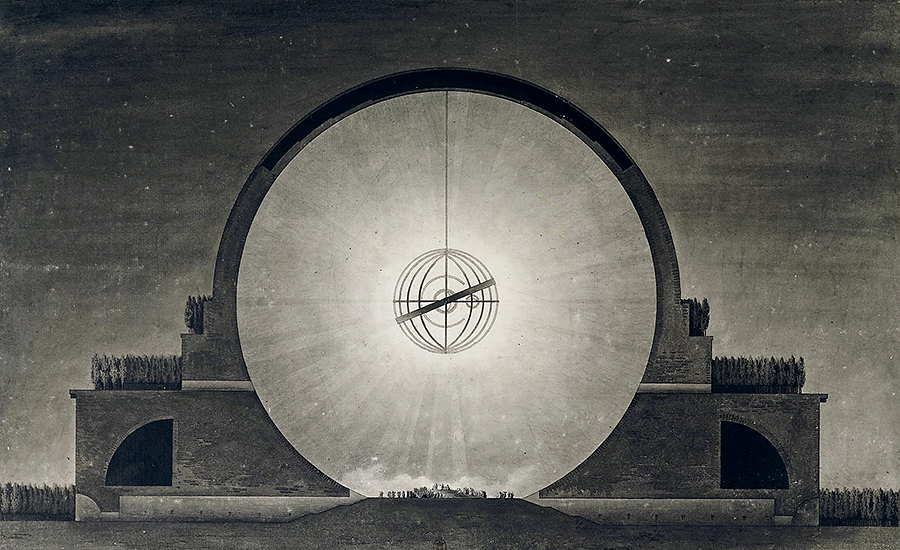 Concept of Sir Isaac Newton’s Cenotaph, proposed by Étienne-Louis Boullée, 1784.
An architect that you admire.
For my labyrinth I chose to collaborate with Pier Carlo Bontempi, one of those few architects—like my friend Guido Canali—that still work following tradition. Together with Bontempi I also share the passion for Neoclassicism and specially for French architects that came before the Revolution: Étienne-Louis Boullée, Claude-Nicolas Ledoux, Jean-Jacques Lequeu, but also the Italian Giovanni Antonio Antolini who proposed to Napoleon a visionary project for the Foro Bonaparte in Milan. Because of the circumstances none of those architects left us impressive buildings. However, their drawings and plans, dictated by the love for geometry, Egypt, Greek and Roman world remind us that neoclassicisms are not classicism, but previews of the modern. That repertoire of shapes—suspended over time because never builded—continues to act as a model for a new architecture, conscious heir of its long past.
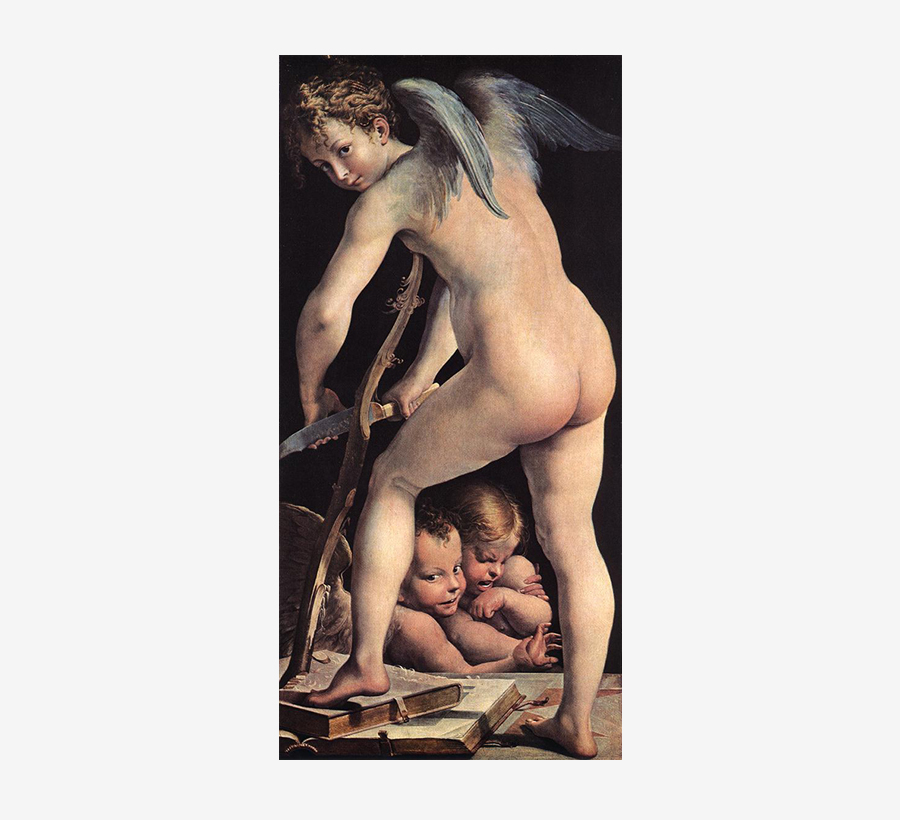 Parmigianino, “Cupid making his Arch,” 1533-35, Kunsthistorisches Museum, Vienna.
An art piece.
A Parmesan like me could not mention Correggio and Parmigianino, whom first artwork I particular admire: the cycle of “Diana and Actaeon” (1524) located in Fontanellato, really near my home. Another artwork by Parmigianino that I particularly love is “Cupid making his Arch” (1533-35), kept in Vienna. I couldn’t buy the original one so I bought two beautiful copies from the 17th century, painted by Rudolphine masters.
Does art affects design? What is the relationship between the two?
Design is more related to comprehensible values, while art is more related to aesthetic values. Personally I don’t like contemporary art or at least the one produced after the 1950s.
What are the features that distinguish the types of Bodoni from the others?
He lived during Neoclassicism—like Baskerville and Didot—and tried to retrieve the sharp, absolute legibility of Latin epigraphic letters, making them just a little bit less squared, a little bit softer. The types of Bodoni are a masterpiece of Neoclassicism like the sculptures by Antonio Canova.
The types that you use in your books have a shape which is different from all the other digital editions of Bodoni typefaces. Is it a font that you specifically redrawn?
Exactly. During the early digital age there were no Bodoni fonts on the market, so we decided to digitize the most beautiful fonts of the publishing house, both romans and italics. We still use them today.
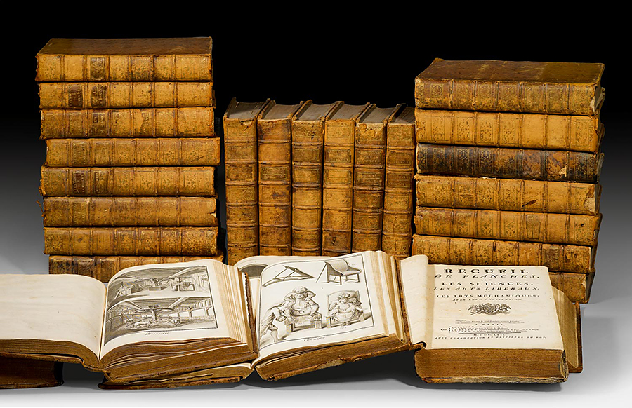 An original set of the French “Encyclopedie” by Diderot and D’Alembert, 1751-80.
What is the project you remember with more pleasure and interest?
In 1970 I decided to reprint the great French “Encyclopédie” (1751-80) by Diderot and D’Alemebert, edited by the most important intellectuals, artists, philosophers, and scientists of the Illuminism. The project ended in 1980 after ten years of hard work. It consists in 18 volumes: 12 facsimile-volume reprints for the pictures, 5 for the texts, and 1 as a presentation with texts written by Barthes, Venturi, Jacques Proust, etc. and introduced by Borges. Everyone thought that the project would be an economic distaster, rather it was a huge success with 5.000 collections sold both in Italy and the rest of the world, many to public libraries and many to the French Elysium as presidential state gifts.
Has the way people perceive design changed?
Today graphic designers have been substituted by advertising agencies that naturally takes more care of market and business rather than aesthetics.
Without considering technology, what are the differences between the design—specially editorial design—from the past and the current one?
To a Bodoni lover like me, editorial design in which I am interested in is the one with the white of page surrounding the black of types, producing a perfect balance. This is what Bodoni searched through the printing techniques of his time. Something that today can be gained thanks to the computer.
What would you recommend to a young designer? And to a hopeful editor?
To both of them I suggest to read the fundamental classical texts, from Homerus to Borges. Another excersise that I have always loved to do is what I call “going to churches”: go to whatever church and try to understand the period and the authors of the paintings, or at least what are beautiful and what are not.
What is your definition of good design?
Classical simplicity, elegant typesetting. Quoting again Bodoni: “Je ne veux que du magnifique et je ne travaille pas pour le vulgaire.”
Thank you very much.
Thank you.
 © 2014-16 Franco Maria Ricci, Nicola-Matteo Munari. All rights reserved.
TO THE TOP ↑
Portfolio
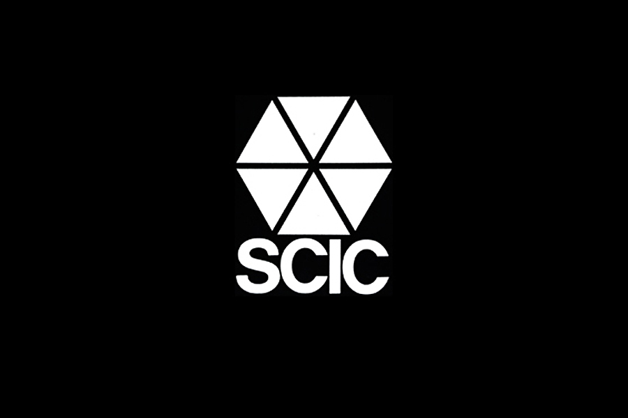
SCIC
Mark and Logotype
1963
Designed for a kitchen manufacturing company based in Parma, Italy.
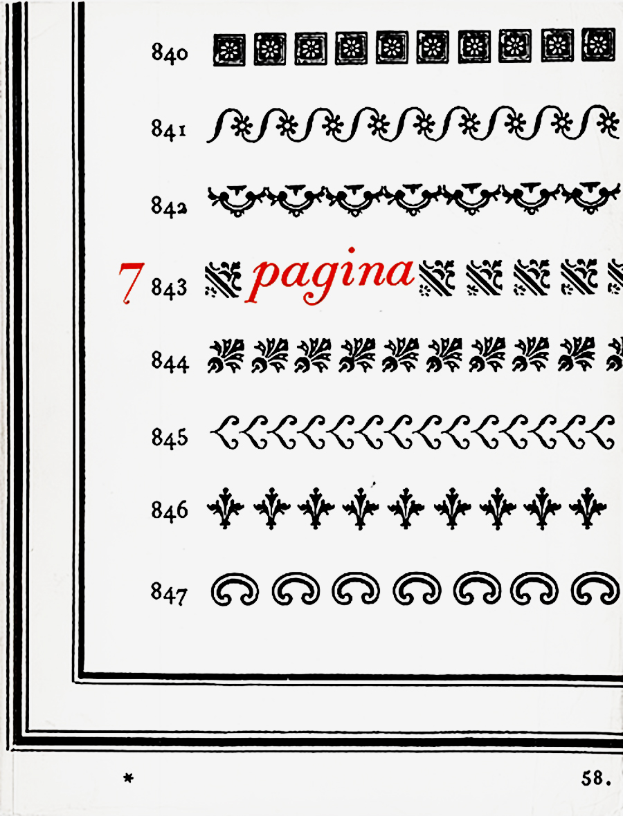
Pagina, n.7
Magazine Cover
1965
Set on a page from “Manuale Tipografico” by Giambattista Bodoni dedicated to ornaments and frames. The same page was used to arrange a cover for a catalog about Ricci published in 1982.
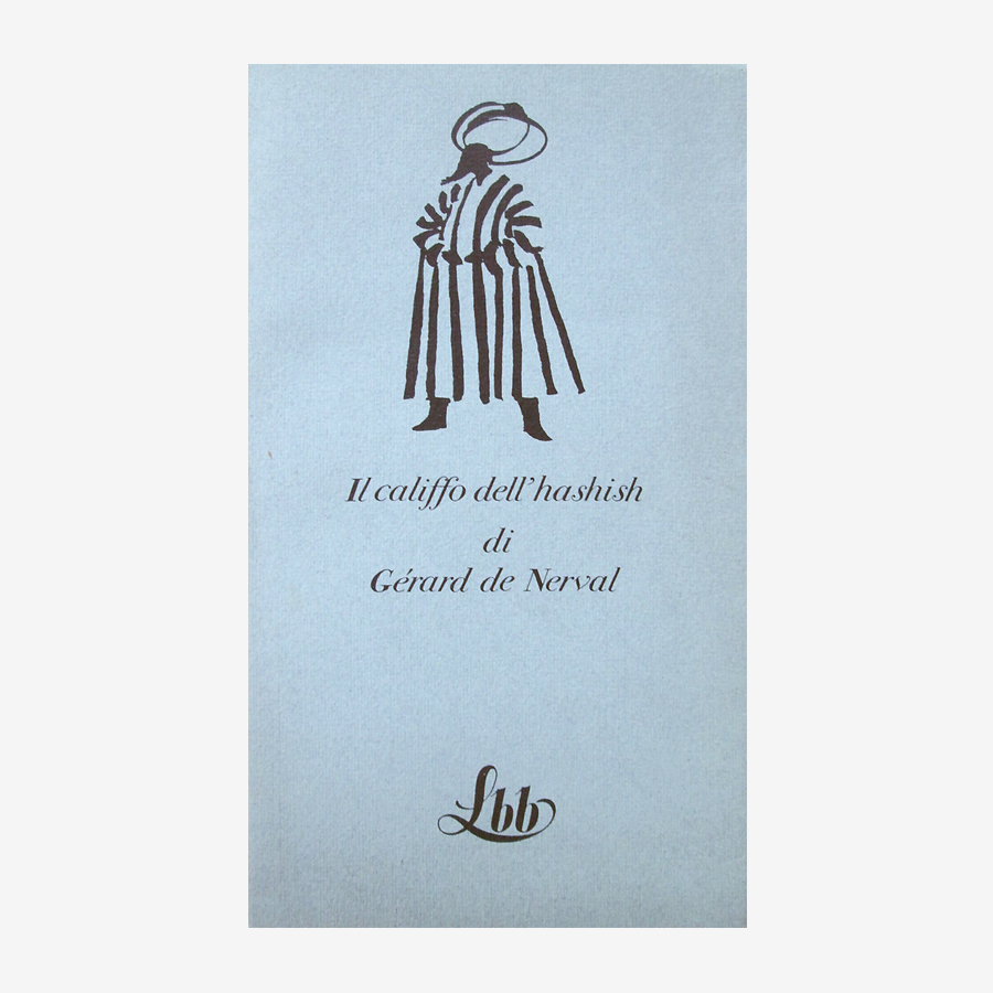
La Biblioteca Blu
Book Series
1972-77
“The Caliph of Hashish” (1977), a title from The Blue Library book series.
Top Symbols & Trademarks of the World
Book Series, 21×10.5 cm each
1973
A masterpiece in graphic design literature: The 7 volume set features over 5.500 marks and logotypes designed since 1945. Four additional volumes were added to the series in 1974-77. Published by Deco Press.
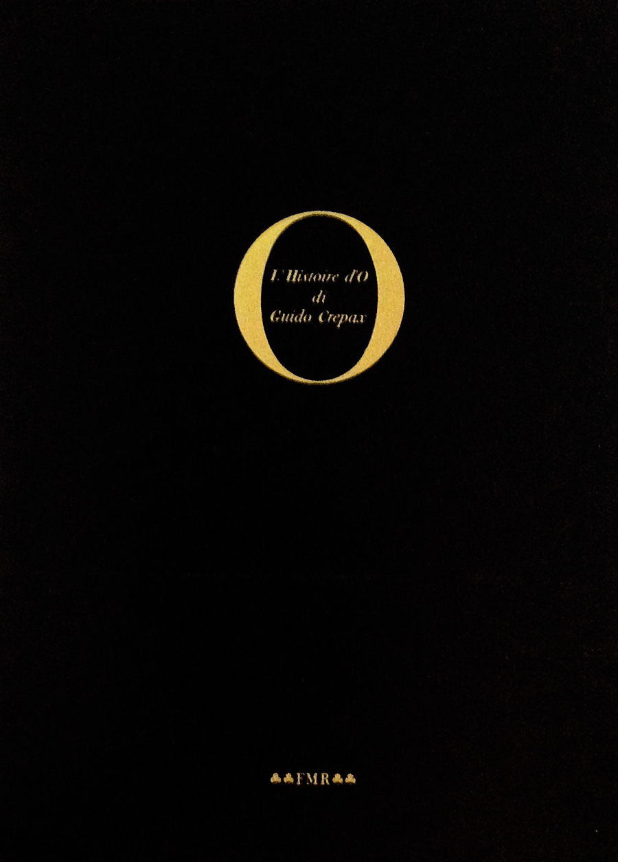
L’Histoire d’O
Book Cover
1974
Cover for a book published by Ricci with illustrations by Guido Crepax.
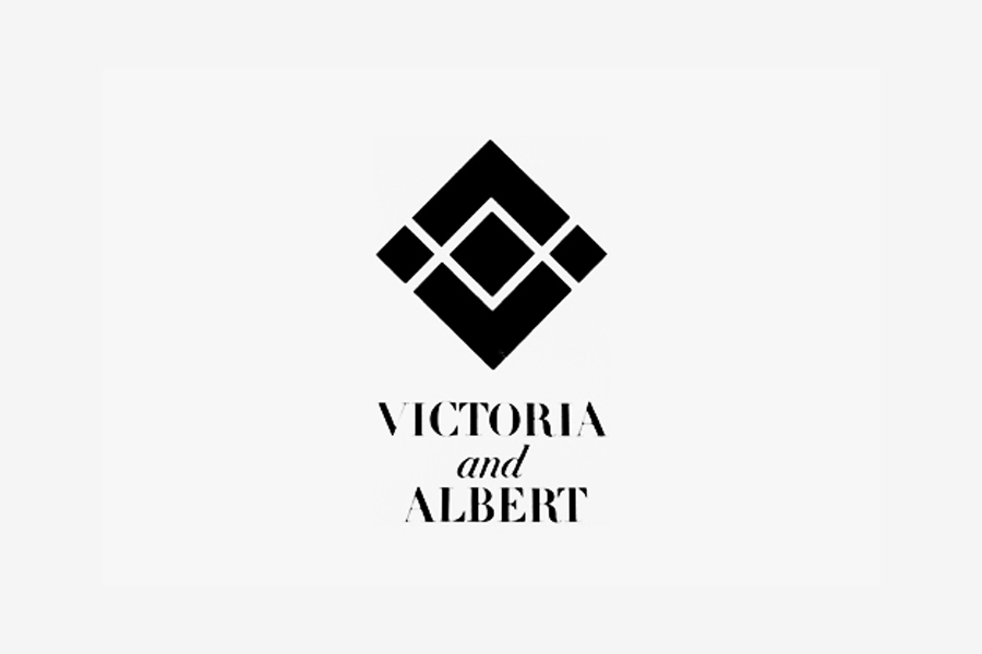
Victoria & Albert
Mark and Logotype
1974
Mark for a furniture collection manufactured by SCIC, Parma.
Cassa di Risparmio
Mark
1978
Mark for Cassa di Risparmio di Parma, one of Italy’s biggest bank. Originally printed in a bronze tone.
FMR
Magazine
1981-2004
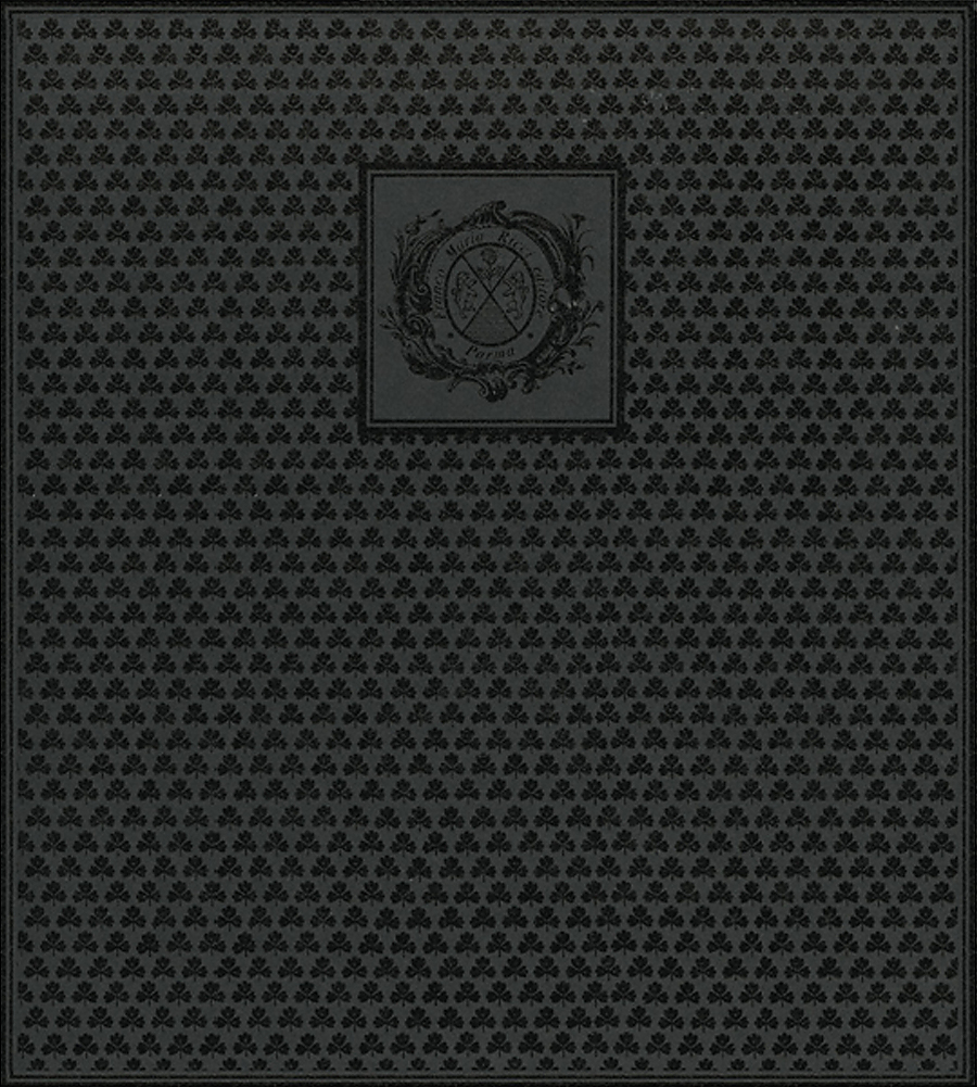
Les Dames de Fontainebleau
Book Case
1987
A beautiful book case for Quadreria series, featuring a monogram pattern.
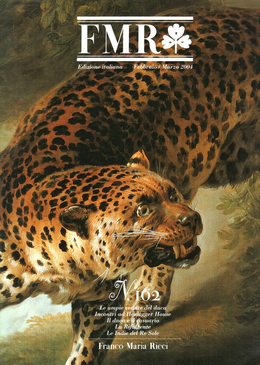
FMR, n.162
Magazine
2004-09
A cover from the second series of FMR, after that Ricci sold his publishing house.
Bodoni 1740-1813
Book,c.30×30 cm
2013
Published on the occasion of Bodoni’s centenary exhibition at Museo Bodoniano, Parma.
Links & Docs
Articles
Il Sole 24 Ore FMR prepara il ritorno
La Repubblica Si è perso nel Labirinto
La Stampa Nel mio labirinto
Rocaille, Lover of Ephemera
Interviews
Designboom Franco Maria Ricci
Il Sole 24 Ore Intervista con Graziano Origa
Profiles
Facebook Labirinto FMR
Franco Maria Ricci Official Website
Labirinto della Masone Official Website
Wikipedia Franco Maria Ricci
Projects
Archivio Grafica Italiana Franco Maria Ricci
Biblioteca Bodoni Bodoni 1740-1813
Videos
Arte RAI Franco Maria Ricci (1)
Arte RAI Franco Maria Ricci (2)
Franco Maria Ricci FMR U.S.A.
Franco Maria Ricci KOS
Franco Maria Ricci Oratio Dominica
Medesano Album Premio San Giacomo d’Oro
YouTube Un uomo del Rinascimento
TO THE TOP ↑
Comments
Follow on Facebook
Partnerships

Archivio Grafica Italiana is the first digital resource to the Italian graphic design heritage. Founded by Nicola Munari in 2015.

Design consultancy based in Piacenza, Italy. Founded by Nicola Munari in 2015, it operates in the whole field of design.
TO THE TOP ↑
© 2013-16 Nicola-Matteo Munari. All rights reserved.

 A type case that contains original punches cut by Bodoni. Museo Bodoniano, Parma.
 The main courtyard of Labirinto della Masone, Fontanellato, 2015.
 Concept of Sir Isaac Newton’s Cenotaph, proposed by Étienne-Louis Boullée, 1784.
 Parmigianino, “Cupid making his Arch,” 1533-35, Kunsthistorisches Museum, Vienna.
 An original set of the French “Encyclopedie” by Diderot and D’Alembert, 1751-80.