Italo Lupi
Cagliari, Italy, 1934
Who’s Who
Italo Lupi is an Italian internationally acclaimed designer, one of the most-known Italian graphic designers worldwide.
He graduated in architecture from the Politecnico University of Milan in 1959. After a short teaching experience as the assistant of
Pier Giacomo Castiglioni, he started working as an art director at the Development Office of La Rinascente. In 1960, at 25 years old, he designed the 6th Compasso d’Oro annual exhibition in collaboration with his former classmate Mario Bellini, a colleague at La Rinacente.
During the 1960s he opened his first studio focusing on exhibition and editorial design. In 1968 he designed the 14th Triennale exhibition that unfortunately was soon closed due to student protests. Two years later he designed the Compasso d’Oro exhibition at the Sforza Castle, Milan.
From 1970 to 1973 he designed the layout of Zodiac—a famous architecture magazine published by Adriano Olivetti—, and in 1971-72 he also worked as art director of Shop magazine. At the same time he started to collaborate with Abitare as a writer, photographer, and cover designer becoming its art director in 1973. He left for Domus in 1986, working as its art director with Mario Bellini as editor-in-chief until 1992.
From 1979 to 1988 he also worked as a design consultant for La Triennale, Milan, designing the identity and printed collaterals for the 16th Triennale exhibition in 1979-82, the official mark of La Triennale in 1983, and the 17th Triennale exhibition in 1988 with the collaboration of
Achille Castiglioni.
From 1990 to 1999 he worked as art director of IBM magazines IBM Italia and IF. From 1992 to 2007 he was both editor-in-chief and art director of Abitare, which under his direction became one of the best-known architecture and design magazines in the world.
During the 2000s he designed many major exhibitions in collaboration with Migliore+Servetto Architects, including the 2006 Turin Winter Olympics, the 2011 Turin Look of the City for the 150th anniversary celebrations for the Unification of Italy, and the Expo 2015 Flags Boulevard in Milan.
In 2014 we designed together the graphics for the 7th Triennale Design Museum exhibition that included logotype, posters, signage, catalog, and printed collaterals.
During his career he served many major clients such as Cassina, Flos, Prada, and Vespa revealing to be an outstanding designer of marks and logotypes as shown by his prolific and versatile production that includes Cinelli, Fiorucci, Miu Miu, Museo Poldi Pezzoli, Triennale, and many others.
Member of AGI (Alliance Graphique Internationale) since 1981. Honorary Royal Designer for Industry since 2002. He is in the Hall of Fame of ADC Italia (Art Directors Club) since 2007. He was awarded numerous prizes including three Compasso d’Oro (1998, 2006, and 2014 Lifetime Achievement Award), and the 2011 German Design Award. In 2015 he received a honorary degree in communication design by the Politecnico University of Milan.
Author of numerous articles about architecture and design, he has recently published a successful monograph titled “Graphic Autobiography” (Corraini, 2014) that was presented at La Triennale in front of thousands spectators.
I have been lucky to work daily at his side for three years, sharing passions and projects. I am very grateful to him for the unique experience that he granted me.
Enjoy your reading,
 TO THE TOP ↑
Quotations
“British graphic culture is what had the most influence on my work.”
“It may seem strange that a designer so undisciplined like me, choose
Massimo Vignelli as his master, and his Cartesian rigour as a benchmark. But Massimo is my constant reference.”
“It was hard to find any new typeface, and I remember that in order to use Helvetica, I had to cut out letter by letter from Swiss magazines and glued them in place.”
“Mark and logotype are two words, with a wide range of meanings, that we often and properly confused with each other.”
“The goals must be clarity and hierarchy. To make the reader able to instantly understand, we need a hierarchy that starts from an extreme synthesis.”
“We renounce the indiscriminate use of the computer, and we have understood that the anarchy of deformed types was part of an ephemeral experience.”
TO THE TOP ↑
Q&A
Published Jan 6, 2014
Recorded July, 29, 2013
What did you want to do when you were growing up?
The aviator or maybe the policeman.
What was your educational path?
Liceo Classico and a degree in architecture at the Politecnico University in Milan.
What was your favorite subject at school?
History and geography at the secondary school. Architectural planning and interior design at the Politecnico.
When and how did your career start?
It began with a position as design consultant for La Rinascente department store in Milan together with two colleagues from the Politecnico of which one was the architect and designer Mario Bellini, just before he started his successful career at Olivetti. We worked at the development office, designing new objects or, in my case, new forms of packaging and graphics. It was a very interesting experience. The office was located right in front of the Cathedral’s spires. It seemed that you could touch them simply extending a hand out of the window. La Rinascente was an international place frequented by intellectually and culturally interesting people and—a very rare thing at that time—by people who came from all over the world: Finland, Germany, Japan, U.S.A, etc. There was a very open atmosphere.
You told me that during your early experiences in typography you had a particular task: the ‘taccheggio.’ (Unfortunately, I don’t know any proper terms in English.) Can you describe what is it?
The ‘taccheggio’ consisted of placing by hand small pieces of tissue paper folded two, three, four or more times under the types or cliches to obtain a print impression with a homogeneous tonal intensity, without paler printing areas.
Is there a typeface that you particularly like?
Bodoni Book, but not only this one. As a typographer I am bulimic and undisciplined.
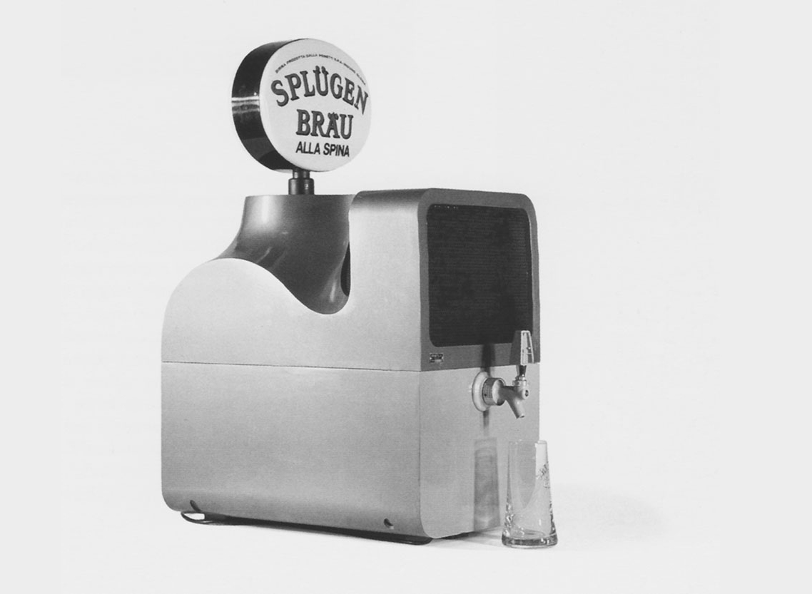 A.P.G. Castiglioni, Spinamatic, 1964, beer tapster for Splügen Bräu’s beer house in Milan.
A product or graphic design piece.
Spinamatic beer tapster designed by
Achille and
Pier Giacomo Castiglioni for Splügen Brau (Compasso d’Oro 1964). While in the field of graphic design, the advertising campaigns for RAI (Italian Radio Television) designed by Erberto Carboni during the 1950s, and all the earlier projects by Pentagram.
A piece of architecture.
Two buildings by the great Le Corbusier: the Unité d'Habitation in Marseille and the convent of Saint-Marie de La Tourette, near Lyon. Two works that possess the solid grandeur of the classic buildings, such as the wonderful Pantheon in Rome or a greek temple, with all its strenght of lights and shadows.
A designer whose work you admire.
The Castiglioni brothers.
Most of the greatest Italian designers have a university degree in architecture, including yourself. This is perhaps because in Italy there was no faculty of industrial design and visual communication until not many years ago. Do you think that this kind of training has been instrumental in the development of certain products or a certain approach typical of the Italian design?
It was certainly crucial because the teaching we received was not specialist but universal, with obvious reference to architecture. Furthermore, because the kind of teachers and context were probably more various than that of contemporary postgraduate schools. And this accustomed us to think in a fast and versatile way, with much more attention to cultural phenomena.
What is the project you remember with more pleasure and interest?
The design of the book “This was Tomorrow,” published by Electa in 1990. It has been totally hand-drawn, from first to last page, in an extremely short time. It is richly illustrated with references to books, magazines, and films produced in a period of the English history that I know very well: the 1960s.
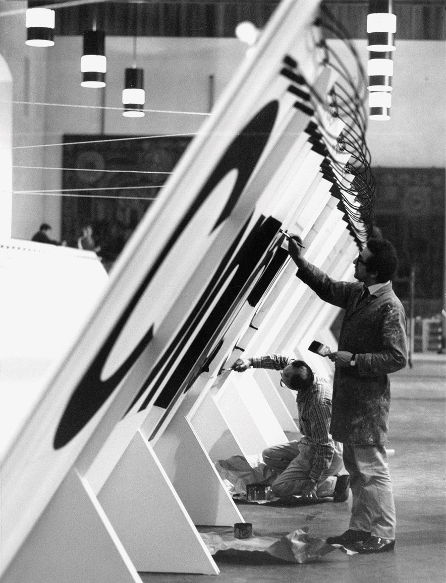 Artisans hand-painting lettering for the 10th Compasso d’Oro Exhibition at the Sforza Castle, Milan, 1970. Courtesy of Italo Lupi. Previously unseen on the internet.
Can you describe the design for the 10th Compasso d'Oro exhibition and tell me about the hand-painted lettering?
The exhibition for the Compasso d’Oro was made together with my friend and then associate Roberto Lucci. It was located in a very large ancient room of the Sforza Castle in Milan. The room is decorated with enormous Italian and Flemish schools tapestry that strongly characterize the place. Considering their looming presence, we decided to shield the objects within a corridor that was entirely built in white laminate, and lighten by a series of milky white bulbs. On the inner walls of the corridor, there was a long shelf that housed the awarded objects, while outside there was the word ‘Compasso d’Oro’ along the whole lenght of the corridor. The text was not made by stickers like today, but was entirely painted by hand following our plan. The outline of the letters was traced with a pencil, and then painted internally with brushes of various sizes. But I remember a very fat gentleman, very fast and very good at drawing letters directly by brush, without having a track to follow. He was able to achieve a flawless replica of Bodoni or Helvetica.
What would you recommend to a young designer?
Be curious and look at things carefully because there is something to learn, copy, and invent from each one. Don’t try to be strange at all costs, rather try to have discipline and imagination.
How would you define a good design?
A good design is a simple design, understandable by everyone, free of unnecessary complications, that responds exactly to the reason for which it was designed and for which it should be used.
What was your favourite game when you were a child?
Some beautiful tin soldiers in Napoleonic uniforms: cavalry, dragoons, and hussars. And also Meccano, I was fascinated by these perforated metal bars with which you can build all sorts of things and invent new architectural forms.
Thank you very much.
Thank you too.
 © 2013-16 Italo Lupi, Nicola-Matteo Munari. All rights reserved.
TO THE TOP ↑
Portfolio
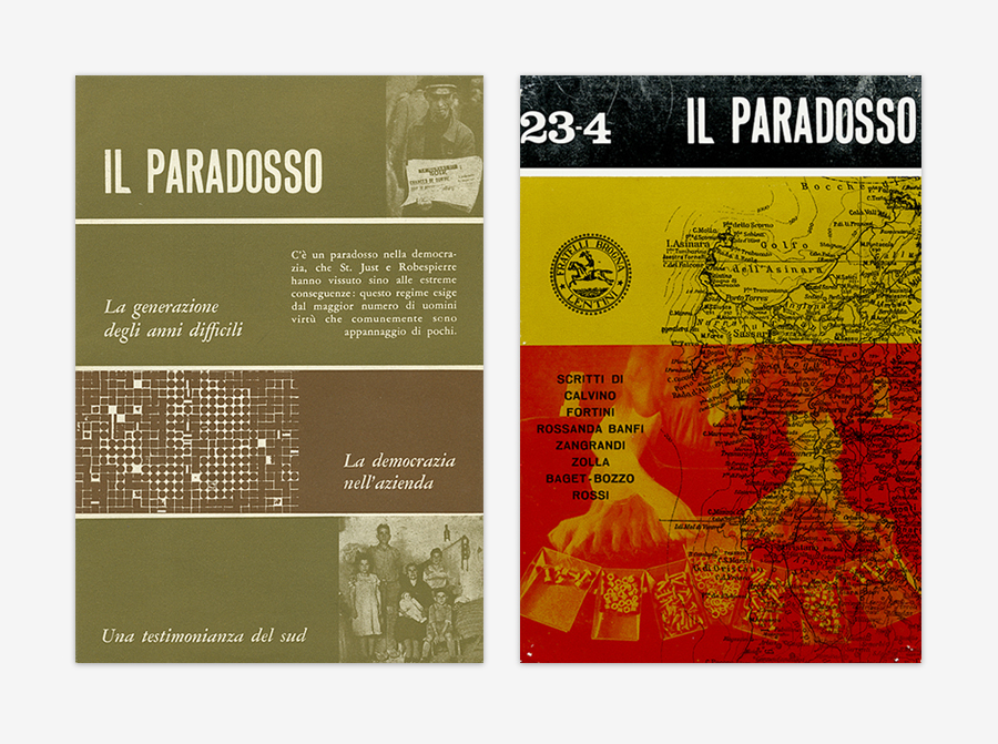
Il Paradosso
Magazine
c.1959-64
As the subtitle stated, it was a discussion and research magazine of youth culture. “Il Paradosso (The Paradox) was a magazine published on an irregular basis, which strove to bring together different lines of politics: reformism inspired by British Fabian Labour politics and progressive Catholic politics.” Previously unseen on the internet.
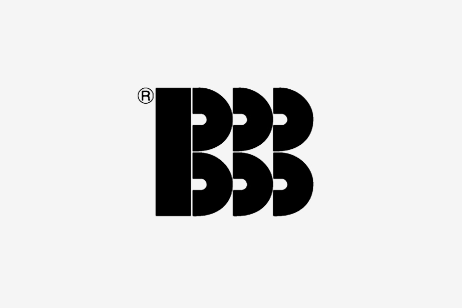
BBB Bonacina
Trademark
1968
A visually bold but graphically simple mark for an Italian furniture company run by three brothers, that’s way the triple repetition of the letter.
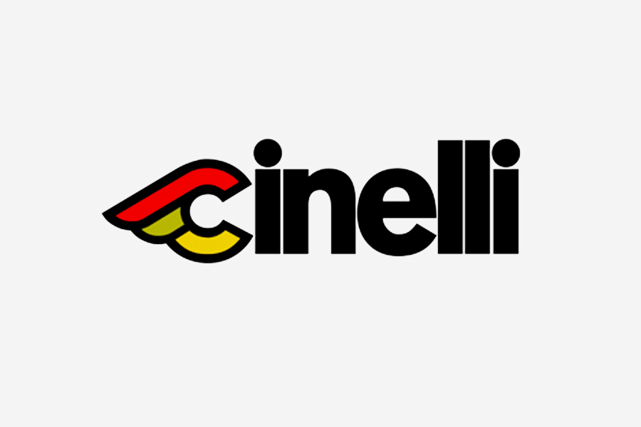
Cinelli
Mark-Logotype
1979
Designed for an Italian manufacturer of race bicycles. The colorful winged ‘c’ clearly communicates the idea of speed, in a simple then effective way.
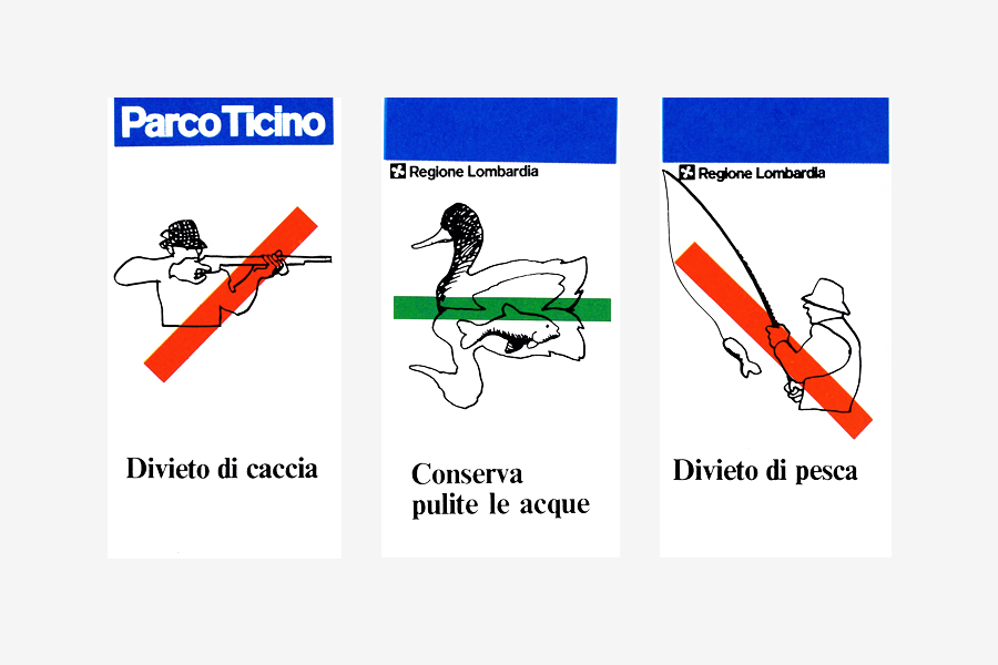
Parco Ticino
Sign System
1980-82
Signage for the Parco del Ticino (Park of the Ticino Valley), later adopted for all the Parchi Regionali della Lombardia (Regional Parks of Lombardy). After the great era of geometric pictograms and abstract symbols, Lupi asked to Ferenc Pintér to illustrate the signs with figurative drawings that, he realized, better fitted the quietness of the parks, thus offering the visitors a friendly yet clear communication enhanced by colored bars that add a doubtless meaning to the picture. The logotypes is set in Akzidenz-Grotesk. Previously unseen on the internet.
Fiorucci
Logotype
1981
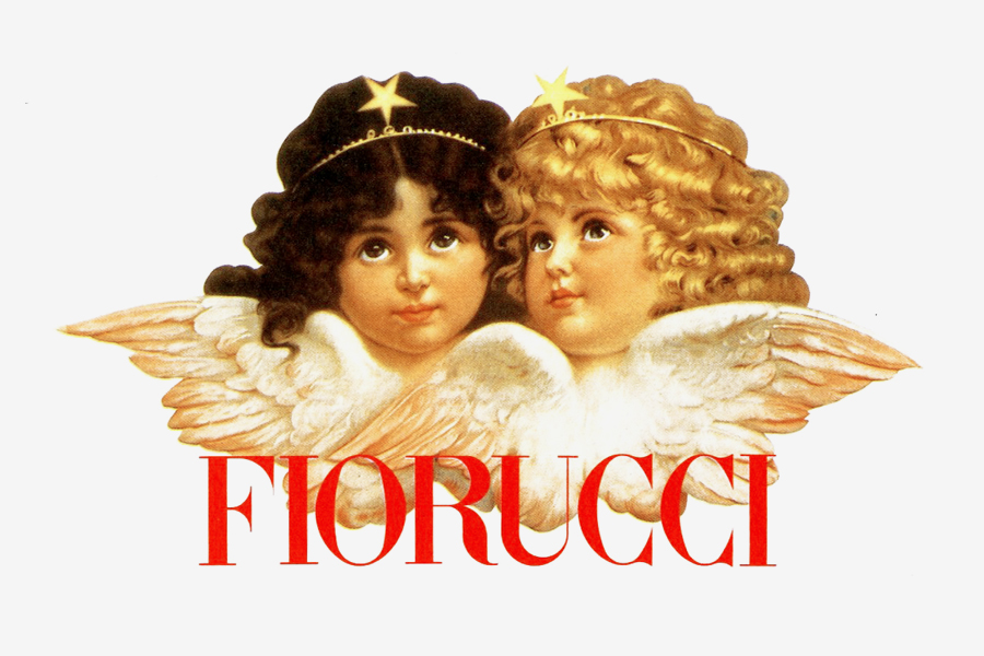
Designed for the worldwide renowned fashion artist, Emilio Fiorucci. Lupi assembled a Victorian illustration from an English postcard with an elegant logotype set in Didot Condensed. The intuition of Lupi was to use a classical illustration to represent a pop culture company. The contrast was beautiful and the impact was strong. Designed with Mirelli Clemencic.
Museo Poldi Pezzoli
Mark
1981
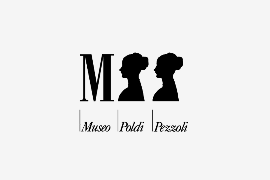
A Milanese icon designed for Museo Poldi Pezzoli. The two ‘P’ have been substituted with the elegant and iconic silhouette of Pollaiuolo’s “Portrait of a Lady” (1470-72), which is the best-known piece in the permanent collection of the museum.
Triennale
Mark
1981
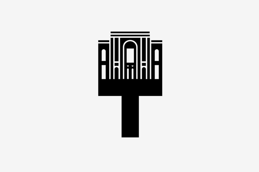
An international icon, the official mark of La Triennale, Milan. The ‘T’ of Triennale has been crowned with the façade of the Palazzo dell’Arte, the building that houses the Triennale exhibition, thus generating an oustanding mark that can last forever.
IBM Italia
Annual Report
1984
“The most elaborate of all the publications I had the honor of handling during my time as a design consultant for IBM Italia, featuring an alteration of the mark—the first to be authorized by Paul Rand—designed by my own.” Designed with Rob Barré, a Dutch graphic designer based in Italy. The image shows back and front cover.
Napoli
Poster
1984
Designed for Napoli ’99 Foundation to celebrate the cultural heritage of the city. It features two of the city’s most-known personalities: Pulcinella and Benedetto Croce. It was part of a series of posters designed by some of the best-known graphic designers of the 1980s. Other series followed in the following years.
Palazzo della Pilotta
Poster, 100×70 cm
1986
A poster promoting the renovation of La Pilotta, Parma, after the implementation of the project by Guido Canali, a former schoolmate of Lupi at the Politecnico University. The poster features Parmigianino’s painting “The Turkish Slave” (1533), from the Parma National Gallery, housed at La Pilotta together with the Parma National Archaologic Museum, and the Palatina Library with Bodoni Museum.
Alvar AaltoPoster, 100×70 cm
1988
An irriverent but intelligent poster from a series challenging our vision of the masters of contemporary architecture and design: Aalto, Le Corbusier, Mies, and Ponti. Illustration by Steven Guarnaccia. Designed for Domus. The entire series is published on the
Archivio Grafica Italiana.
The Italian Manifesto
Poster
1989
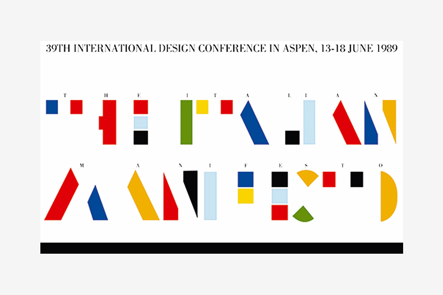
Designed for the 39th International Design Conference in Aspen, Colorado. Previously unseen on the internet.
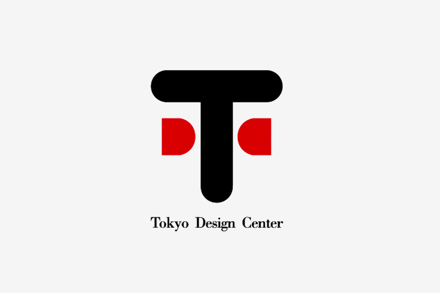
Tokyo Design Center
Mark
1992
Mark for the Tokyo Design Center, whose building was designed by Mario Bellini. The color is a clear reference to the Japanese flag. It visually generates an iconic face for the Center.
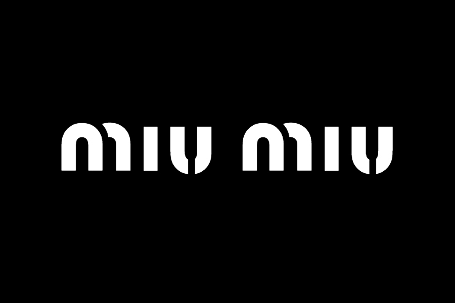
Miu Miu
Logotype
1993
Designed for Miuccia Prada’s fashion brand. Here, Lupi shows his great talent by graphically emphasizing the allitteration through the repetition of a few identical elements. It has already become a world classic. And Lupi still minimize: “I designed it in five minutes.”
50 Years of Vespa
Poster, 100×70 cm
1996
A celebrative poster based on the scheme of Harry Back’s 1930 London Underground Map, to suggest the endless routes and travels to ride with a Vespa.
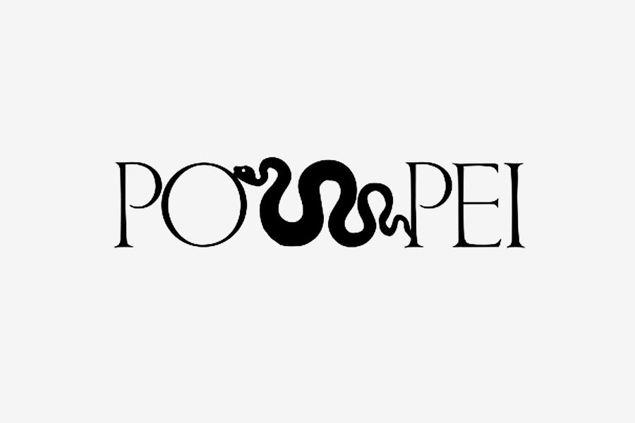
Pompei
Logotype
2001
Proposal for the identity of Pompei Superintendance Authority. The letter ‘M’ in trajan’s character is substituted by a roman snake, thus producing an iconic visual reference to the Roman culture. Designed with Marina Del Cinque. It could be an interesting logotype to promote the tourism in Pompei.
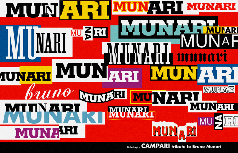
Munari Campari
Poster
2008
A beautiful tribute to the poster that Bruno Munari designed for Campari in 1964. Lupi substituted the name of the company with that of the designer. Designed for the exhibitions about Munari at the Ara Pacis, Rome, and the Rotonda della Besana, Milan. Previously unseen on the internet.
Grafiche Mariano
Calendar, 84×59.5 cm
1990-2015
Since 25 years Lupi designs a theme calendar for Grafiche Mariano, a major printing house based in Mariano Comense, Milan. It has become a Milanese icon, and an appreciated gift for many friends and designers worldwide. I assisted him on the design of the 2013, 2014, and 2015 editions. The mark Grafiche Mariano is designed by Pino Tovaglia. Previously unseen on the internet.
Italo Lupi did and is still doing a lot of great projects in museum and urban exhibition design. However, I have chose to limit the portfolio to the graphic production that better fits Designculture, and I think is the core of his career.
TO THE TOP ↑Links & Docs
Articles
Domus Graphic Autobiography
La Repubblica Straparlando (Ita)
Il Sole 24 Ore Nostra signora dell’acquarello
La Stampa Un album di idee
Sitographics Italo Lupi
Interviews
Print Sees All, Does All, Shows All
RAI Educational Italo Lupi
Profiles
AGI Italo Lupi
Italo Lupi Studio Official Website
Projects
Archivio Grafica Italiana Italo Lupi
Thinking Form Thinking Italo Lupi
Videos
ADI Design Movies
Fondazione Castiglioni Choosing the Logo
Interni Showroom Danese
SPD Design Talks
TO THE TOP ↑
Comments
Follow on Facebook
Partnerships

Archivio Grafica Italiana is the first digital resource to the Italian graphic design heritage. Founded by Nicola Munari in 2015.

Design consultancy based in Piacenza, Italy. Founded by Nicola Munari in 2015, it operates in the whole field of design.
TO THE TOP ↑
© 2013-16 Nicola-Matteo Munari. All rights reserved.

 A.P.G. Castiglioni, Spinamatic, 1964, beer tapster for Splügen Bräu’s beer house in Milan.
 Artisans hand-painting lettering for the 10th Compasso d’Oro Exhibition at the Sforza Castle, Milan, 1970. Courtesy of Italo Lupi. Previously unseen on the internet.

