Richard Danne
Kingfisher, Oklahoma, USA, 1934
Who’s Who
Richard Danne is an internationally acclaimed American graphic designer.
Born in 1934 at the depth of the Great Depression, Danne was raised on an Oklahoma farm during the Dust Bowl. After studying music and art at the Oklahoma State University, he attended the UCLA Graduate School of Design (1952-57).
He began his independent career in Dallas in 1959 and moved to New York City in 1963, where he practiced for 35 years as a founding partner of Gips & Danne (1964-69), Danne New Center (1969-73), Danne & Blackburn (1973-84), and Danne & Associates (1985-2005). After a stay at Cape Cod, he relocated to Napa Valley in early 2006, practicing as Danne Design together with his wife Barbara as a partner.
During his career, Danne worked in the whole field of graphic design from books to posters, from logos to major corporate identity programs, also serving as consultant to leading organizations such as AT&T, DuPont, FIT (Fashion Institute of Technology), Harvard Business School, NASA, Paramount, and Seagram.
Most of all, Danne is best-known for being the design director behind the legendary NASA visual identity program of 1975, one of the most famous corporate identity projects ever made as well as one of the best. In particular, the NASA Graphic Standards Manual is still today one of the most beautiful, comprehensible, and enjoyable design manuals ever produced.
In 1974 he was elected to the AGI (Alliance Graphique Internationale), and he also served as President of AGI US for eight years. President of the AIGA (American Institute of Graphics Arts) from 1977 to 1979, he later organized and was Founding President of AIGA NY. Danne also fostered the transition from the New York Club to the National Chapter-based Organization and served on the board of the Third Street Music School, the New York Public Library, the Center for Coastal Studies and the Napa Valley Jazz Society.
He was judge in many competitions, lectured at conferences and university, and has been widely published in numerous magazines including Communication Arts, Idea, Industrial Design, and Print. For several years, he also taught at the SVA (School of Visual Arts) in New York City.
Among other recognitions, he received three US Presidential Awards for Design Excellence, the AIGA Medal, the Fellow Award from AIGA San Francisco and was named a Graphis Master.
I wish to thank him very much for his enthusiasm in sharing his experience.
Enjoy your reading,
 TO THE TOP ↑
Quotations
“A classically trained graphic designer, Danne has applied a fresh, contemporary sensibility to every project he has undertaken,” Markagerthe P. Laurenzi.
“Richard Danne has lived and practiced design by a singular principle: Create work that has beauty, simplicity and permanence,” Margarethe P. Laurenzi.
TO THE TOP ↑
Q&A
Published June 27, 2021
Recorded March 10-15, 2021
What job did you want to do when you were a child?
I grew up on a farm in Kingfisher, Oklahoma, during the Great Depression and the Dust Bowl. Not a great beginning, yet I was the youngest of a wonderful family. It was work, work, work, but on my own time I quickly developed an interest in the Arts—specifically in Music! My mom was an excellent pianist and all our family played piano and another instrument. (I played trumpet and valve trombone as a professional jazz musician later).
Where did your interest in graphic design come from?
I’m not sure, but in grade school and high school I drew constantly. I designed cars and carved them in clay or wood. Some people thought they were very progressive, including my dad (who only had a third grade education). I also designed posters for class events, though there were no Art classes offered. These were early indications of what I would do with my life.
When and why did you choose to become a graphic designer?
I always gravitated to it, but it was when I attended Undergraduate school.
What was your educational path?
I attended Oklahoma State University and majored in Engineering, mostly to please my parents (a Real job!). Although this experience was not a waste of my time, I switched to Art in my sophomore year (second year). No design courses were offered at OSU but I designed campus posters for music events, and for the International Relations Council, etc. and I became very interested in type fonts and their uses. My professors recognized that I wanted to design and allowed me to create my own curriculum for my last year. One teacher in particular helped me gain acceptance to the UCLA Graduate School of Design. I drove to Los Angeles directly after graduating from OSU and I discovered the World of Design… I was in heaven!
What are the people who most influenced your conception of design? And what did you learn from them?
A couple of classmates, though mostly the working professionals in LA at the time like: Saul Bass,
Lou Danziger, Charles and Ray Eames. It was a very robust time and I excelled in Grad School and even won a scholarship for Special Studies at the Los Angeles Art Center. Our class was also exposed to the best designers in New York and Chicago: Lou Dorfsman, Herb Lubalin, John Massey, to name a few.
Has your approach to design changed during the years? And if so, how did it evolve?
I believe there has been some metamorphosis, but I remain true to the principle of “Timeless Design,” that design which holds up for decades! I started as a freelance designer in Dallas, Texas, designing advertising, promotion, and everything else. It was a great start. The work was vibrant, colorful, more carefree. Later, in New York, I transitioned into much more serious assignments for large-scale organizations. There was a natural shift to Program and Systems work and the design reflected the concrete nature of these important, more profound projects. These were for well-known national/international companies and so the design had to reflect different goals and objectives.
What do you think are the qualities of good design? What are the aspects to consider in order to understand if a design project is more or less good?
I feel the work should be distinctive, have impact, and be memorable. Time is the ultimate judge as to whether the public rates the design to be effective and appropriate. If the client has retail products, then one can judge by increased sales. If it is for Public Media or image, then it will be reflected in a rise in stock value, and goodwill.
What is the role of graphic design in the society? Do you think that its role has changed over time, or is it always the same?
I believe its role has changed and not necessarily for the better. The Web, the Internet has had a remarkable impact on the world of design. Solutions are often conceived for quick, instant use: Now you see it, now you don’t! The best of design done in the past had a much longer shelf-life and was honored accordingly. I lecture often, and do many podcasts with young UX designers: They all seem to be longing for the “golden age” of design. It is bringing us closer together, and I really like that, but it will take many decades before we know where this all lands.
What is the role of beauty in your graphic design? Do you think that design shall be beautiful in order to better perform its function?
Not necessarily, no. Sometimes it needs to be rougher, or stronger, just to make a point or garner attention. Having said that, I personally am interested in bringing a kind of beauty to an ever-increasing, ugly world. There is so much competitive “noise” surrounding us and I strive to counter this intrusive material and offer a calm respite from the cacophony.
I am fascinated by the idea of connections between music and graphic design—and typography in particular—in terms of arrangement, rhythm, tone, etc. Do you think that your background in music influenced your design, and if so how?
Without a doubt, they are very synchronized. It’s about point and counterpoint (Bach), about dynamics, the proper tone, rhythm and pace. Lyricism can be expressed in both mediums and that helps the flow and contributes lasting qualities.
Do you think that graphic design can be considered as a form of art? Or should it be something closer to engineering?
Interesting question! I do believe that, at its best, it can be highly artistic, valuable, and memorable. But I don’t think it should be compared directly with Art. I’ve often said that if one wants to be an audience of one, then Paint! On the contrary designers work for large audiences, in the thousands or millions. This means our work must do a job and perform for the client. Happily, and in many cases, the designer accomplishes it all—pleasing the art world, the client, and oneself. As you know, I started in Engineering and I feel design employs many of the same principles. Creating large, complex design programs and getting them off the ground requires engineering savvy. Building something formidable, strong and lasting, requires solid planning and smarts.
Should design produce things that are necessarily useful?
No, not always. Some graphic design can simply make you smile, or feel good, or bring pleasure. I believe the role of the Industrial Designer is almost entirely dedicated to Function! I greatly admire fine industrial design, and feel it has benefited society.
From many aspects, I think it is possible to say that your design is rooted in modernism. What is modernism for you and what does it mean, for a designer, to be a modernist?
Tough to answer: Yours is a true statement, that modernism is at the core of my work. I believe modernism implies a complimentary mix of problem-solving, useful information, dramatic use of color, forms, and typography that is concrete, not flip of superficial, and is long-lasting.
So do you think design should produce things that last as long as possible? If so, why and how is that possible?
Yes, I believe in permanence… and solutions that stand the test of time. Put another way, solutions that are not temporary or disposable! I can’t fully explain it, I think my work is intuitive and I’m proud that is has held up for years.
You have designed some important graphic standards manuals, the most famous of which is that of NASA. What is the value and usefulness of such a document? And what does it mean from a design point of view to define a coordinated program, so complex and articulated?
This is important work! These documents are meant for the ages rather than the moment. I’ve worked on many oversized design programs like NASA and have strong feelings about them. They cannot be taken lightly, they may look glamorous going in, but they are monsters to complete with style and integrity. Most especially the Public Programs we created like: Department of Transportation, Federal Aviation Administration, NASA, the New York Power Authority. These Standards Manuals have guaranteed the organization will enjoy strong, and consistent messaging and “look” for decades. They are also very cost-efficient (very important in the Public realm) and gives the internal staff a wonderful blueprint/path to follow.
As a European, when I think to the history of communication in the U.S. I think first to advertising and then to design. Do you think that advertising and design are two different worlds with different purposes, or do you think that they share the same purpose?
You are right to think of it that way. Advertising led the way in America for years—very creative, very, persuasive, and all-pervasive. However, design was close on its heels and ultimately the two mediums fused. I think good design survived longer than good advertising, but today’s agencies offer both and they are entwined. They often have the same purpose though advertising might have to be more aggressive, more forward to get results. Design still enjoys a somewhat rarified air.
In the 1960s and 70s many graphic design projects—in particular graphic programs of public interest—seem to have been designed in a very conscientious and responsible way, embodying the aspiration of building something useful for the people, not only for today but with a vision of the future.
Today, on the contrary, many communication projects seem designed simply to change by doing something different for its own sake. Do you think that designing with a future perspective has failed, because continuous change has prevailed? Or do you think that we still have an urgent need for projects of public utility with a future vision?
Often it is: Change for Change Sake. So I think, to some degree, the plan has failed. However, by no means is it over. It requires a renewed commitment from designers and managers to seek a more lasting image and value for their organizations. There is an old adage: “What goes around, comes around” which implies that, over time, the ship will right itself. Everything will likely come Full Circle and the transitory NOW will not be as prevalent in the future. The young designers I’m in contact with are focused on a return to the principles of earlier decades. They are totally immersed in “Style Guides” (the current and sexier title for Standards Manuals). Things are looking up!!!
What is your ultimate goal as a designer?
To positively affect as many organizations and as wide an audience as possible. To help lead the way in our profession (a six-decade commitment for me), and to create handsome work which is “timeless.”
What would you suggest to a young graphic designer, who is approaching this profession today?
Be open minded, never stop learning, associate yourself with talented mentors and colleagues, and work very hard! Always consider how you can help elevate the profession, not just your own career.
What was your favorite game as a child?
“Hide and Seek”. We were somewhat poor on the farm and had to make our own fun!
Thank you very much.
Thank you.
© 2021 Nicola-Matteo Munari. All rights reserved.
TO THE TOP ↑
Portfolio
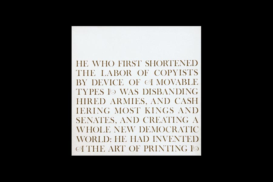
The Art of Printing
Booklet
1962
Promotional booklet for Robert Willmans Printer, featuring texts by C.A. Nicholson.
100
Mark
1964
Designed for the 100th anniversary of the Printing Industries of New York.
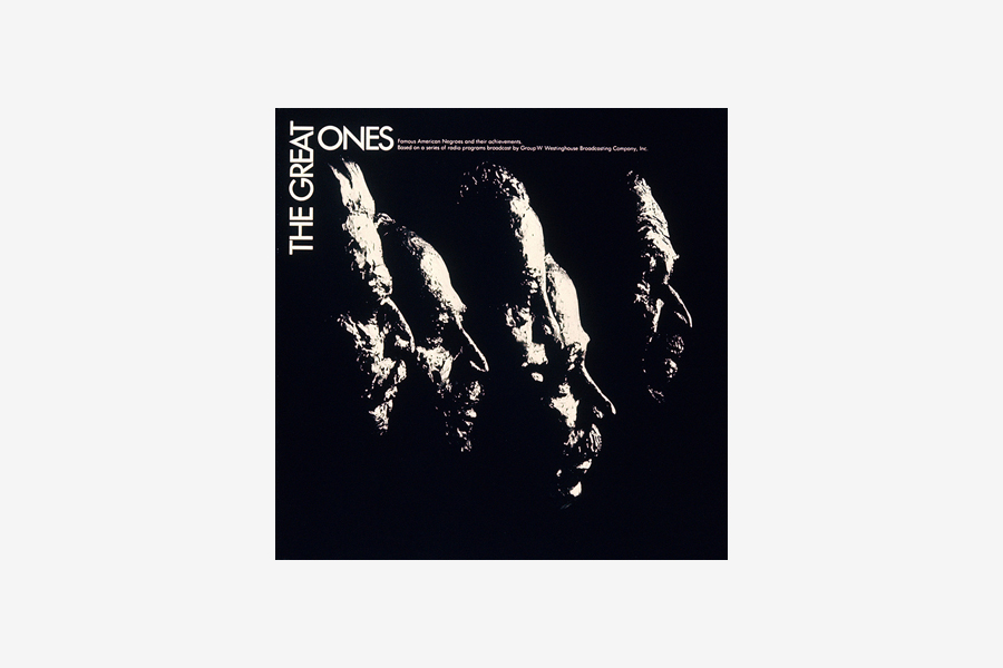
The Great Ones: Notables in Black History
LP Cover
1966
LP cover and case designs for Group W, Westinghouse Broadcasting. Photo by Hermann Backmann.
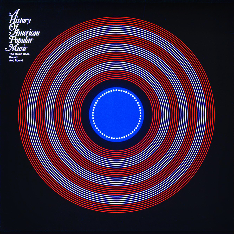
The Music Goes Round and Round
LP Cover
1967
LP cover and case designs for Group W, Westinghouse Broadcasting.
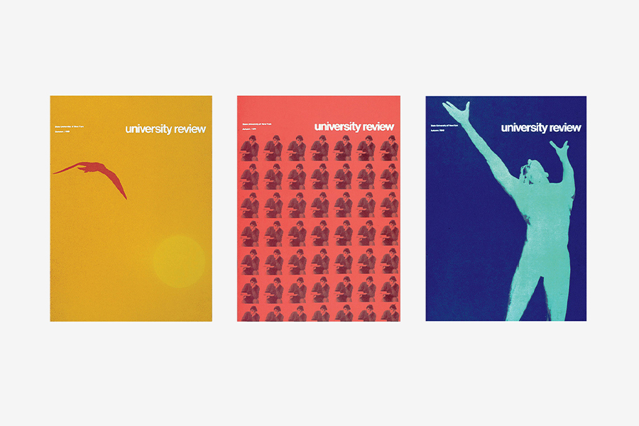
University Review
Magazine
1968
Quarterly magazine published by the State University of New York. Designed by Richard Danne at Gips & Danne. Photographs by Hermann Bachmann and Al Geiss.
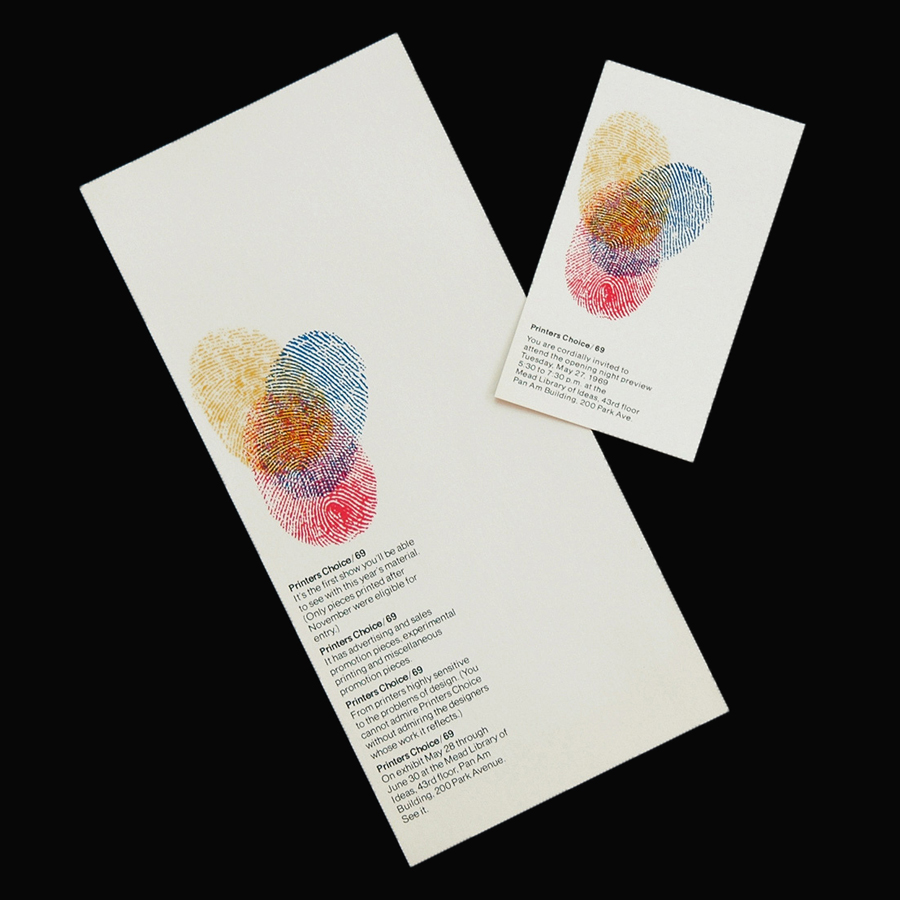
Printers Choice/69
Flyer and Invitation
1969
Designed for the Mead Library of Ideas, Pan Am Building, Park Avenue, NY.
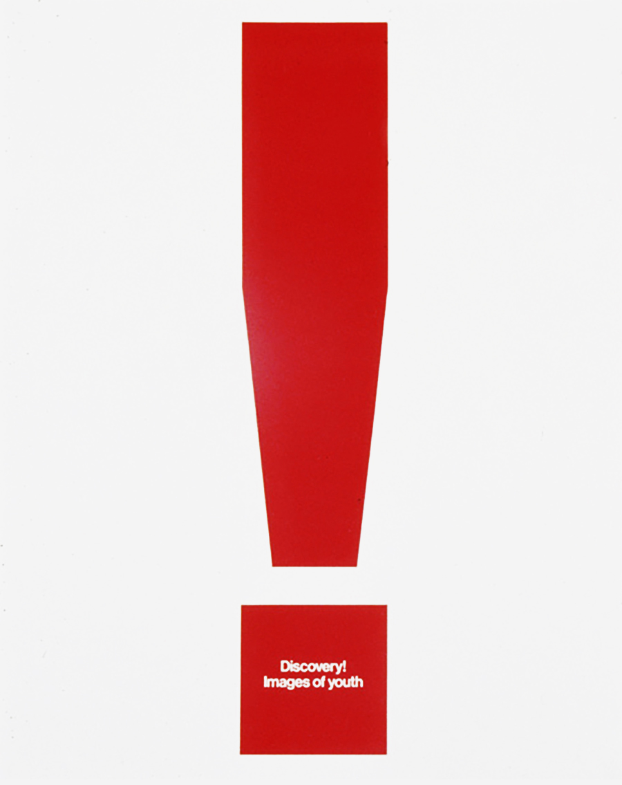
Discovery!
Poster
1972
Promotional poster for an exhibition of the Boy Scouts ‘Boys Life Magazine’. Designed with David Griffing.
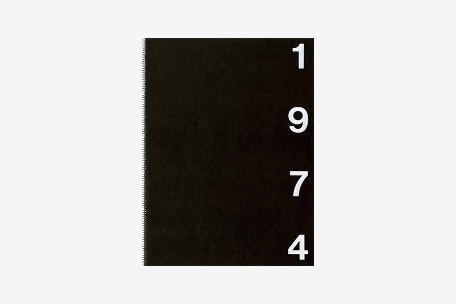
1974
Agenda
1973
Appointment calendar designed for S.D. Scott Printing Company.
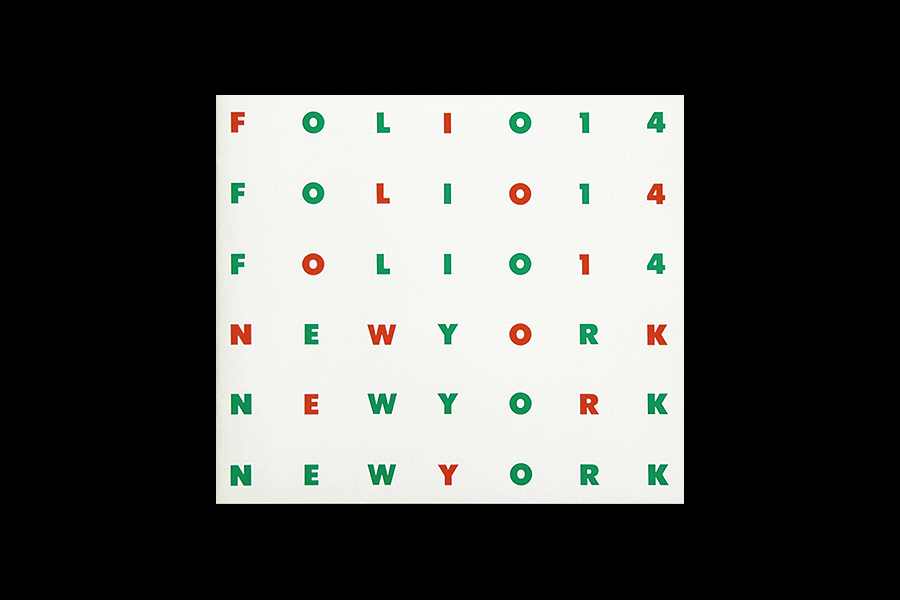
Folio14
Booklet
1973
Promotional booklet designed for Mead Paper and Sanders Printing.
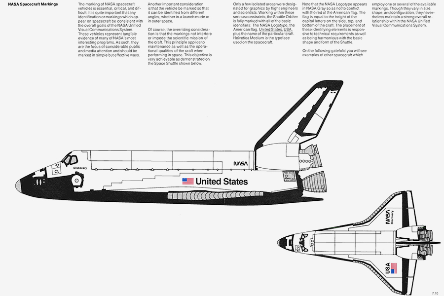
NASA
Corporate Identity and Graphic Standards Manual
1975
Corporate identity and graphic standards manual for the NASA (National Aeronautics and Space Administration). Designed by Richard Danne and Bruce Blackburn with Stephen Loges.
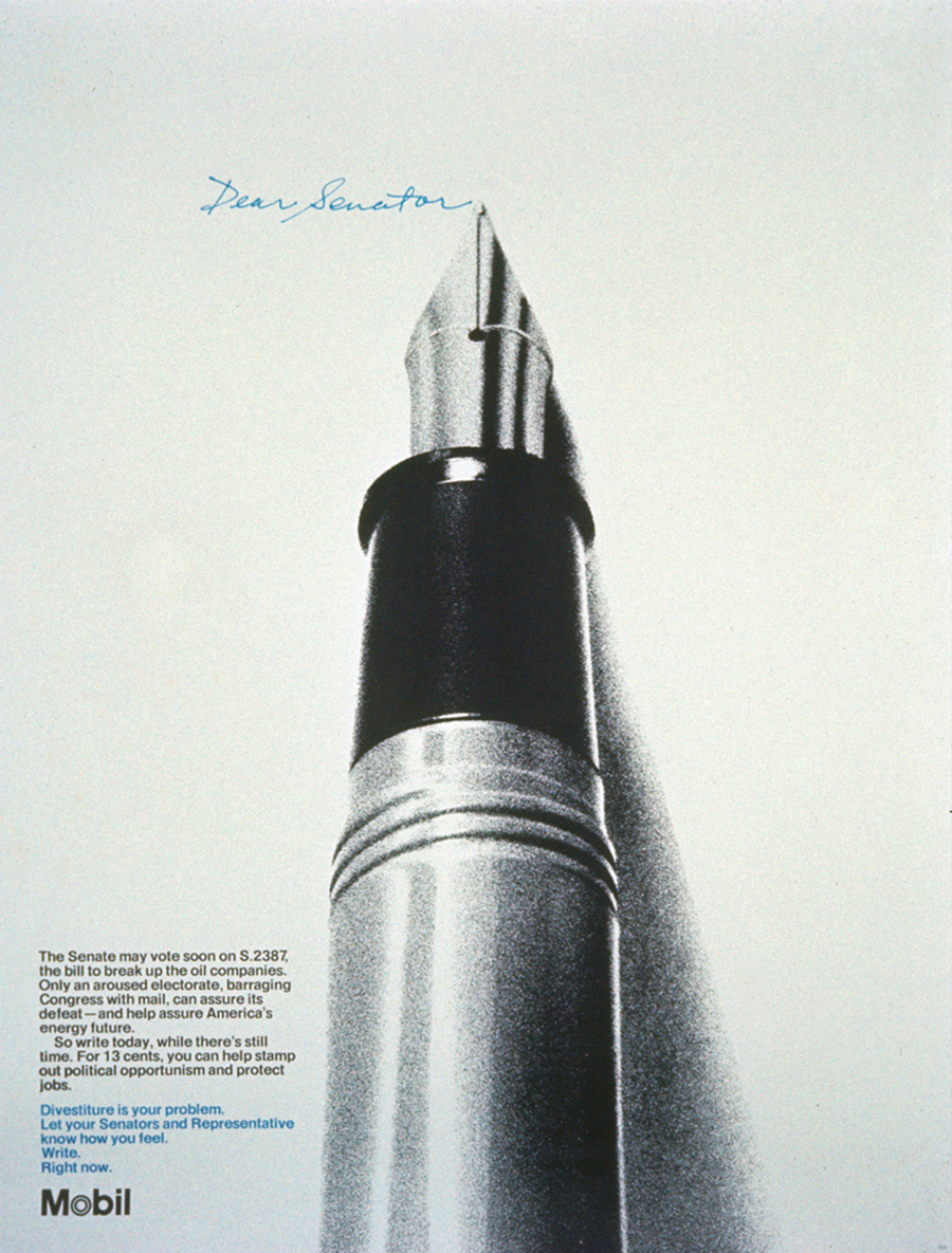
Dear Senator
Poster
1976
Poster for Mobil by Danne & Blackburn. Designed by Richard Danne. Creative direction by Herb Schmertz.
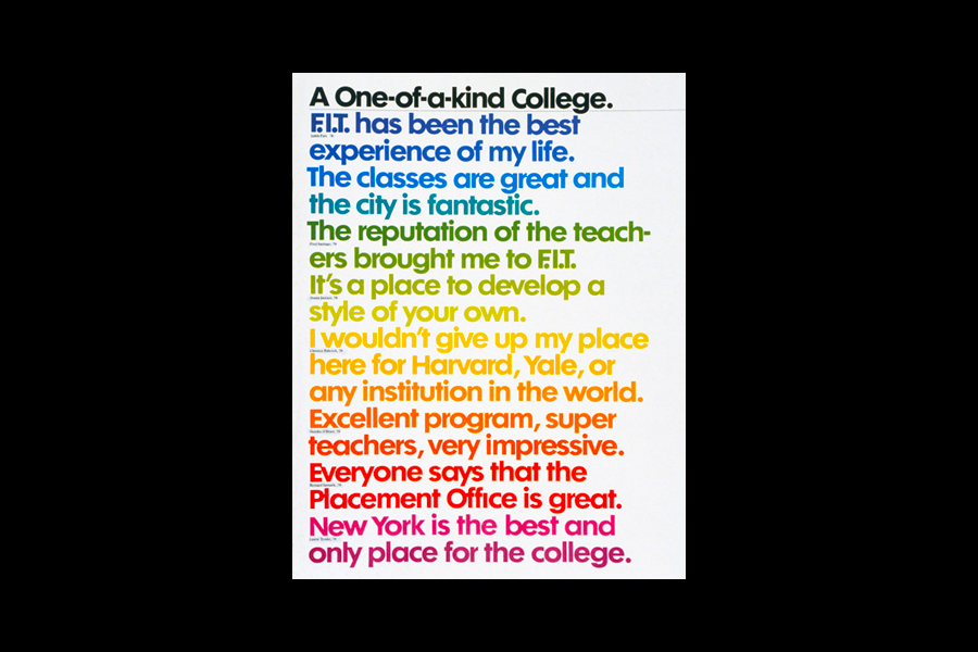
A One-of-a-kind College
Brochure
1976
Promotional brochure for the Fashion Institute of Technology. Texts by Linda Olsheim.
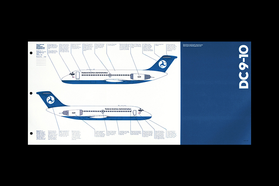
Federal Aviation Administration
Graphic Standards Program
1980
Designed by Richard Danne with Kevork Banian, Bruce Blackburn, and Donald Meeker at Danne & Blackburn.
Going to Work in Space
Poster Series
1980
Promotional posters for the NASA (National Aeronautics and Space Administration).
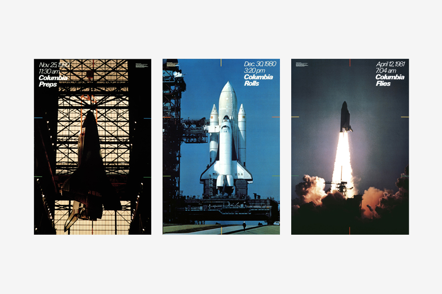
Columbia Maiden Flight
Poster Series
1981
Part of the poster series dedicated to the Space Shuttle Columbia. Designed for the National Air & Space Museum.
New York Power Authority
Mark
1983
Part of the graphic standards program designed for the New York Power Authority.
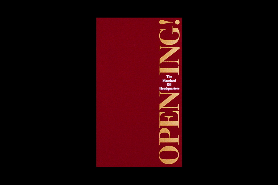
Opening
Press Materials
1986
Part of the press materials designed for the opening of the Standard Oil Company World Headquarters.
Surgical Design
Mark
1987
Designed for a developer/producer of surgical instrumentation for the eye.
Ambac Connect
Symbol
1996
Designed for a government procurement software.
Kid Knowledge
Mark
2009-10
Part of a visual identity system for teaching Science to K-2 children.
The Space Watch
Watch
2021
Limited edition watches designed for Anicorn.
Links & Docs
Articles & Resources
Danne Design Official Website
AIGA Awards
CEROS The Story of NASA’s Logo Design
Creative Review How the NASA worm logo was designed
DesignWeek How Danne & Blackburn designed the NASA Worm
Graphis Master Portfolios
PRINT Pitch Deck of NASA’s Worm Logo
Standards Manual NASA Graphics Standards Manual
Interviews
AIGA San Francisco Fellow Series
NASA Ep 154: The NASA Worm
Videos
Afocal #1 Richard Danne
AIGA Medalist
Ask Me Anything Richard Danne
Clarity Designing for Earthlings and Austronauts
Collins Richard Danne shares his 1975 NASA design program
Cronan Metamorphosis
Standards Manual NASA Graphic Standards Manual
Strand Book Store Richard Danne & Michael Bierut
TO THE TOP ↑
Comments
If you wish to add a comment please feel free to write at
info@designculture.it
TO THE TOP ↑
Follow on Facebook
Partnerships

Archivio Grafica Italiana is the first digital resource to the Italian graphic design heritage. Founded by Nicola-Matteo Munari in 2015.

Design+Branding firm based in Piacenza, Italy.
Founded by Nicola-Matteo Munari in 2015.
TO THE TOP ↑
© 2013-21 Nicola-Matteo Munari. All rights reserved.

