Stuart Ash
Hamilton, Ontario, 1942
Who’s Who
Stuart Ash is an internationally renowned pioneer of Canadian graphic design.
He studied graphic design at the Western Technical School from 1957 to 1962, and at the Ontario College of Art from 1962 to 1964. Once graduated, he started an apprenticeship under Anthony Mann at Cooper & Beatty in Toronto. Cooper & Beatty was commissioned to create Canada’s Centennial Symbol and arranged to collaborate with Paul Arthur and Associates on the project. It was there where he met the Swiss designer
Fritz Gottschalk who at that time was working in the Montreal office of the prestigious Paul Arthur+Associates on the Expo 67 sign system.
In 1966, after
Gottschalk withdrew from the agency, they started to work together and founded Gottschalk+Ash in Montreal, that soon became one of the world’s best design firms rivaling with Pentagram, Total Design, and Unimark International.
In 1967 the Canadian Confederation celebrated its 100th anniversary and Stuart Ash’s symbol design was selected as the official mark for the celebrations, a geometric, multi-colored maple leaf formed by eleven equilateral triangles representing Canada’s ten provinces and the Northwest Territories. The mark was widely applauded, and in 1968 Ash was awarded the Canadian Centennial Medal for his role in designing the Centennial’s identity program.
In 1972 the firm Gottschalk+Ash opened another office in Toronto and Ash made the city his new home. An office in New York—opened in collaboration with Ken Carbone and Leslie Smolan—followed four years later. In 1978
Gottschalk established a new office in Zurich, and another one—cofounded with Walter Ballmer—followed in 1982 in Milan. At the same time, Ash took over the business responsibilities in Montreal, Toronto, and New York City, and in 1997 he opened another office in Calgary. He stayed at the head of the agency until his retirement in 2007, at which time he sold the Canadian, Toronto and Calgary Offices of Gottschalk+Ash.
Since its foundation, Gottschalk+Ash served major clients including American Airlines, Calgary Airport, Four Seasons, Montreal Museum of Fine Arts, Ottawa Airport, and Shell Oil. Today, the Swiss office of the company still works in Zurich as Gottschalk+Ash International, headed by
Fritz Gottschalk himself and his partner Sascha Lötscher.
Member of the AGI (Alliance Graphique Internationale) since 1974, during his career he was awarded the Canadian Centennial Medal in 1968, the Royal Canadian Academy of Arts Centennial Medallion in 1998, the Society of Graphic Designers of Canada’s Lifetime Achievement Award in 2008, and was Honored by the Communication Design Association in 2011. His work has been exhibited in the Montreal Museum of Fine Arts, the National Gallery of Canada, and the Mead Library of Ideas in New York.
Enjoy your reading,
 TO THE TOP ↑
Q&A
Published June 19, 2016
Recorded May 13, 2015
What is your definition of design?
Graphic design that is functional, unadorned and simple, clear and concise.
What is the purpose of design?
Graphic design is about visual communication. It is about creating a visual idea that delivers a measured message to a predetermined audience.
What are the qualities of good design?
Good design is about simplification and consistency. “Less is more.”
Should design produce things, which are necessarily useful?
The consequence of good design is rather a search for the appropriate idea that elegantly solves a predetermined communication purpose. Therefore, in that sense, it is useful.
Should the products of design be beautiful?
It’s not about beautiful, it’s about a passion for details, typography, color, and iconic images, all maturing into communicating a powerful visual statement.
What do you think are the aspects to consider to understand if a project is of high quality?
High quality graphic design focuses on addressing the strategic business communication needs of the client while creating a focused consistent premium high-end communications solution.
What are the key features of your design?
While working at my first design job during the summer in 1962, I designed a mathematics textbook cover. Using mathematical symbols in a bold but simple idea, the design director enthusiastically accepted this minimalist approach. This influenced me totally and I embraced at that time classic austere graphic design that was functional, unadorned, simple, clear, and idea driven. After, having graduated from OCAD (Ontario College of Art and Design) in 1963, I worked as an intern with Anthony Mann at Cooper & Beatty. During this time, through Tony’s mentoring I came to appreciate that design was not just something you did as a “job”, but rather a way of life.
What is the necessary condition to practice design?
Fritz Gottschalk and I first met while the two design firms that we worked with—I with Cooper & Beatty in Toronto, and
Fritz with Paul Arthur and Associates in Ottawa—collaborated on a project to design Canada’s Centennial Symbol.
My mark was selected, a stylized maple leaf, constructed from 11 equilateral triangles, representing the ten provinces and the Northwest Territories which was the accepted geography of Canada at the time. This launched my career.
The clarity of this idea was exemplary in my work as the simplification of the idea formed the foundation and the visual result was both immediate and powerful.
Does design is one or there are many different ones?
When I started in design in the 1960s, the international style of design was not widespread in North America. It was just emerging through designers trained in Europe, such as
Fritz Gottschalk, Stefan Geissbuhler,
Massimo Vignelli, and others moving to North America. Also during this time in the 1960s, awareness for graphic design was enhanced through a number of well published, international CI programs, created by design pioneers: Paul Rand for IBM, Walter Ballmer for Olivetti, and Saul Bass for AT&T. A further example of this was
Massimo Vignelli’s design program for the New York Subway System
[Note: It was designed by Bob Noorda—who first designed a similar sign system for the Milan Metro—teamed with Massimo Vignelli and Peter Van Delft by Unimark International], and the simplification of the subway map design. It merged the graphic simplification of the relationship of the stations, and the routing in a geographically abridged relationship, which could be immediately understood.
What are the difference between art and design? Could design be art?
The task of the designer has evolved from design as a craft “executed by hand on the art-board”—“referred to as an applied art.” The practice of graphic design has evolved and increasingly become a strategic business communication tool executed electronically.
Does design require a handcraft or an industrial production?
The practice of design has also evolved—increasingly design took on a greater responsibility for both content and production through to fabrication. The role of graphic design also evolved from two-dimensional applications to three-dimensional architecture applications requiring of the design professional new technical qualifications.
To whom is design addressed? Is it for the masses?
With every new assignment, we found it was necessary to slowly build acceptance and awareness. Demonstrating with each solution how strategic based design could add business value and reach a wider audience.
Through our international exposure together with our reputation for strategic business based design, we have over the years attracted a number of like-minded enthusiastic and very talented designers to become part of the team.
Should the products of design be cheap or expensive?
Design is about creating something that is tasteful and timeless. It’s not about cost nor about ego, but rather a search for the appropriate idea. It’s about a passion for details, typography, color, iconic images, all maturing into what is called an international style. Design has been about addressing niches—creating a premium high-end business that focuses on sharing the same value system as the customer.
What job did you want to do in the future as a child?
My business-focused father inspired my career direction.
I came to appreciate his intuitive understanding in dealing with people; he totally trusted his perceptions in sizing up business situations and relied on his instincts in making his business decisions. Thus my approach has been to rely on my instincts in analyzing most design problems in search of a solution.
I grew up with typical Canadian values and evolved through the association with a number of early, mostly European mentors to appreciate timeless international design.
For me creating a graphic design business has rather been about building personal relationships, sharing similar values, and having a passion for quality. It goes beyond the typical business structure. There is more to it than just money.
Thank you very much.
Thank you.
© 2015-16 Nicola-Matteo Munari, Stuart Ash. All rights reserved.
TO THE TOP ↑
Portfolio
Canadian Confederation Centennial
Official Mark
1966
The mark was used on printed matters, flags, coins, etc. The symbol keeps this shape, but colors and filling patterns varied from application to application.
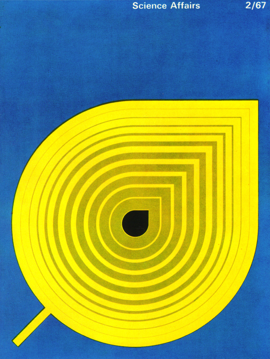
Science Affairs, n.2
Magazine Cover
1967
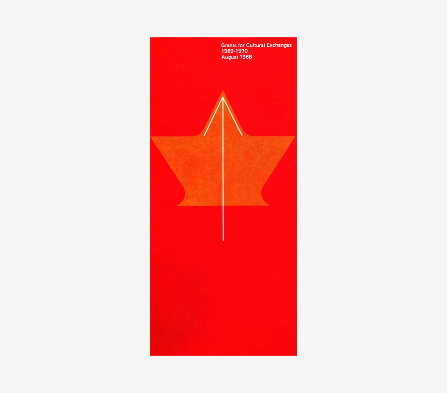
Grants for Cultural Exchanges
Booklet
1968
Published by the Canadian Commission.
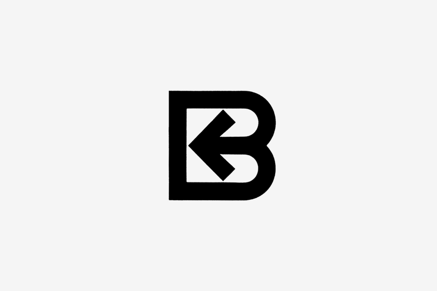
Reginald Bennet, Ltd.
Mark
1968
Designed for an importing company.
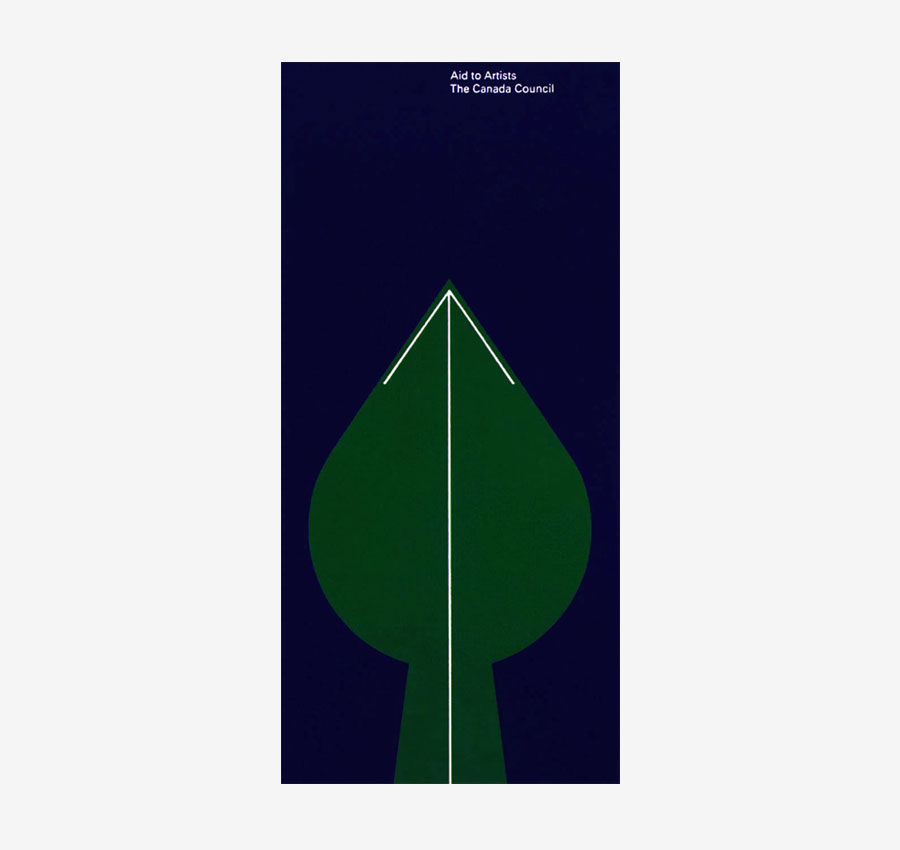
Aid to Artists
Booklet
1968
Published by the Canadian Commission.
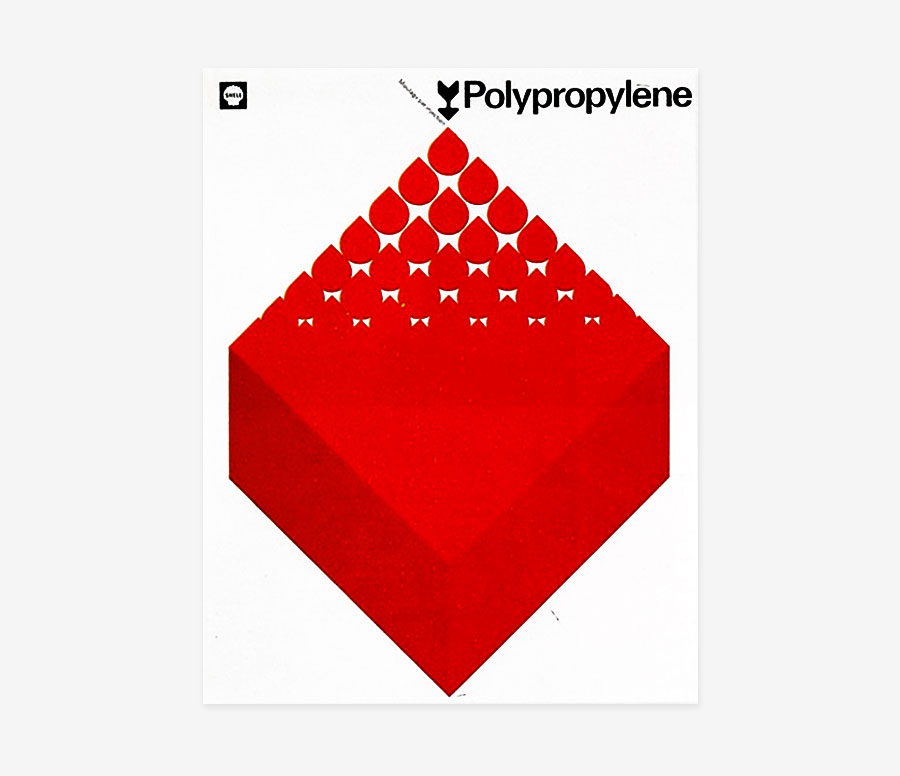
Shell Polypropylene
Brochure Cover
1968
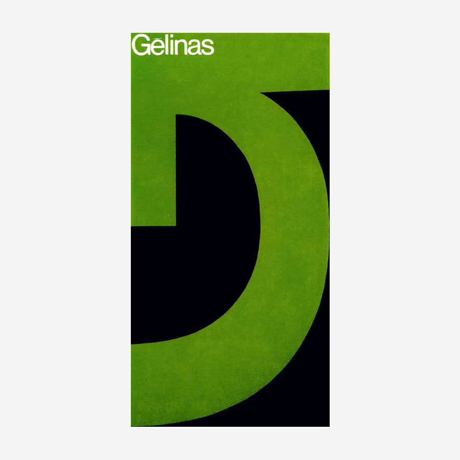
Gesser+Gélinas
Promotional Booklet
1969-70
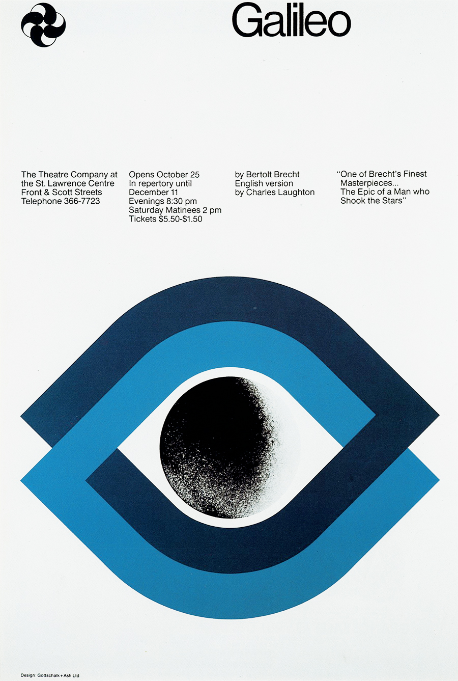
Galileo
Theatre Poster
1972
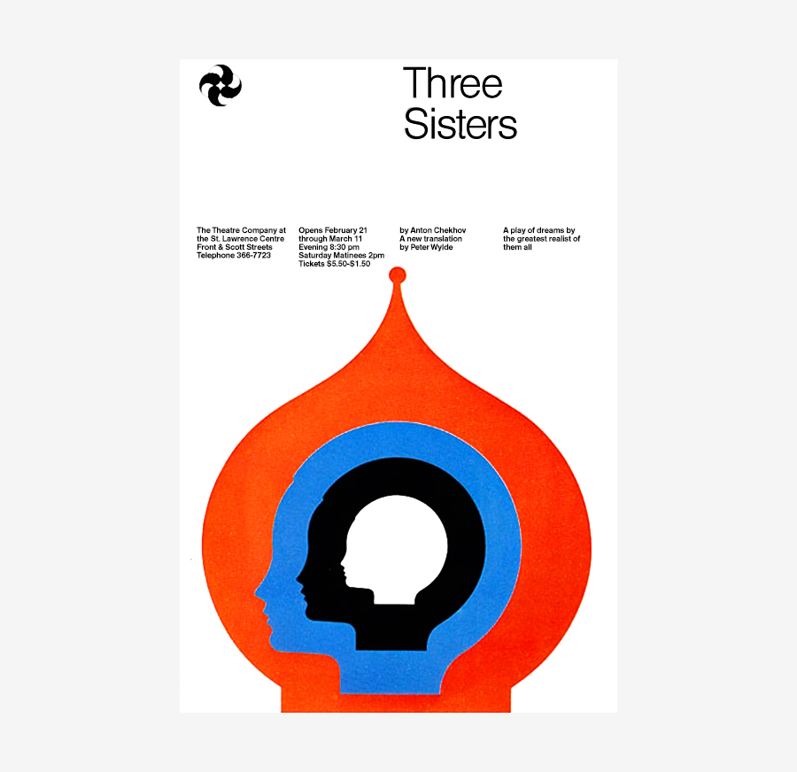
Three Sisters
Theatre Poster
1972
Copp Clark
Mark for a Toronto publisher
1973
Previously unseen on the internet.
Reilly Lock
Mark for a locksmith, Toronto
1973
Previously unseen on the internet.
Sudbury Transit
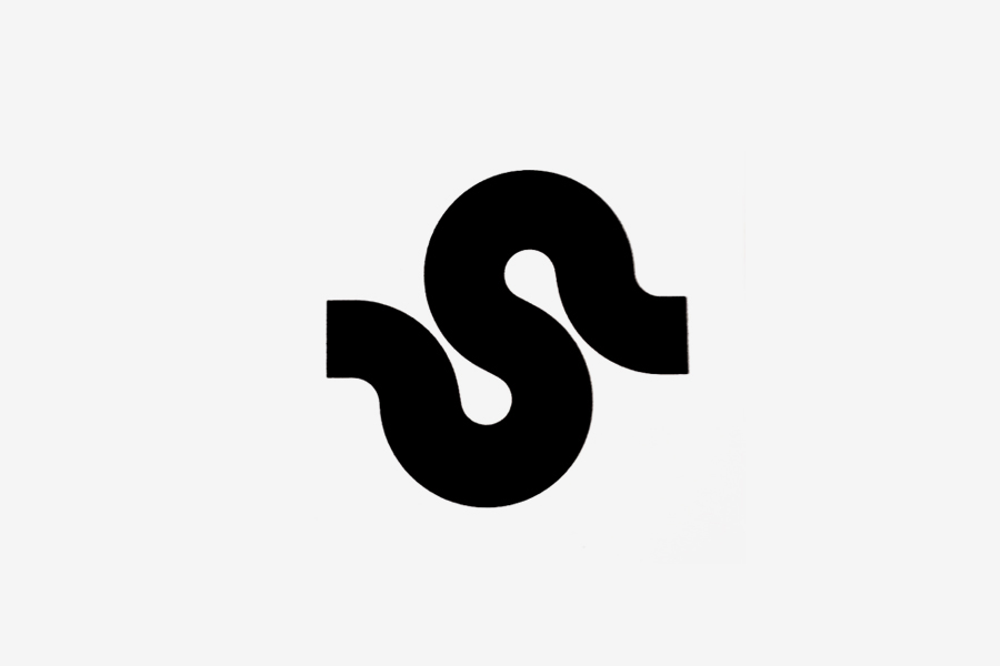
Mark
1972
Designed for the Municipal transportation system of Sudbury, Ontario. The symbol was also used for the bus liveries. Previously unseen on the internet.
York Centre
Mark for an office complex in Toronto
1973
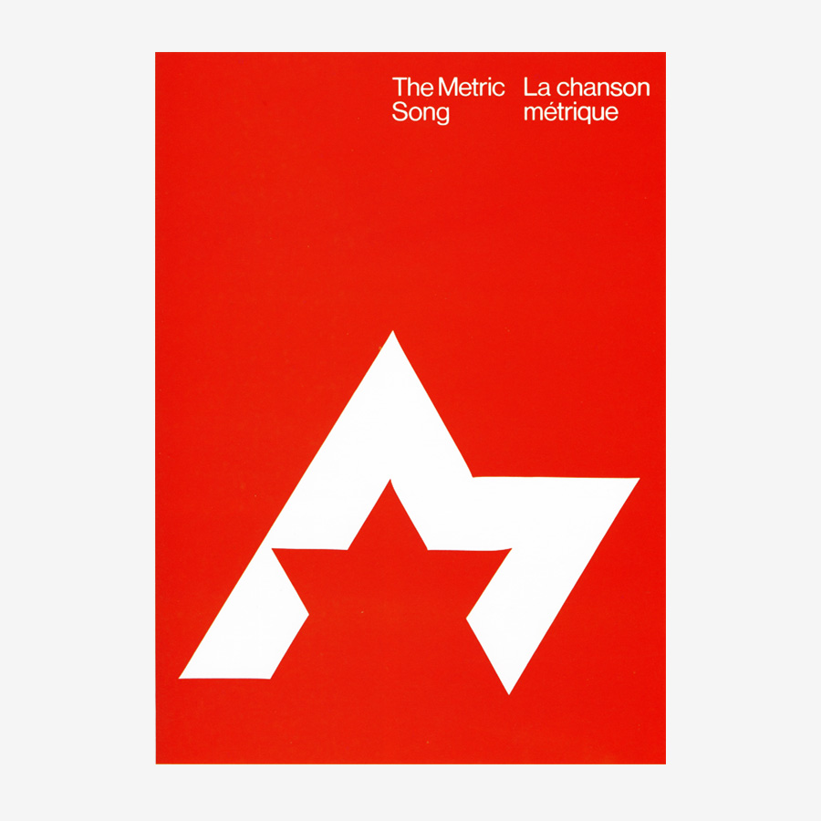
Metric Song
Brochure and Mark
1974
Brochure featuring the mark designed in 1974 by Stuart Ash for the Metric Commission.
Norcount, Inc.
Mark
1974
Designed for a Canadian national property managament and development company.
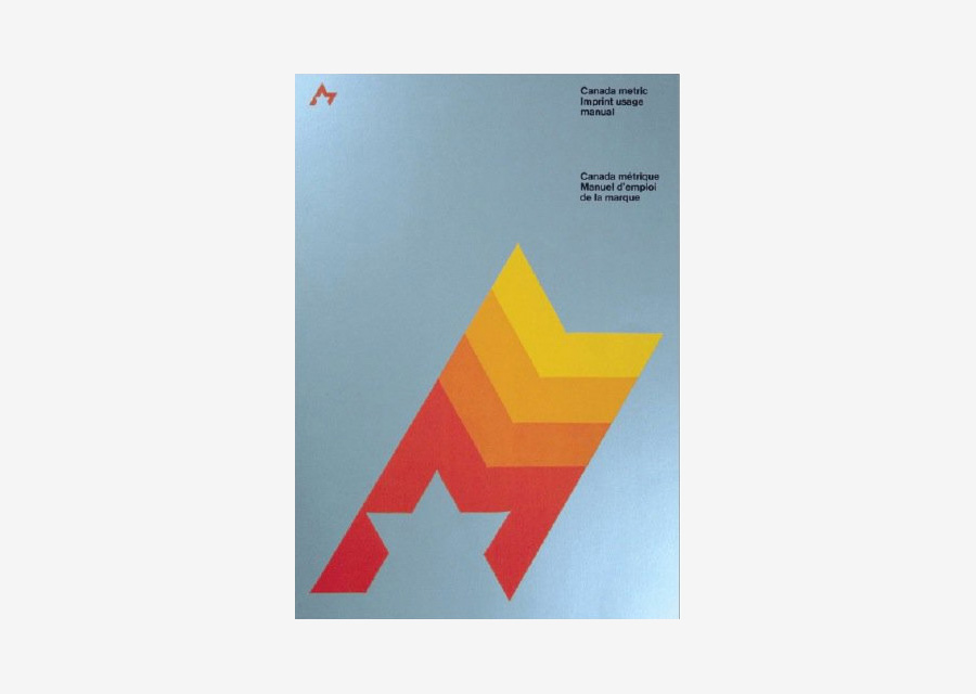
Canadian Metric
Design Manual
1975
Imprint Usage Manual for the Metric mark.
BerGold, Inc.
Mark for a jewelry importer from Toronto
1976
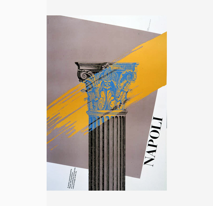
Napoli
Poster, 100×70 cm
1985
Designed for the Fondazione Napoli ’99.
Canadian Pacific Forest Products
Official Mark
1986
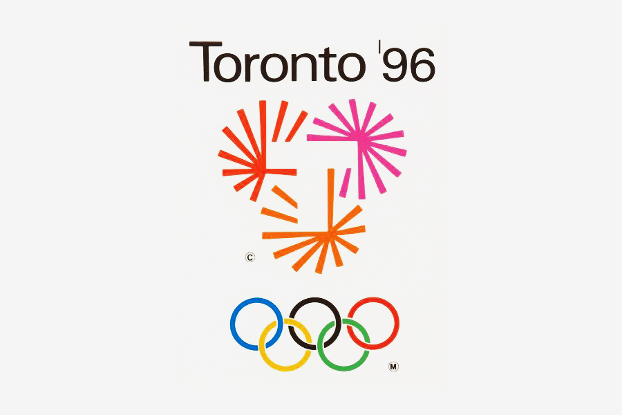
Toronto ’96
Olympic Mark (Rejected)
1990
Designed with Robert Jensen.
Links & Docs
Articles
Azure The battle over a national logo
CBC Canada 150th Symbol
Entro Canada 150 Symbol
GDC History Repeating Itself
Huffington Post Canada 150th Symbol
The 150 Logo Design Alternatives
The Canadian Encycliopedia Stuart Ash
The True North Times Canada 150th Symbol
Toronto Life Canada 150th Symbols
Profiles
Thinking Form Stuart Ash
Wikipedia France Stuart Ash
Projects
Northern Army Canadian Symbols
The Red List Stuart Ash
Videos
CCCA Stuart Ash
Facebook Communication Designers Association
TO THE TOP ↑
Comments
If you wish to add a comment please feel free to write at
info@designculture.it
TO THE TOP ↑
Follow on Facebook
Partnerships

Archivio Grafica Italiana is the first digital resource to the Italian graphic design heritage. Founded by Nicola Munari in 2015.

Design consultancy based in Piacenza, Italy. Founded by Nicola Munari in 2015, it operates in the whole field of design.
TO THE TOP ↑
© 2013-16 Nicola-Matteo Munari. All rights reserved.


