The deepest black of the night whispers in the silence exotic images to the mind: golden masks, odalisques, and dancing satyrs stand out sharply in the darkness, brightened by the moon paleness of Bodoni headline. Browsing FMR is like getting lost in a dream, the endless labyrinth of imagination.
The most beautiful magazine in the world, as Jacqueline Kennedy stated, was published in Italy starting from March 1982 by Parmesan designer
Franco Maria Ricci, one of the finest publishers and typographers in the world. A cultured bibliophile and passione collector, enthusiast of the beauty and disciple of the ephemeral,
Ricci has been able to promote the Italian artistic heritage and Bodoni’s typographic tradition better than anyone else.
 Portrait of Franco Maria Ricci, 1990s.
During the early 1960s, after a short experience as a geologist in Kurdistan, Mesopotamia—(one of his cousins was president of Gulf Oil)—, he returned to his native Parma, Northern Italy, where started dedicating himself to graphic design, a profession that gave him an equal success to that achieved as a publisher.
At the time of his very first experiences in design,
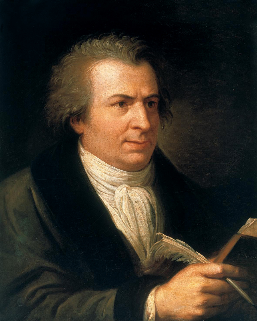
Ricci came in contact with the late 18th-century work of Giambattista Bodoni (1740-1813), an internationally renowned Piedmontese printer and typographer. Director of the Stamperia Reale (Royal Print House) of Parma, Bodoni was considered the king of typographers and the typographer of kings, serving the Duchy of Parma from 1768 until his death.
Ricci himself considers Bodoni as “the greatest graphic designer ever.”
 Andrea Appiani, Potrait of Giambattista Bodoni, 1799.
The typographic work of Bodoni constitutes an essential contribution to the Italian artistic heritage. It is a Neoclassic masterpiece which is comparable to the sculptural work of Antonio Canova in terms of both aesthetic and technical quality. “Regularity, sharpness, good taste, and gracefulness” are the well-known qualities of the typefaces he designed as his widow Margherita wrote in the foreword to his famous Manuale Tipografico, posthumously published in 1818.
A true alphabetic odyssey illustrating the production of more than forty years of work, the Manuale Tipografico is Bodoni’s typographic testament collecting 284 roman and italic fonts, 37 script fonts, 216 roman and italic capitals fonts, 17 script capitals fonts in the first volume and 74 cyrillic fonts, 51 greek fonts, 48 exotic fonts (including arabic), 7 hebraic fonts, 2 blackletter fonts, 1036 ornaments, 31 borders, 34 type rules, and 15 pages of frames, lines, brackets, symbols, numerals, and musical notations in the second volume.
 Page spread from Giambattista Bodoni’s Manuale Tipografico, 1818.
The love and enthusiasm for the work of Bodoni lead
Ricci to undertake his first heroic publishing adventure, the first reprint ever of Manuale Tipografico, 145 years after the printing of the original edition. The enterprise—unanimously declared as an unavoidable fiasco—was an extraordinary success with the selling of all the 900 printed copies, that were released starting from 1965. This success determined the foundation of Franco Maria Ricci publishing house and inaugurated a long series of extraordinary printing works oriented towards the promotion of artistic heritage, good taste, and aesthetic culture.
One of these wonderful publications was FMR, that appeared with elegance and charm in the midst of Postmodernism’s aesthetic barbarities of 1980s. The title FMR—the publisher’s private monogram—added a distinctive quality to the publication making it a sort of bespoke garment of its author. Indeed, if read in French it is pronounced “éphémère,” thus revealing the magazine’s most authentic character like in a Dada game.
 Franco Maria Ricci and Giulio Confalonieri, FMR, n.61, May 1988.
“Monthly magazine of art, literature, enchantment. FMR is not embarrassed to be extraordinary elegant and sophisticated. With no presumption, it is the most beautiful magazine in the world,” wrote
Ricci. The graphic design originated from the joint efforts of
Ricci and Giulio Confalonieri—one of the protagonists of the Italian graphic design scene during the 1960s—whose aid was essential for the setting of the headline. “I thought to print the title putting an M in Bodoni Papale—(a display font with swooshes)—between the F and R set in Bodoni Roman. Confalonieri convinced me that the M in Papale would make the cover too fancy and that three identical roman letters would have a greater impact. He was right,” told
Ricci.
The design of FMR is simply elegant, respecting the pure aesthetics of Bodoni. The three column layout is headed by a type rule that gives architectural structure to the pages. The typeface is specifically redesigned starting from Bodoni’s original fonts and the letters run along the lines with great harmony, thus giving absolute authenticity and elegance to the pages. “Bodoni’s characters are very difficult to be used and require great respect for proportions, distances, and white spaces,”
Ricci stated.
 A case of Giambattista Bodoni’s types. Bodoni Museum, Parma.
FMR is a black pearl, as Italian movie director Federico Fellini described it, thus identifying in the dark and deep brilliance of its covers the main aesthetic quality of the magazine. It is the same background black that accompanies the reader on his journey through the pages, a black that instead of capture the images let them stand out even more sharply. “Does not the object of vision stand out clearly if it is surrounded by the colour of no-vision?” was written in one of the magazine’s foreword. In such way, FMR seems a night creature, distilled during the shorter hours of the day. It should be read in secret by candlelight to enjoy the pleasure of discovering precious images, rich of charme and mystery.
The structure of the magazine is clear and simple: 28 pages of advertisements of which half at the beginning and half at the end of the magazine to not disturb the reader from the contents, the bulletin of exhibitions, the calendar of international events, and three or four monographic pieces of 30 pages each dedicated to secret wonders that were lost, forgotten, and finally rediscovered by
Ricci.
 Franco Maria Ricci and Giulio Confalonieri, FMR.
FMR totally redefined the concept of a magazine. “It is an art periodical like no one was before: the painting series are reproduced entirely, the manuscripts in their original colours, the visited collections, monuments, gardens, and palazzi are illustrated through monographic pieces from 16 to 30 pages. The entire Trajan’s Column ‘unfolded’ page after page. The Gardens of Bomarzo, monster after monster. Forty towers of Babel found in public museums and private collections. Sphinxes, hippogriffs, Renaissance grottoes, pagodas, cabalas, forgotten codices, mysterious hypogea, fantastic gardens, allegorical fountains, Qajar dancers, tantric diagrams, illusory perspectives, Venetian portolani, turquerie, scraped anatomies, Mannerist Dianas, alchemical tablets, trompe-l’œil, fashion sketches, heraldic animals, utopian machines, angels, devils, Deco panthers, precious vanities, wunderkammer, Stations of the Cross, hydraulic lions, mandrakes, unicorns, slot machines, epigraphs, visionary architectures” follow each other in an endless labyrinth.
Among the memorable articles stand out the ones dedicated to the great Masters of Italian art, such as Caravaggio and Donatello. But FMR specially proved a great courage and ability in juxtaposing in a few pages away an Italian fresco from the 14th century with the Virgin and the Child and an American painting from late 18th century portraying steamboats. In this way, the magazine managed to promote artistic sensibility of the visually unexplored, unusual, and unexpected, crossing the borders of a canonical and orthodox aesthetic culture.
 Franco Maria Ricci and Giulio Confalonieri, FMR, n.83, October 1990.
And even if it is “invented from the images,” as
Ricci said, FMR enjoyed texts that are vital not only to the understanding of the images, but that also allow the reader to project himself into their narrative dimension.
Ricci chose to work only with leading writers and prominent art historians, from Italo Calvino to Jorge Luis Borges, on to Leonardo Sciascia, Vittorio Sgarbi, Anthony Burgess, and others.
In 1984 the American edition of FMR was launched on the market with a pharaonic advertising campaign. The presentation was held at the New York Public Library, then the largest library in the world, introduced by Jorge Luis Borges, a great friend and longtime collaborator of
Ricci, and boasted the presence of the American élite.
In the U.S.A., fascinated to novelty more than Europe, FMR, that was completely new and different from other magazines, had an amazing success with more than 20.000 subscribers in the first year. It seduced the public because “it is a beautiful magazine to exhibit on a desk,” an idol to worship, “elegant as a Gucci bag.”
Ricci himself was the first to promote it in this way, as a coffee table book, without considering it a demerit but rather emphasizing its obvious aesthetic virtue.
 Franco Maria Ricci, KOS, n.0.
Following the success of FMR,
Ricci started to publish several other exclusive periodicals and supplements, sometime edited by himself: Gazzetta del Bibliofilo (The Bibliophile’s Gazette), KOS—a guaranteed presence in the waiting rooms of many Italian medical offices—, Liber Amicorum, Ephemeris, Mæcenas, PO, πoiein, and others.
In December 2002, after twenty years from the release of the first issue,
Ricci sold his creation to devote himself to a project that he cultivated for a long time: to build the largest maze in the world. FMR was bought by Group Art’è, that continued to publish the magazine until 2009, when it definitely closed. In 2015, after completing the seven-hectares wide maze also featuring an art museum and a library, Ricci bought back the copyrights of FMR with the intent to resume the publication in 2016, but still not resumed.
 Franco Maria Ricci and Giulio Confalonieri, FMR.
FMR has been a unique and unrepeatable magazine, that contributed to the spreading of an artistic culture worldwide, establishing itself as an excellent school of taste, teaching to distinguish the beautiful from the ugly, and becoming an eternal guardian of the ephemeral. It consacrated
Ricci as the heir of Bodoni by perpetuating the aesthetic principle declared by the famous motto of the Piedmontese typographer: “Je ne veux que du magnifique et je ne travaille pas pour le vulgaire.”
 Originally written in September 2014 and published in Italian on Pretext magazine, no.3, May 2015.
© 2017 Nicola-Matteo Munari. All rights reserved.
TO THE TOP ↑


